Quantitative Data Analysis
4 Bivariate Analyses: Crosstabulation
Crosstabulation
Roger Clark
In most research projects involving variables, researchers do indeed investigate the central tendency and variation of important variables, and such investigations can be very revealing. But the typical researcher, using quantitative data analysis, is interested in testing hypotheses or answering research questions that involve at least two variables. A relationship is said to exist between two variables when certain categories of one variable are associated, or go together, with, certain categories of the other variable. Thus, for example, one might expect that in any given sample of men and women (assume, for the purposes of this discussion, that the sample leaves out nonbinary folks), men would tend to be taller than women. If this turned out to be true, one would have shown that there is a relationship between gender and height.
But before we go further, we need to make a couple of distinctions. One crucial distinction is that between an independent variable and a dependent variable. An independent variable is a variable a researcher suspects may affect or influence another variable. A dependent variable, on the other hand, is a variable that a researcher suspects may be affected or influenced by (or dependent upon) another variable. In the example of the previous paragraph, gender is the variable that is expected to affect or influence height and is therefore the independent variable. Height is the variable that is expected to be affected or influenced by gender and is therefore the dependent variable. Any time one states an expected relationship between two (or more) variables, one is stating a hypothesis. The hypothesis stated in the second-to-last sentence of the previous paragraph is that men will tend to be taller than women. We can map two-variable hypotheses in the following way (Figure 3.1):
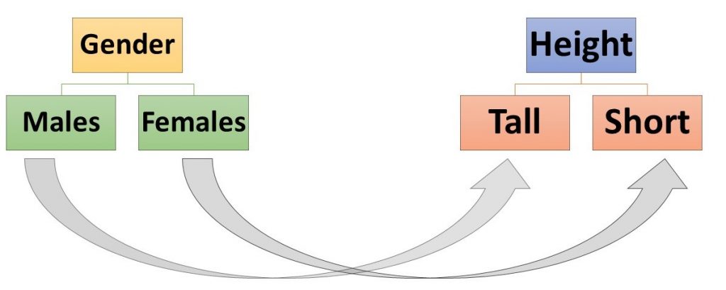
When mapping a hypothesis, we normally put the variable we think to be affecting the other variable on the left and the variable we expect to be affected on the right and then draw arrows between the categories of the first variable and the categories of the second that we expect to be connected.
Quiz at the End of The Paragraph
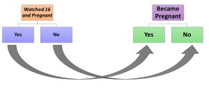
Read the following report by Annie Lowrey about a study done by two researchers, Kearney and Levine. What is the main hypothesis, or at least the main finding, of Kearney and Levine’s study on the effects of Watching 16 and Pregnant on adolescent women? How might you map this hypothesis (or finding)?
We’d like to say a couple of things about what we think Kearney and Levine’s major hypothesis was and then introduce you to a way you might analyze data collected to test the hypothesis. Kearney and Levine’s basic hypothesis is that adolescent women who watched 16 and Pregnant were less likely to become pregnant than women who did not watch it. They find some evidence not only to support this basic hypothesis but also to support the idea that the ones who watched the show were less likely to get pregnant because they were more likely to seek information about contraception (and presumably to use it) than others. Your map of the basic hypothesis, at least as it applied to individual adolescent women, might look like this:
Let’s look at a way of showing a relationship between two nominal level variables: crosstabulation. Crosstabulation is process of making a bivariate table for nominal level variables to show their relationship. But how does crosstabulation work?
Suppose you collected data from 8 adolescent women and the data looked like this:
Table 1: Data from Hypothetical Sample A
| Watched 16 and Pregnant | Got Pregnant | |
| Person 1 | yes | no |
| Person 2 | yes | no |
| Person 3 | yes | no |
| Person 4 | yes | yes |
| Person 5 | no | yes |
| Person 6 | no | yes |
| Person 7 | no | yes |
| Person 8 | no | no |
Quick Check: What percentage of those who have watched 16 and Pregnant in the sample have become pregnant? What percentage of those who have NOT watched 16 and Pregnant have become pregnant?
If you found that 25 percent of those who had watched the show became pregnant, while 75 percent of those who had not watched it did so, you have essentially done a crosstabulation in your head. But here’s how you can do it more formally and more generally.
First you need to take note of the number of categories in your independent variable (for “Watched 16 and Pregnant” it was 2: Yes and No). Then note the number of categories in your dependent variable (for “Got Pregnant” it was also 2: again, Yes and No). Now you prepare a “2 by 2” table like the one in Table 3.2,[1] labeling the columns with the categories of the independent variables and the rows with the categories of the dependent variable. Then decide where the first case should be put, as we’ve done, by determining which cell is where its appropriate row and column “cross.” We’ve “crosstabulated” Person 1’s data by putting a mark in the box where the “Yes” for “watched” and the “No” for “got pregnant” cross.
Table 2. Crosstabulating Person 1’s Data from Table 3.1 Above
| Watched 16 and Pregnant | |||
| Yes | No | ||
| Got Pregnant | Yes | ||
| No | I | ||
We’ve “crosstabulated” the first case for you. Can you crosstabulate the other seven cases? We’re going to call the cell in the upper left corner of the table cell “A,” the one in the upper right, cell “B,” the one in the lower left, cell “C,” and the one in the lower right, cell “D.” If you’ve finished your crosstabulation and had one case in cell A, 3 in cell B, 3 in cell C, and 1 in cell D, you’ve done great!
In order to interpret and understand the meaning of your crosstabulation, you need to take one more step, and that is converting those tally marks to percentages. To do this, you add up all the tally marks in each column, and then you determine what percentage of the column total is found in each cell in that column. You’ll see what that looks like in Table 3 below.
Direction of the Relationship
Now, there are three characteristics of a crosstabulated relationship that researchers are often interested in: its direction, its strength, and its generalizability. We’ll define each of these in turn, and as we come to it. The direction of a relationship refers to how categories of the independent variable are related to categories of the dependent variable. There are two steps involved in working out the direction of a crosstabulated relationship… and these are almost indecipherable until you’ve seen it done:
1. Percentage in the direction of the independent variable.
2. Compare percentages in one category of the dependent variable.
The first step actually involves three substeps. First you change the tally marks to numbers. Thus, in the example above, cell A would get a 1, B, a 3, C, a 3, and D, a 1. Second, you’d add up all the numbers in each category of the independent variable and put the total on the side of the table at the end of that column. Third, you would calculate the percentage of that total that falls into each cell along that column (as noted above). Once you’d done all that with the data we gave you above, you should get a table that looks like this (Table 3.3):
Table 3 Crosstabulation of Our Imaginary Data from a 16 and Pregnant Study
| Watched 16 and Pregnant | |||
| Yes | No | ||
| Got Pregnant | Yes | 1 (25%) | 3 (75%) |
| No | 3 (75%) | 1 (25%) | |
| Total | 4 (100%) |
4 (100%) | |
Step 2 in determining the direction of a crosstabulated relationship involves comparing percentages in one category of the dependent variable. When we look at the “yes” category, we find that 25% of those who watched the show got pregnant, while 75% of those who did NOT watch the show got pregnant. Turning this from a percentage comparison to plain English, this crosstabulation would have shown us that those who did watch the show were less likely to get pregnant than those who did not. And that is the direction of the relationship.
Note: because we are designing our crosstabulations to have the independent variable in the columns, one of the simplest ways to look at the direction or nature of the relationship is to compare the percentages across the rows. Whenever you look at a crosstabulation, start by making sure you know which is the independent and which is the dependent variable and comparing the percentages accordingly.
Strength of the Relationship
When we deal with the strength of a relationship, we’re dealing with the question of how reliably we can predict a sample member’s value or category of the dependent variable based on knowledge of that member’s value or category on the independent variables, just knowing the direction of the relationship. Thus, for the table above, it’s clear that if you knew that a person had watched 16 and Pregnant and you guessed she’d not gotten pregnant, you’d have a 75% (3 out of 4) chance of being correct; if you knew she hadn’t watched, and you guessed she had gotten pregnant, you’d have a 75% (3 out of 4) chance of being correct. Knowing the direction of this relationship would greatly improve your chances of making good guesses…but they wouldn’t necessarily be perfect all the time.
There are several measures of the strength of association and, if they’ve been designed for nominal level variables, they all vary between 0 and 1. When one of the measures is 0.00, it indicates that knowing a value of the independent variable won’t help you at all in guessing what a value of the dependent variable will be. When one of these measures is 1.00, it indicates that knowing a value of the independent variable and the direction of the relationship, you could make perfect guesses all the time. One of the simplest of these measures of strength, which can only be used when you have 2 categories in both the independent and dependent variables, is the absolute value of Yule’s Q. Because the “absolute value of Yule’s Q” is so relatively easy to compute, we will be using it a lot from now on, and it is the one formula in this book we would like you to learn by heart. We will be referring to it simply as |Yule’s Q|—note that the “|” symbols on both sides of the ‘Yule’s Q’ are asking us to take whatever Yule’s Q computes to be and turn it into a positive number (its absolute value). So here’s the formula for Yule’s Q:
[latex]|\mbox{Yule's Q}| = \frac{|(A \times B) - (B \times C) |}{|(A \times D) + (B \times C)|} \\ \text{Where }\\ \text{$A$ is the number of cases in cell $A$ }\\ \text{$B$ is the number of cases in cell $B$ }\\ \text{$C$ is the number of cases in cell $C$ }\\ \text{$D$ is the number of cases in cell $D$}[/latex]
For the crosstabulation of Table 3,
[latex]|{\mbox{Yule's Q}}| = \frac{|(1 \times 1) - (3 \times 3)|}{|(1 \times 1) + (3 \times 3)|} = \frac{|1-9|}{|1+9|} = \frac{|-8|}{|10|} = \frac{8}{10} = .80[/latex]
In other words, the Yule’s Q is .80, much close to the upper limit of Yule’s Q (1.00) than it is to its lower limit (0.00). So the relationship is very strong, indicating, as we already knew, that, given knowledge of the direction of the relationship, we could make a pretty good guess about what value on the dependent variable a case would have if we knew what value on the independent variable it had.
Practice Exercise
Suppose you took three samples of four adolescent women apiece and obtained the following data on the 16 and Pregnant topic:
| Sample 1 | Sample 2 | Sample 3 | |||
| Watched | Pregnant | Watched | Pregnant | Watched | Pregnant |
| Yes | No | Yes | No | Yes | Yes |
| Yes | No | Yes | Yes | Yes | Yes |
| No | Yes | No | Yes | No | No |
| No | Yes | No | No | No | No |
See if you can determine both the direction and strength of the relationship between having watched “16 and Pregnant” in each of these imaginary samples. In what ways does each sample, other than sample size, differ from the Sample A above? Answers to be found in the footnote.[2]
Roger now wants to share with you a discovery he made after analyzing some data that two now post-graduate students of his, Angela Leonardo and Alyssa Pollard, have made using crosstabulation. At the time of this writing, they had just coded their first night of TV commercials, looking for the gender of the authoritative “voice-over”—the disembodied voice that tells viewers key stuff about the product. It’s been generally found in gender studies that these voice-overs are overwhelmingly male (e.g., O’Donnell and O’Donnell 1978; Lovdal 1989; Bartsch et al. 2000), even though the percentage of such voice-overs that were male had dropped from just over 90 percent in the 1970s and 1980s to just over 70 percent in 1998. We will be looking at considerably more data, but so far things are so interesting that Roger wants to share them with you…and you’re now sophisticated enough about crosstabs (shorthand for crosstabulations) to appreciate them. Thus, Table 3.4 suggests that things have changed a great deal. In fact the direction of the relationship between the time period of the commercials and the gender of the voice-over is clearly that more recent commercials are much more likely to have a female voice-over than older ones. While only 29 percent of commercials in 1998 had a female voice-over, 71 percent in 2020 did so. And a Yule’s Q of .72 indicates that the relationship is very strong.
Table 3.4 Crosstabulation of Year of Commercial and Gender of the Voice-Over
| Year of Commercial | |||
| 1998 | 2020 | ||
| Gender of Voice-Over | Male | 432 (71%) | 14 (29%) |
| Female | 177 (29%) | 35 (71%) | |
| Notes: |Yule’s Q| = 0.72; 1998 data from Bartsch et al., 2001. | |||
Yule’s Q, while relatively easy to calculate, has a couple of notable limitations. One is that if one of the four cells in a 2 x 2 table (a table based on an independent variable with 2 categories and a dependent variable with 2 categories) has no cases, the calculated Yule’s Q will be 1.00, even if the relationship isn’t anywhere near that strong. (Why don’t you try it with a sample that has 5 cases on cell A, 5 in cell B, 5 in cell C, and 0 in cell D?)
Another problem with Yule’s Qis that it can only be used to describe 2 x 2 tables. But not all variables have just 2 categories. As a consequence, there are several other measures of strength of association for nominal level variables that can handle bigger tables. (One that we recommend for sheep farmers is lambda. Bahhh!) But, we most typically use one called Cramer’s V, which shares with Yule’s Q (and lambda) the property of varying between 0 and 1. Roger normally advises students that values of Cramer’s V between 0.00 and 0.10 suggests that the relationship is weak; between 0.11 and 0.30, that the relationship is moderately strong; between 0.31 and and 0.59, that the relationship is strong; and between 0.60 and 1.00, that the relationship is very strong. Associations (a fancy word for the strength of the relationship) above 0.59 are not so common in social science research.
An example of the use of Cramer’s V? Roger used statistical software called the Statistical Package for the Social Sciences (SPSS) to analyze the data Angela, Alyssa and he collected about commercials (on one night) to see whether men or women, both or neither, were more likely to appear as the main characters in commercials focused on domestic goods (goods used inside the home) and non-domestic goods (goods used outside the home). Who (men or women or both) would you expect to be such (main) characters in commercials involving domestic products? Non-domestic products? If you guessed that females might be the major characters in commercials for domestic products (e.g., food, laundry detergent, and home remedies) and males might be major characters in commercials for non-domestic products (e.g., cars, trucks, cameras), your guesses would be consistent with findings of previous researchers (e.g., O’Donnell and O’Donnell, 1978; Lovdal, 1989; Bartsch et al., 2001). The data we collected on our first night of data collection suggest some support for these findings (and your expectations), but also some support for another viewpoint. Table 3.5, for instance, shows that women were, in fact, the main characters in about 48 percent of commercials for domestic products, while they were the main characters in only about 13 percent of commercials for non-domestic products. So far, so good. But males, too, were more likely to be main characters in commercials for domestic products (they were these characters about 24 percent of the time) than they were in commercials for non-domestic products (for which they were the main character only about 4 percent of the time). So who were the main product “representatives” for non-domestic commercials? We found that in these commercials at least one man and one woman were together the main characters about 50 percent of the time, while men and women together were the main characters in only about 18 percent of the time in commercials for domestic products.
But the analysis involving gender of main character and whether products were domestic or non-domestic involved more than a 2 x 2 table. In fact, it involved a 2 x 4 table because our dependent variable, gender of main character, had four categories: female, male, both, and neither. Consequently, we couldn’t use Yule’s Q as a measure of strength of association. But we could ask, and did ask (using SPSS), for Cramer’s V, which turned out to be about 0.53, suggesting (if you re-examine Roger’s advice above) that the relationship is a strong one.
Table 3.5 Crosstabulation of Type of Commercial and Gender of Main Character
| Type of Commercial | |||
| For Domestic Product | For Non-Domestic Product | ||
| Gender of Main Character | Female | 18 (47.4%) | 3 (12.5%) |
| Male | 9 (23.7%) | 1 (4.2%) | |
| Both | 7 (18.4%) | 12 (50%) | |
| Neither | 4 (10.4%) | 8 (33.3%) | |
| Notes: Cramer’s V = 0.53 | |||
Generalizability of the Relationship
When we speak of the generalizability of a relationship, we’re dealing with the question of whether something like the relationship (in direction, if not strength) that is found in the sample can be safely generalized to the larger population from which the sample was drawn. If, for instance, we drew a probability sample of eight adolescent women like the ones we pretended to draw in the first example above, we’d know we have a sample in which a strong relationship existed between watching “16 and Pregnant” and not becoming pregnant. But how could one tell that this sample relationship was likely to be representative of the true relationship in the larger population?
If you recall the distinction we drew between descriptive and inferential statistics in the Chapter on Univariate Analysis, you won’t be surprised to learn that we are now entering the realm of inferential statistics for bivariate relationships. When we use percentage comparisons within one category of the dependent variable to determine the direction of a relationship and measures like Yule’s Q and Cramer’s V to get at its strength, we’re using descriptive statistics—ones that describe the relationship in the sample. But when we talk about Pearson’s chi-square (or Χ²), we’re referring to an inferential statistic—one that can help us determine whether we can generalize that something like the relationship in the sample exists in the larger population from which the sample was drawn.
But, before we learn how to calculate and interpret Pearson’s chi-square, let’s get a feel for the logic of this inferential statistic first. Scientists generally, and social scientists in particular, are very nervous about inferring that a relationship exists in the larger population when it really doesn’t exist there. This kind of error—the one you’d make if you inferred that a relationship existed in the larger population when it didn’t really exist there—has a special name: a Type I error. Social scientists are so anxious about making Type 1 errors that they want to keep the chances of making them very low, but not impossibly low. If they made them impossibly low, then they’d risk making the opposite of a Type 1 error: a Type 2 error—the kind of error you’d make when you failed to infer that a relationship existed in the larger population when it really did exist there. The chances, or probability, of something happening can vary from 0.00 (when there’s no chance at all of it happening) to 1.00, when there’s a perfect chance that it will happen. In general, social scientists aim to keep the chances of making a Type 1 error below .05, or below a 1 in 20 chance. They thus aim for a very small, but not impossibly small, chance of making the inference that a relationship exists in the larger population when it doesn’t really exist there.

Karl Pearson, the statistician whose name is associated with Pearson’s chi-square, studied the statistic’s property in about 1900. He found, among other things, that crosstabulations of different sizes (i.e., different numbers of cells) required a different chi-square to be associated with a .05 chance, or probability (p), of making a Type 1 error or less. As the number of cells increase, the required chi-square increases as well. For a 2 x 2 table, the critical chi-square is 3.84 (that is, the computed chi-square value should be 3.84 or more for you to infer that a relationship exists in the larger population with only a .05 chance, or less, of being wrong); for a 2 x 3 table, the critical chi-square is 5.99, and so on. Before we were able to use statistical processing software like SPSS, statistical researchers relied on tables that outlined the critical values of chi-quare for different size tables (degrees of freedom, to be discussed below) and different probabilities of making a Type 1 error. A truncated (shortened) version of such a table can be seen in Table 6.
Table 6: Table of Critical Values of the Chi-Square Distribution
| Probability less than the critical value | ||||
| Degrees of Freedom | 0.90 | 0.95 | 0.99 | 0.999 |
| 1 | 2.706 | 3.841 | 5.024 | 10.828 |
| 2 | 4.605 | 5.991 | 7.378 | 13.816 |
| 3 | 6.251 | 7.815 | 9.384 | 16.266 |
| 4 | 7.779 | 9.488 | 11.143 | 13.277 |
| 5 | 9.236 | 11.070 | 12.833 | 20.515 |
| 6 | 10.645 | 12.592 | 14.449 | 22.458 |
| 7 | 12.017 | 14.067 | 17.013 | 24.458 |
| And so on… | ||||
Now you’re ready to see how to calculate chi-square. The formula for chi-square (Χ²) is:
[latex]\chi^2 = \sum\frac{(O-E)^2}{E}\\ \text{where}\\ \text{$\chi$ means "the sum of"}\\ \text{$O = $ the number of observed number of cases in each cell in the sample}\\ \text{$E =$ the expected number in each cell, if there were no relationship between the two variables}[/latex]
Let’s see how this would work with the example of the imaginary data in Table 3.3. This table, if you recall, looked (mostly) like this:
Table 7 (Slightly Revised) Crosstabulation of Our Imaginary Data from a “16 and Pregnant” Study
| Watched 16 and Pregnant | Row Marginals | |||
| Yes | No | |||
| Got Pregnant | Yes | 1 | 3 | 4 |
| No | 3 |
1 | 4 | |
| Column Marginals | 4 |
4 | N=8 | |
How do you figure out what the expected number of cases would be in each cell? You use the following formula:
[latex]E = \frac{M_r \times M_c}{N}\\ \text{Where}\\ \text{$M_r$ is the row marginal for the cell}\\ \text{$M_c$ is the column marginal for the cell}\\ \text{$N$ is the total number of cases in the sample}[/latex]
A row marginal is the total number of cases in a given row of a table. A column marginal is the total number of cases in a given column of a table. For this table, the N is 8, the total number of cases involved in the crosstabulation. For cell A, the row marginal is 4 and the column marginal is 4, which means its expected number of cases would be 4 x 4 = 16/8 = 2. In this particular table, all the cells would have had an expected frequency (or number of cases) of 2. So now all we have to do to compute χ2 is to make a series of calculation columns:
| Cell | Observed Number of Cases in Cell | Expected Number of Cases in Cell | (O-E) | (O-E)2 | (O-E)2/E |
| A | 1 | 2 | -1 | 1 | ½ |
| B | 3 | 2 | 1 | 1 | ½ |
| C | 1 | 2 | -1 | 1 | ½ |
| D | 3 | 2 | 1 | 1 | ½ |
And the sum of all the numbers in the (0-E)²/E column is 2.00. This is less than the 3.84 that χ² needs to be for us to conclude that the chances of making a Type 1 error are less than .05 (see Table 3.6), so we cannot safely generalize that something like the relationship in this small sample exists in the larger population. Aren’t you glad that these days programs like SPSS can do these calculations for us? Even though they can, it’s important to go through the process a few times on your own so that you understand what it is that the computer is doing.
Chi-square varies based on three characteristics of the sample relationship. The first of these is the number of cells. Higher chi-squares are more easily achieved in tables with more cells; hence the 3.84 standard for 2 x 2 tables and the 5.99 standard for 2 x 3 tables. You’ll recall from Table 3.6 that we used the term degrees of freedom to refer to the calculation of table size. To figure out the degrees of freedom for a crosstabulation, you simply count the number of columns in the table (only the columns with data in them, not columns with category names) and subtract one. Then you count the number of rows in the table, again only those with data in them, and subtract one. Finally, you multiply the two numbers you have computed. Therefore, the degrees of freedom for a 2×2 table will be 1 [(2-1)*(2-1)], while the degrees of freedom for a 4×6 table will be 15 [(4-1)*(6-1)].
Higher chi-squares will also be achieved when the relationship is stronger. If, instead of the 1, 3, 3, 1 pattern in the four cells above (a relationship that yields a Yule’s Q of 0.80, one had a 0, 4, 4, 0 pattern (a relationship that yields a Yule’s Q of 1.00), the chi-square would be 8.00,[3] considerably greater than the 3.84 standard, and one could then generalize that something like the relationship in the sample also existed in the larger population.
But chi-square also varies with the size of the sample. Thus, if instead of the 1, 3, 3, 1 pattern above, one had a 10, 30, 30, 10 pattern—both of which would yield a Yule’s Q of 0.80 and are therefore of the same strength, and both of which have the same number of cells (4)—the chi-square would compute to be 20, instead of 2, and give pretty clear guidance to infer that a relationship exists in the larger population. The message of this last co-variant of chi-square—that it grows as the sample grows—implies that researchers who want to find generalizable results do well to increase sample size. A sample that tells us that the relationship under investigation is generalizable is said to be significant—sometimes a desirable and often an interesting thing.[4] Incidentally, SPSS computed the chi-square for the crosstabulation in Table 3.5, the one that showed the relationship between type of product advertised (domestic or non-domestic) and the gender of the product representative, to be 17.5. Even for a 2 x 4 table like that one, this is high enough to infer that a relationship exists in the larger population, with less than a .05 chance of being wrong. In fact, SPSS went even further, telling us that the chances of making a Type 1 error were less than .001. (Aren’t computers great?)
Crosstabulation with Two Ordinal Level Variables
We’ve introduced crosstabulation as a technique designed for the analysis of the relationship between two nominal level variables. But because all variables are at least nominal level, one could theoretically use crosstabulation to analyze the relation between variables of any scale.[5] In the case of two interval level variables, however, there are much more elegant techniques for doing so and we’ll be looking at those in the chapter on correlation and regression. If one were looking into the relationship between a nominal level variable (say, gender, with the categories male and female)[6] and an ordinal level variable (say, happiness with marriage with the three categories: very happy, happy, not so happy), one could simply use all the same techniques for determining the direction, strength, and generalizability we’ve discussed above.
If we chose to analyze the relationship between two ordinal level variables, however, we could still use crosstabulation, but we might want to use a more elegant way of determining direction and strength of relationship than by comparing percentages and seeing what Cramer’s V tells us. One very cool statistic used for determining the direction and strength of a relationship between two ordinal level variables is gamma. Unlike Cramer’s V and Yule’s Q, whose values only vary between 0.00 and 1.00, and therefore can only speak to the strength of a relationship, gamma’s possible values are between -1.00 and 1.00. This one statistic can tell us about both the direction and the strength of the relationship. Thus, a gamma of zero still means there is no relationship between the two variables. But a gamma with a positive sign not only reveals strength (a gamma of 0.30 indicates a stronger relationship than one of 0.10), but it also says that as values of the independent variable increase, so do values of the dependent variable. And a gamma with a negative sign not only reveals strength (a gamma of -0.30 indicates a stronger relationship than one of -0.10), but also says that as values of the independent variable increase, values of the dependent variable decrease. But what exactly do we mean by “values,” here?
Let’s explore a couple of examples from the GSS (via the Social Data Archive, or SDA). Table 8 shows the relationship between the happiness of GSS respondents’ marriages (HAPMAR) and their general happiness (HAPPY) over the years. Using our earlier way of determining direction, we can see that 90 percent of those that are “very happy” generally are also happy in their marriages, while only 19.5 percent of those who are “not too happy” generally are pretty happy in their marriages. Pretty clear that marital happiness and general happiness are related, right?
Table 8. Crosstabulation of Marital Happiness and General Happiness, GSS data from SDA
| Frequency Distribution | |||||
|---|---|---|---|---|---|
| Cells contain: –Column percent -N of cases |
HAPPY | ||||
| 1 very happy |
2 pretty happy |
3 not too happy |
ROW TOTAL |
||
| HAPMAR | 1: very happy | 90.0 11,666 |
46.5 7,938 |
35.0 894 |
63.0 20,498 |
| 2: pretty happy | 9.6 1,237 |
51.0 8,617 |
45.5 1,120 |
34.0 10,974 |
|
| 3: not too happy | .4 51 |
2.4 433 |
19.5 503 |
2.9 987 |
|
| COL TOTAL | 100.0 12,954 |
100.0 16,988 |
100.0 2,517 |
100.0 32,459 |
|
| Means | 1.10 | 1.56 | 1.84 | 1.40 | |
| Std Devs | .32 | .54 | .72 | .55 | |
| Unweighted N | 12,954 | 16,988 | 2,517 | 32,459 | |
| Color coding: | <-2.0 | <-1.0 | <0.0 | >0.0 | >1.0 | >2.0 | |
|---|---|---|---|---|---|---|---|
| N in each cell: | Smaller than expected | Larger than expected | |||||
| Summary Statistics | ||||||||
|---|---|---|---|---|---|---|---|---|
| Eta* = | .46 | Gamma = | .75 | Rao-Scott-P: F(4,2360) = | 1,807.32 | (p= 0.00) | ||
| R = | .46 | Tau-b = | .45 | Rao-Scott-LR: F(4,2360) = | 1,709.73 | (p= 0.00) | ||
| Somers’ d* = | .42 | Tau-c = | .35 | Chisq-P(4) = | 8,994.28 | |||
| Chisq-LR(4) = | 8,508.63 | |||||||
| *Row variable treated as the dependent variable. | ||||||||
The more elegant way is to look at the statistics at the bottom of the table. Most of these statistics aren’t helpful to us now. But one, gamma, certainly is. You’ll note that gamma is 0.75. There are two important attributes of this statistic: its sign (positive) and its magnitude (0.75). The former tells you that as coded values of marital happiness—1=very happy; 2 happy; 3=not so happy—go up, values of general happiness—1=very happy; 2=happy; 3=not so happy—tend to go up as well. We can interpret this by saying that respondents who are less happy with their marriages are likely to be less happy generally than others. (Notice that this also means that people who are happy in their marriages are also likely to be more generally happy than others.) But the 0.75, independent of the sign, means that this relationship is very strong. By the way, you might also notice that there is a little parenthetical expression at the end of the row gamma is on in the statistics box—(p=0.00). The “p” stands for the chances (probability) of making a Type 1 error, and is sometimes called the “p value” or the significance level. The fact that the “p value” here is 0.00 does NOT mean that there is zero chance of making an error if you infer that there is a relationship between marital happiness and general happiness in the larger population. There will always be such a chance. But the SDA printouts of such values give up after two digits to the right of the decimal point. All one can really say is that the chances of making a Type 1 error, then, are less than 0.01 (which itself is less than 0.05)—and so researchers would conclude that they could reasonably generalize.
To emphasize the importance of the sign of gamma (+ or -), let’s have a look at Table 9, which displays the relationship between job satisfaction, whose coded values are 1=very dissatisfied; 2=a little dissatisfied; 3= moderately satisfied; 4=very satisfied, and general happiness, whose codes are the same as they were in Table 3.7. You can probably tell from looking at the internal percentages of the table that as job satisfaction increases so does general happiness—as one might expect. But sign of the gamma of -0.43 might at first persuade you that there is a negative association between job satisfaction and happiness, until you remember that what it’s really telling you is that when the coded values of job satisfaction go up, from 1 (very dissatisfied) to 4 (very satisfied), the coded values of happiness go down, from 3 (not so happy) to 1 (very happy). Which really means that as job satisfaction goes up, happiness goes up as well, right? Note, however, that if we reversed the coding for the job satisfaction variable, so that 1 represented being very satisfied with your job while 4 represented being very dissatisfied, the direction of gamma would reverse. Thus, it is essential that data analysts do not stop by looking at whether gamma is positive or negative, but rather also ensure they understand the way the variable is coded (its attributes).
Also note here that the 0.43 portion of the gamma tells you how strong this relationship is—it’s strong, but not as strong as the relationship between marital happiness and general happiness (which had a gamma of 0.75). The “p value” here again is .00, which means that it’s less than .01, which of course is less than .05, and we can infer that there’s very probably a relationship between job satisfaction and general happiness in the larger population from which this sample was drawn.
Table 9. Crosstabulation of Job Satisfaction and General Happiness, GSS data from SDA
| Frequency Distribution | ||||||
|---|---|---|---|---|---|---|
| Cells contain: –Column percent -Weighted N |
satjob2 | |||||
| 1 Very Dissatisfied |
2 A Little Dissatisfied |
3 Moderately Satisfied |
4 Very Satisfied |
ROW TOTAL |
||
| happy | 1: very happy | 15.1 283.0 |
15.6 722.3 |
23.9 4,317.4 |
44.9 10,134.3 |
32.8 15,457.0 |
| 2: pretty happy | 51.1 955.7 |
62.1 2,877.8 |
64.9 11,716.0 |
48.7 10,982.8 |
56.3 26,532.3 |
|
| 3: not too happy | 33.8 631.3 |
22.3 1,034.4 |
11.3 2,032.6 |
6.4 1,448.8 |
10.9 5,147.1 |
|
| COL TOTAL | 100.0 1,870.0 |
100.0 4,634.5 |
100.0 18,066.0 |
100.0 22,566.0 |
100.0 47,136.4 |
|
| Means | 2.19 | 2.07 | 1.87 | 1.62 | 1.78 | |
| Std Devs | .67 | .61 | .58 | .60 | .62 | |
| Unweighted N | 1,907 | 4,539 | 17,514 | 22,091 | 46,051 | |
| Color coding: | <-2.0 | <-1.0 | <0.0 | >0.0 | >1.0 | >2.0 | |
|---|---|---|---|---|---|---|---|
| N in each cell: | Smaller than expected | Larger than expected | |||||
| Summary Statistics | ||||||||
|---|---|---|---|---|---|---|---|---|
| Eta* = | .28 | Gamma = | -.43 | Rao-Scott-P: F(6,3396) = | 584.48 | (p= 0.00) | ||
| R = | -.28 | Tau-b = | -.26 | Rao-Scott-LR: F(6,3396) = | 545.83 | (p= 0.00) | ||
| Somers’ d* = | -.25 | Tau-c = | -.23 | Chisq-P(6) = | 4,310.95 | |||
| Chisq-LR(6) = | 4,025.87 | |||||||
| *Row variable treated as the dependent variable. | ||||||||
We haven’t shown you the formula for gamma, but it’s not that difficult to compute. In fact, when you have a 2 x 2 table gamma is the same as Yule’s Q, except that it can take on both positive and negative values. Obviously, Yule’s Q could do that as well, if it weren’t for the absolute value symbols surrounding it. As a consequence, you can use gamma as a substitute for Yule’s Q for 2 x 2 tables when using the SDA interface to access GSS data—as long as you remember to take the absolute value of gamma that is calculated for you. Thus, in Table 10, showing the relationship between gender and whether or not a respondent was married, the absolute value of the reported gamma—that is, |-0.11|=0.11—is the Yule’s Q for the relationship. And it is clearly weak. By the way, the p value here, 0.07, indicates that we cannot safely infer that a similar relationship existed in the larger population in 2010.
Table 10. Crosstabulation of Gender and Marital Status in 2010, GSS data from SDA
| Frequency Distribution | ||||
|---|---|---|---|---|
| Cells contain: –Column percent -Weighted N |
sex | |||
| 1 male |
2 female |
ROW TOTAL |
||
| married | 0: not married | 45.4 420.9 |
50.7 565.9 |
48.3 986.8 |
| 1: married | 54.6 506.1 |
49.3 549.5 |
51.7 1,055.6 |
|
| COL TOTAL | 100.0 927.0 |
100.0 1,115.4 |
100.0 2,042.4 |
|
| Means | .55 | .49 | .52 | |
| Std Devs | .50 | .50 | .50 | |
| Unweighted N | 891 | 1,152 | 2,043 | |
| Color coding: | <-2.0 | <-1.0 | <0.0 | >0.0 | >1.0 | >2.0 | Z |
|---|---|---|---|---|---|---|---|
| N in each cell: | Smaller than expected | Larger than expected | |||||
| Summary Statistics | ||||||||
|---|---|---|---|---|---|---|---|---|
| Eta* = | .05 | Gamma = | -.11 | Rao-Scott-P: F(1,78) = | 3.29 | (p= 0.07) | ||
| R = | -.05 | Tau-b = | -.05 | Rao-Scott-LR: F(1,78) = | 3.29 | (p= 0.07) | ||
| Somers’ d* = | -.05 | Tau-c = | -.05 | Chisq-P(1) = | 5.75 | |||
| Chisq-LR(1) = | 5.76 | |||||||
| *Row variable treated as the dependent variable. | ||||||||
One problem with an SDA output is that none of the statistics reported (not the Eta, the R, the Tau-b, etc.) are actually designed to measure the strength of relationship between two purely nominal level variables—Cramer’s V and Yule’s Q, for instance, are not provided in the output. All of the measures that are provided, however, do have important uses. To learn more about these and other measures of association and the circumstances in which they should be used, see the chapter focusing on measures of association.
Exercises
- Write definitions, in your own words, for each of the following key concepts from this chapter:
- independent variable
- dependent variable
- crosstabulation
- direction of a relationship
- strength of a relationship
- generalizability of relationship
- Yule’s Q
- Cramer’s V
- Type 1 error
- Type 2 error
- Pearson’s chi-square
- gamma
- hypothesis
- null hypothesis
- Use the following (hypothetical) data, meant to test the hypothesis (with a hypothetically random sample) that adults tend to be taller than children. Create a crosstabulation of the data that enables you to determine the direction, strength and generalizability of the relationship, as well as what determinations you can make in relation to the null and research hypotheses. Present the statistics that permit you to describe these characteristics:
Case Gender Height Person 1 Child Short Person 2 Adult Tall Person 3 Child Short Person 4 Adult Tall Person 5 Child Short Person 6 Adult Tall Person 7 Child Short Person 8 Adult Tall -
Return to the Social Data Archive we’ve explored before. The data, again, are available at https://sda.berkeley.edu/. Go down to the second full paragraph and click on the “SDA Archive” link you’ll find there. Then scroll down to the section labeled “General Social Surveys” and click on the first link there: General Social Survey (GSS) Cumulative Datafile 1972-2021 release.
-
Now type “hapmar” in the row box and “satjob” in the column box. Hit “output options” and find the “percentaging” options and make sure “column” is clicked. (Satjob will be our independent variable here, so we want column percentages.) Now click on “summary statistics,” under “other options.” Hit on “run the table,” examine the resulting printout and write a short paragraph in which you use gamma and the p-value to evaluate the hypothesis that people who are more satisfied with their jobs are more likely to be happily married than those who are less satisfied with their jobs. Your paragraph should mention the direction, strength and generalizability of the relationship as well as what determinations you can make in terms of the null and research hypotheses.
-
Media Attributions
- A Mapping of the Hypothesis that Men Will Tend to be Taller than Women © Mikaila Mariel Lemonik Arthur is licensed under a CC BY-NC-SA (Attribution NonCommercial ShareAlike) license
- A Mapping of Kearney and Levine’s Hypothesis © Mikaila Mariel Lemonik Arthur is licensed under a CC BY-NC-SA (Attribution NonCommercial ShareAlike) license
- If one of your variables had three categories, it might be a “2 by 3” table. If both variables had 3 categories, you’d want a 3 by 3 table, etc. ↵
- Answers: In Sample 1, the direction of the relationship is the same as it was in Sample A (those who watched the show were less likely than those who didn’t), but its strength is greater (Yule’s Q= 1.00, rather than 0.80). In Sample 2, there is no direction of the relationship (those who watched the show were just as likely to get pregnant as those who didn’t) and its strength is as weak as it could be (Yule’s = 0.00). In Sample 3, the direction of the relationship is the opposite of what it was in Sample A. In this case, those who watched the show were more likely to get pregnant than those who didn’t. And the strength of the relationship was as strong as it could be (Yule’s Q= 1.00). ↵
- Can you double-check Roger’s calculation of chi-square for this arrangement to make sure he’s right? He’d appreciate the help. ↵
- Of course, with very large samples, like the entire General Social Survey (GSS) since it was begun, it is sometimes possible to uncover significant relationships—i.e., ones that almost surely exist in the larger population—that aren’t all that strong. Does that make sense? ↵
- You would generate some pretty gnarly tables that would be very hard to interpret, though. ↵
- While there are clearly more than two genders, we are at the mercy of the way the General Social Survey asked its questions in any given year, and thus for the examples presented in this text only data for males and females is available. While this is unfortunate, it's also an important lesson about the limits of existing survey data and the importance of ensuring proper survey question design. ↵
When certain categories of one variable are associated, or go together, with certain categories of the other variable(s).
A variable that may affect or influence another variable; the cause in a causal relationship.
A variable that is affected or influenced by (or depends on) another variable; the effect in a causal relationship.
A statement of the expected or predicted relationship between two or more variables.
An analytical method in which a bivariate table is created using discrete variables to show their relationship.
How categories of an independent variable are related to categories of a dependent variable.
A measure of how well we can predict the value or category of the dependent variable for any given unit in our sample based on knowing the value or category of the independent variable(s).
A measure of the strength of association use with binary variables
The degree to which a finding based on data from a sample can be assumed to be true for the larger population from which the population was drawn.
A measure of statistical significance used in crosstabulation to determine the generalizability of results.
The error made if one infers that a relationship exists in a larger population when it does not really exist; in other words, a false positive error.
The error you make when you do not infer a relationship exists in the larger population when it actually does exist; in other words, a false negative conclusion.
The total number of cases in a given row of a table.
The total number of cases in a given column of a table.
The number of cells in a table that can vary if we know something about the row and column totals of that table, calculated according to the formula (# of columns-1)*(# of rows-1).
A statistical measure that suggests that sample results can be generalized to the larger population, based on a low probability of having made a Type 1 error.
A measure of the direction and strength of a crosstabulated relationship between two ordinal-level variables.
The measure of statistical significance typically used in quantitative analysis. The lower the p value, the more likely you are to reject the null hypothesis.
The possible levels or response choices of a given variable.
