Quantitative Data Analysis With SPSS
11 Quantitative Analysis with SPSS: Univariate Analysis
Mikaila Mariel Lemonik Arthur
The first step in any quantitative analysis project is univariate analysis, also known as descriptive statistics. Producing these measures is an important part of understanding the data as well as important for preparing for subsequent bivariate and multivariate analysis. This chapter will detail how to produce frequency distributions (also called frequency tables), measures of central tendency, measures of dispersion, and graphs in SPSS. The chapter on Univariate Analysis provides details on understanding and interpreting these measures. To select the correct measures for your variables, first determine the level of measurement of each variable for which you want to produce appropriate descriptive statistics. The distinction between binary and other nominal variables is important here, so you need to determine whether each variable is binary, nominal, ordinal, or continuous. Then, use Table 1 to determine which descriptive statistics you should produce.
| Measures of Central Tendency | Measures of Dispersion | Graphs | |
| Binary | Mean; Mode | Frequency distribution | Pie Chart; Bar graph |
| Nominal | Mode | Frequency distribution | Pie Chart; Bar Graph |
|
Ordinal |
Median; Mode | Range (min/max); Frequency distribution; occasionally Percentiles | Bar Graph |
|
Continuous |
Mean; Median | Standard deviation; Variance; Range (min/max); Skewness; Kurtosis; Percentiles | Histogram |
Producing Descriptive Statistics
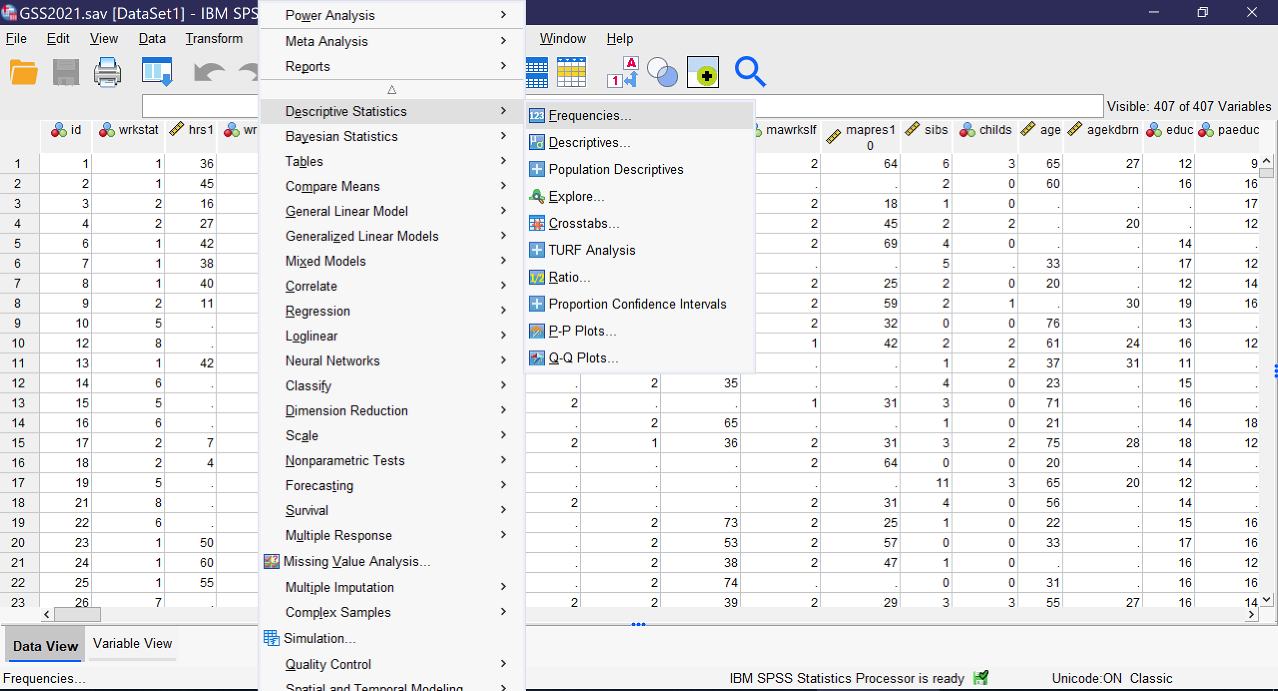
Other than graphs, all of the univariate analyses discussed in this chapter are produced by going to Analyze → Descriptive Statistics → Frequencies, as shown in Figure 1. Note that SPSS also offers a tool called Descriptives; avoid this unless you are specifically seeking to produce Z scores, a topic beyond the scope of this text, as the Descriptives tool provides far fewer options than the Frequencies tool.
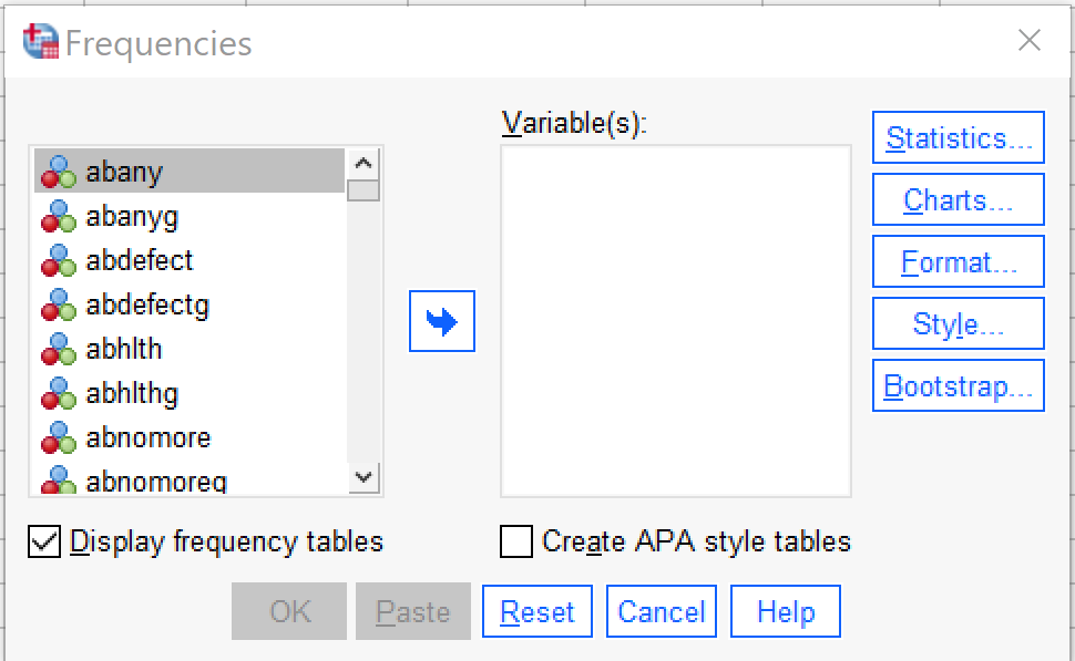
Selecting this tool brings up a window called “Frequencies” from which the various descriptive statistics can be selected, as shown in Figure 2. In this window, users select which variables to perform univariate analysis upon. Note that while univariate analyses can be performed upon multiple variables as a group, those variables need to all have the same level of measurement as only one set of options can be selected at a time.
To use the Frequencies tool, scroll through the list of variables on the left side of the screen, or click in the list and begin typing the variable name if you remember it and the list will jump to it. Use the blue arrow to move the variable into the Variables box or grab and drag it over. If you are performing analysis on a binary, nominal, or ordinal variable, be sure the checkbox next to “Display frequency tables” is checked; if you are performing analysis on a continuous variable, leave that box unchecked. The checkbox for “Create APA style tables” slightly alters the format and display of tables. If you are working in the field of psychology specifically, you should select this checkbox, otherwise it is not needed. The options under “Format” specify elements about the display of the tables; in most cases those should be left as the default. The options under “Style” and “Bootstrap” are beyond the scope of this text.
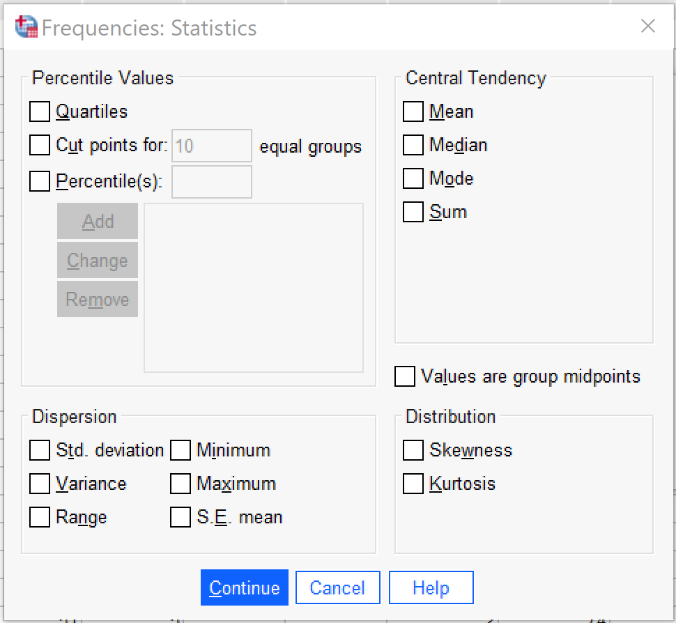
It is under “Statistics” that the specific descriptive statistics to be produced are selected, as shown in Figure 3. First, users can select several different options for producing percentiles, which are usually produced only for continuous variables but occasionally are used for ordinal variables. Quartiles produces the 25th, 50th (median), and 75th percentile in the data. Cut points allows the user to select a specified number of equal groups and see at which values the groups break. Percentiles allows the user to specify specific percentiles to produce—for instance, a user might want to specify 33 and 66 to see where the upper, middle, and lower third of data fall.
Second, users can select measures of central tendency, specifically the mean (used for binary and continuous variables), the median (used for ordinal and continuous variables), and the mode (used for binary, nominal, and ordinal variables). Sum adds up all the values of the variable, and is not typically used. There is also an option to select if values are group midpoints, which is beyond the scope of this text.
Next, users can select measures of dispersion and distribution, including the standard deviation (abbreviated here Std. deviation, and used for continuous variables), the variance (used for continuous variables), the range (used for ordinal and continuous variables), the minimum value (used for ordinal and continuous variables), the maximum value (used for ordinal and continuous variables), and the standard error of the mean (abbreviated here as S.E. mean, this is a measure of sampling error and beyond the scope of this text), as well as skewness and kurtosis (used for continuous variables).
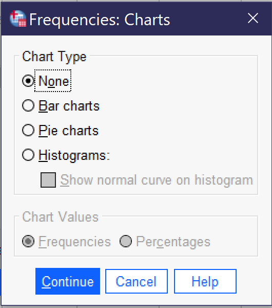
Once all desired tests are selected, click “Continue” to go back to the main frequencies dialog. There, you can also select the Chart button to produce graphs (as shown in Figure 4), though only one graph can be produced at a time (other options for producing graphs will be discussed later in this chapter). Bar charts are appropriate for binary, nominal, and ordinal variables. Pie charts are typically used only for binary variables and nominal variables with just a few categories, though they may at times make sense for ordinal variables with just a few categories. Histograms are used for continuous variables; there is an option to show the normal curve on the histogram, which can help users visualize the distribution more clearly. Users can also choose whether their graphs will be displayed in terms of frequencies (the raw count of values) or percentages.
Examples at Each Level of Measurement
Here, we will produce appropriate descriptive statistics for one variable from the 2021 GSS file at each level of measurement, showing what it looks like to produce them, what the resulting output looks like, and how to interpret that output.
A Binary Variable
To produce descriptive statistics for a binary variable, be sure to leave Display frequency tables checked. Under statistics, select Mean and Mode and then click continue, and under graphs select your choice of bar graph or pie chart and then click continue. Using the variable GUNLAW, then, the selected option would look as shown in Figure 5. Then click OK, and the results will appear in the Output window.
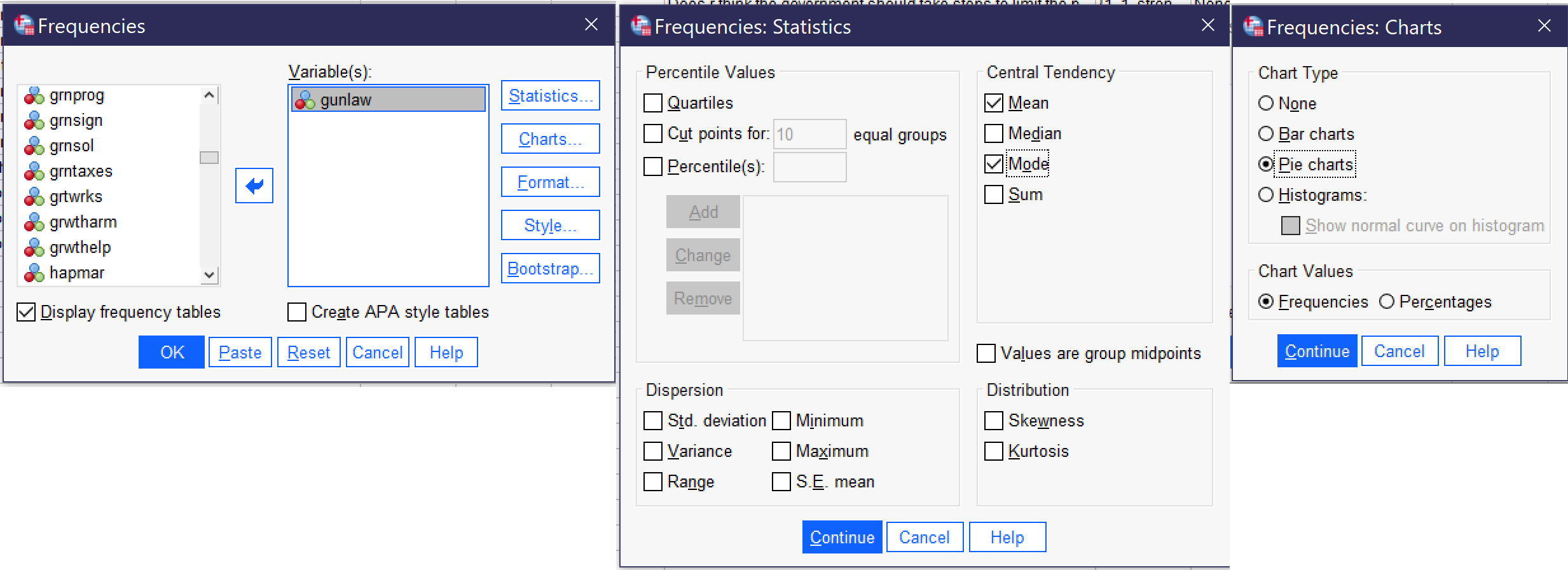
The output for GUNLAW will look approximately like what is shown in Figure 6. GUNLAW is a variable measuring whether the respondent favors or opposes requiring individuals to obtain police permits before buying a gun.
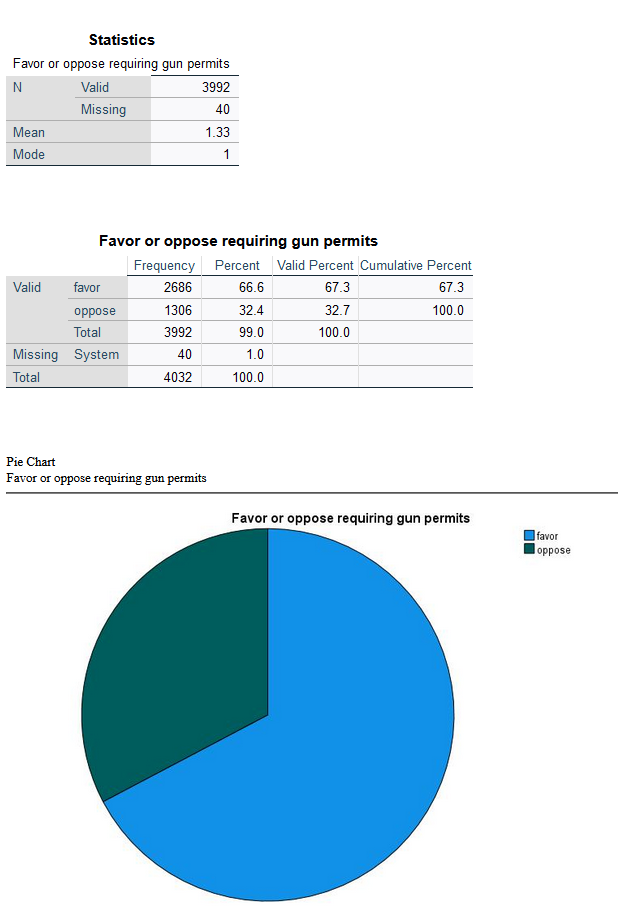
The output shows that 3,992 people gave a valid answer to this question, while responses for 40 people are missing. Of those who provided answers, the mode, or most frequent response, is 1. If we look at the value labels, we will find that 1 here means “favor;” in other words, the largest number of respondents favors requiring permits for gun owners. The mean is 1.33. In the case of a binary variable, what the mean tells us is the approximate proportion of people who have provided the higher-numbered value label—so in this case, about ⅓ of respondents said they are opposed to requiring permits.
The frequency table, then, shows the number and proportion of people who provided each answer. The most important column to pay attention to is Valid Percent. This column tells us what percentage of the people who answered the question gave each answer. So, in this case, we would say that 67.3% of respondents favor requiring permits for gun ownership, while 32.7% are opposed—and 1% are missing.
Finally, we have produced a pie chart, which provides the same information in a visual format. Users who like playing with their graphs can double-click on the graph and then right-click or cmd/ctrl click to change options such as displaying value labels or amounts or changing the color of the graph.
A Nominal Variable
To produce descriptive statistics for a nominal variable, be sure to leave Display frequency tables checked. Under statistics, select Mode and then click continue, and under graphs select your choice of bar graph or pie chart (avoid pie chart if your variable has many categories) and then click continue. Using the variable MOBILE16, then, the selected option would look as shown in Figure 7. Then click OK, and the results will appear in the Output window.
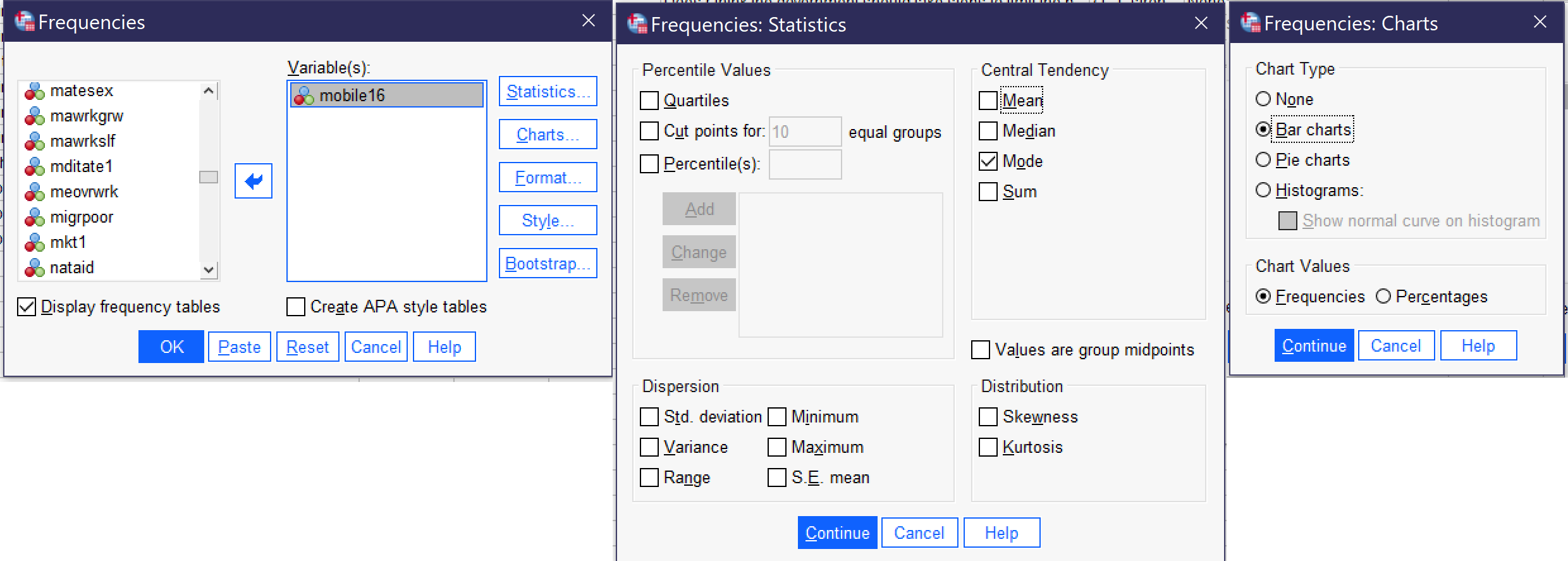
The output will then look approximately like the output shown in Figure 8. MOBILE16 is a variable measuring respondents’ degree of geographical mobility since age 16, asking them if they live in the same city they lived in at age 16; stayed in the same state they lived in at age 16 but now live in a different city; or live in a different state than they lived in at age 16.
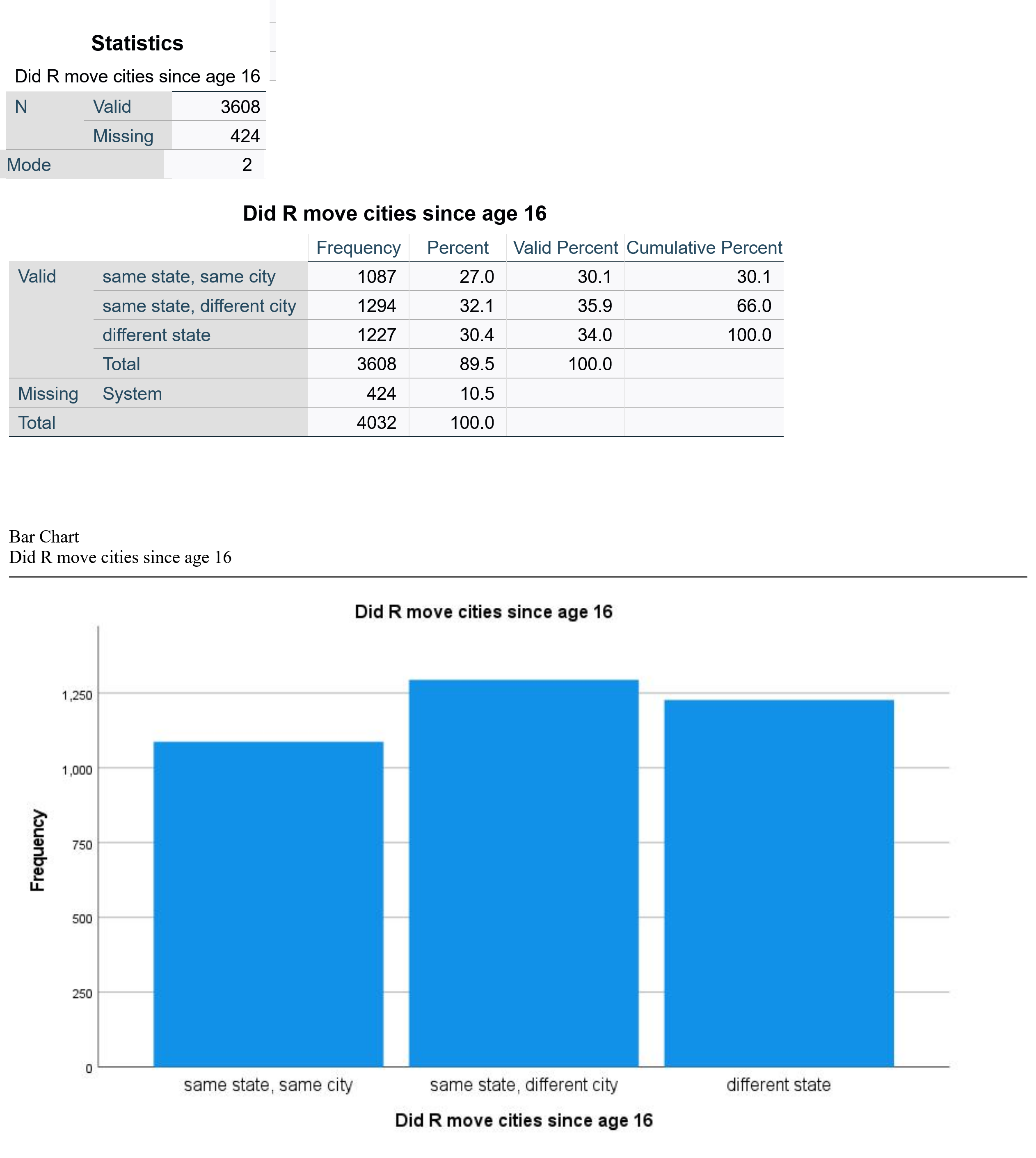
The output shows that 3608 respondents answered this survey question, while 424 did not. The mode is 2; looking at the value labels, we conclude that 2 refers to “same state, different city,” or in other words that the largest group of respondents lives in the same state they lived in at age 16 but not in the same city they lived in at age 16. The frequency table shows us the percentage breakdown of respondents into the three categories. Valid percent is most useful here, as it tells us the percentage of respondents in each category after those who have not responded to the question are removed. In this case, 35.9% of people live in the same state but a different city, the largest category of respondents. Thirty-four percent live in a different state, while 30.1% live in the same city in which they lived at age 16. Below the frequency table is a bar graph which provides a visual for the information in the frequency table. As noted above, users can change options such as displaying value labels or amounts or changing the color of the graph.
An Ordinal Variable
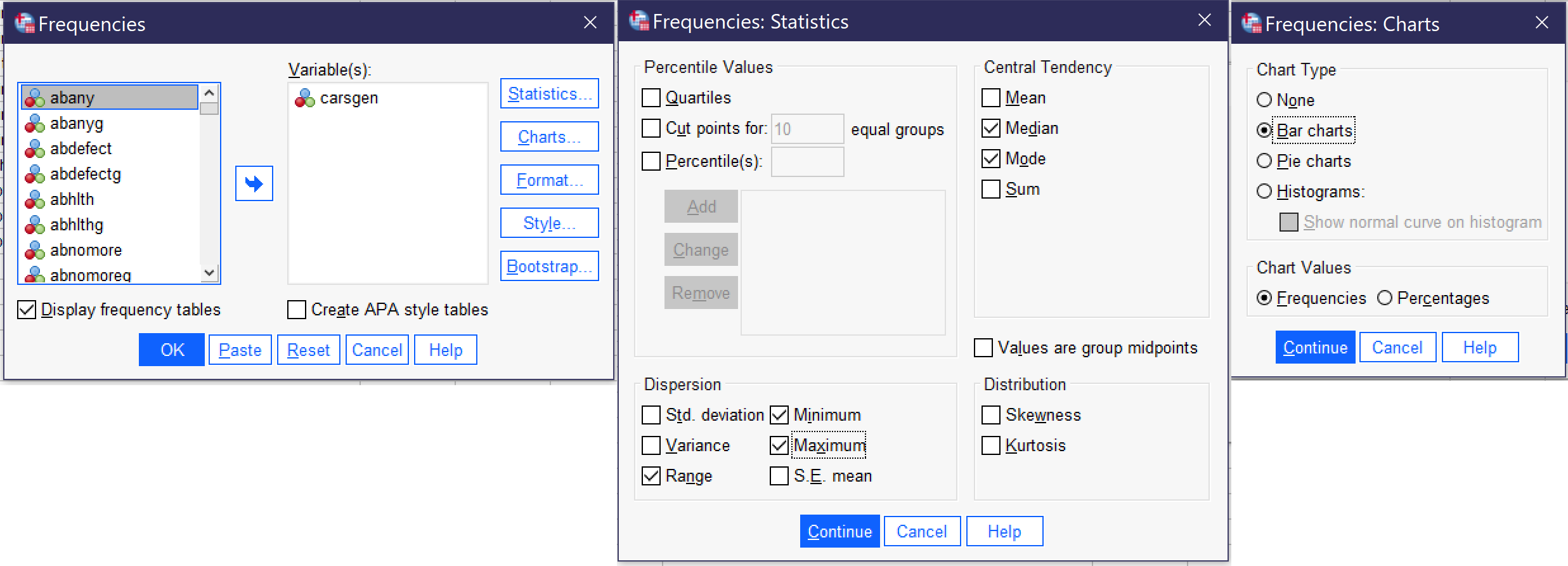
To produce descriptive statistics for an ordinal variable, be sure to leave Display frequency tables checked. Under statistics, select Median, Mode, Range, Minimum, and Maximum, and then click continue, and under graphs select your choice of bar graph and then click continue. Then click OK, and the results will appear in the Output window. Using the variable CARSGEN, then, the selected option would look as shown in Figure 7.
The output will then look approximately like the output shown in Figure 10. CARSGEN is an ordinal variable measuring the degree to which respondents agree or disagree that car pollution is a danger to the environment.
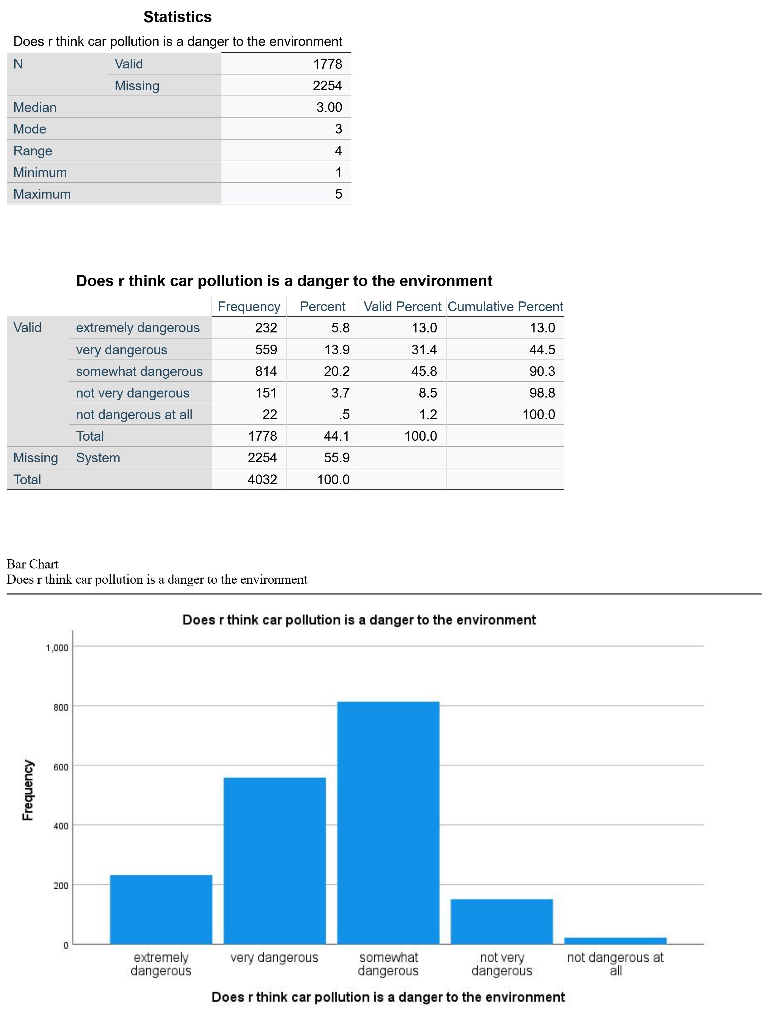
First, we see that 1778 respondents answered this question, while 2254 did not (remember that the GSS has a lot of questions; some are asked of all respondents while others are only asked of a subset, so the fact that a lot of people did not answer may indicate that many were not asked rather than that there is a high degree of nonresponse). The median and mode are both 3. Looking at the value labels tells us that 3 represents “somewhat dangerous.” The range is 4, representing the maximum (5) minus the minimum (1)—in other words, there are five ordinal categories.
Looking at the valid percents, we can see that 13% of respondents consider car pollution extremely dangerous, 31.4% very dangerous, and 45.8%—the biggest category (and both the mode and median)—somewhat dangerous. In contrast only 8.5% think car pollution is not very dangerous and 1.2% think it is not dangerous at all. Thus, it is reasonable to conclude that the vast majority—over 90%—of respondents think that car pollution presents at least some degree of danger. The bar graph at the bottom of the output represents this information visually.
A Continuous Variable
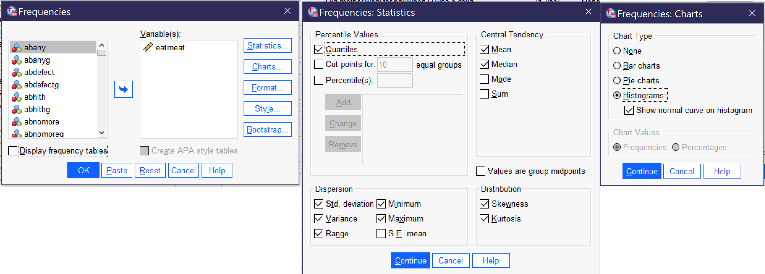
To produce descriptive statistics for a continuous variable, be sure to uncheck Display frequency tables. Under statistics, go to percentile values and select Quartiles (or other percentile options appropriate to your project). Then select Mean, Median, Std. deviation, Variance, Range, Minimum, Maximum, Skewness, and Kurtosis and then click continue, and under graphs select Histograms and turn on Show normal curve on histogram and then click continue. Using the variable EATMEAT, then, the selected option would look as shown in Figure 11. Then click OK, and the results will appear in the Output window.
The output will then look approximately like the output shown in Figure 12. EATMEAT is a continuous variable measuring the number of days per week that the respondent eats beef, lamb, or products containing beef or lamb.
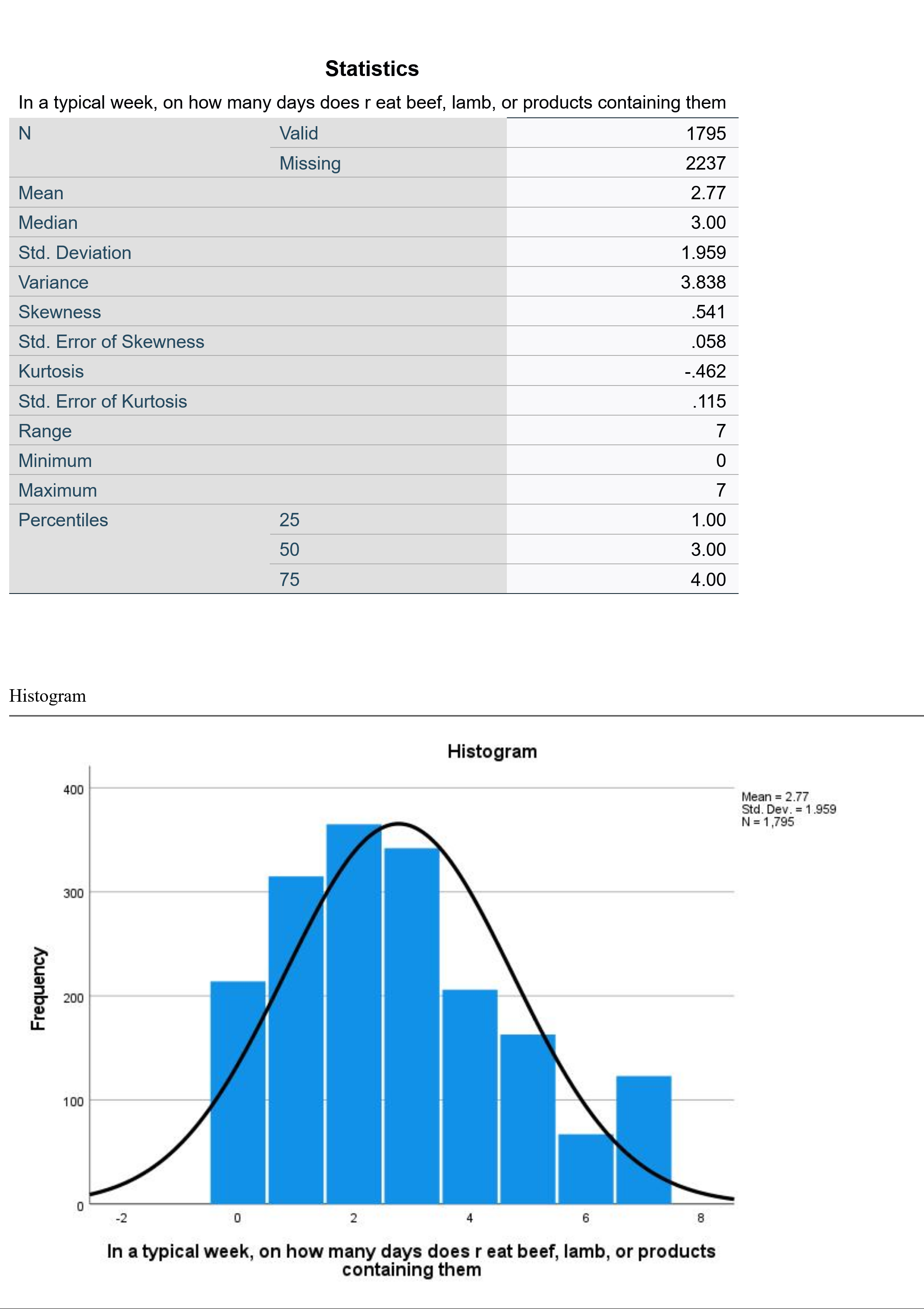
Because this variable is continuous, we have not produced frequency tables, and therefore we jump right into the statistics. 1795 respondents answered this question. On average, they eat beef or lamb 2.77 days per week (that is what the mean tells us). The median respondent eats beef or lamb three days per week. The standard deviation of 1.959 tells us that about 68% of respondents will be found within ±1.959 of the mean of 2.77, or between 0.811 days and 4.729 days. The skewness of 0.541 tells us that the data is mildly skewed to the right, with a longer tail at the higher end of the distribution. The kurtosis of -0.462 tells us that the data is mildly platykurtic, or has little data in the outlying tails. (Note that we have ignored several statistics in the table, which are used to compute or further interpret the figures we are discussing and which are otherwise beyond the scope of this text). The range is 7, with a minimum of 0 and a maximum of 7—sensible, given that this variable is measuring the number of days of the week that something happens. The 25th percentile is at 1, the 50th at 3 (this is the same as the median) and the 75th at 4. This tells us that one quarter of respondents eat beef or lamb one day a week or fewer; a quarter eat it between one and three days a week; a quarter eat it between three and four days a week; and a quarter eat it more than four days per week. The histogram shows the shape of the distribution; note that while the distribution is otherwise fairly normally distributed, more respondents eat beef or lamb seven days a week than eat it six days a week.
Graphs
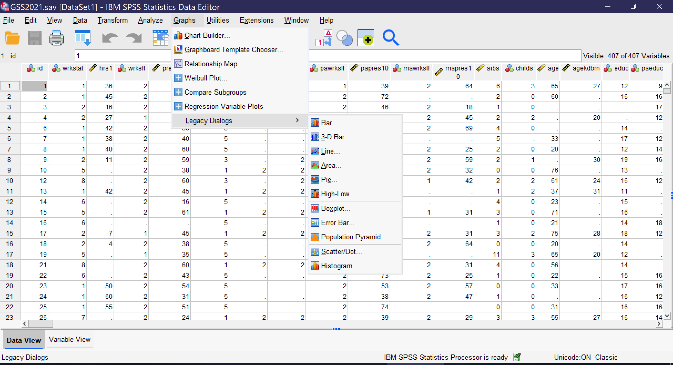
There are several other ways to produce graphs in SPSS. The simplest is to go to Graphs → Legacy Dialogs, where a variety of specific graph types can be selected and produced, including both univariate and bivariate charts. The Legacy Dialogs menu, as shown in Figure 13, permits users to choose bar graphs, 3-D bar graphs, line graphs, area charts, pie charts, high-low plots, boxplots, error bars, population pyramids, scatterplots/dot graphs, and histograms. Users are then presented with a series of options for what data to include in their chart and how to format the chart.
Here, we will review how to produce univariate bar graphs, pie charts, and histograms using the legacy dialogs. Other graphs important to the topics discussed in this text will be reviewed in other chapters.
Bar Graphs
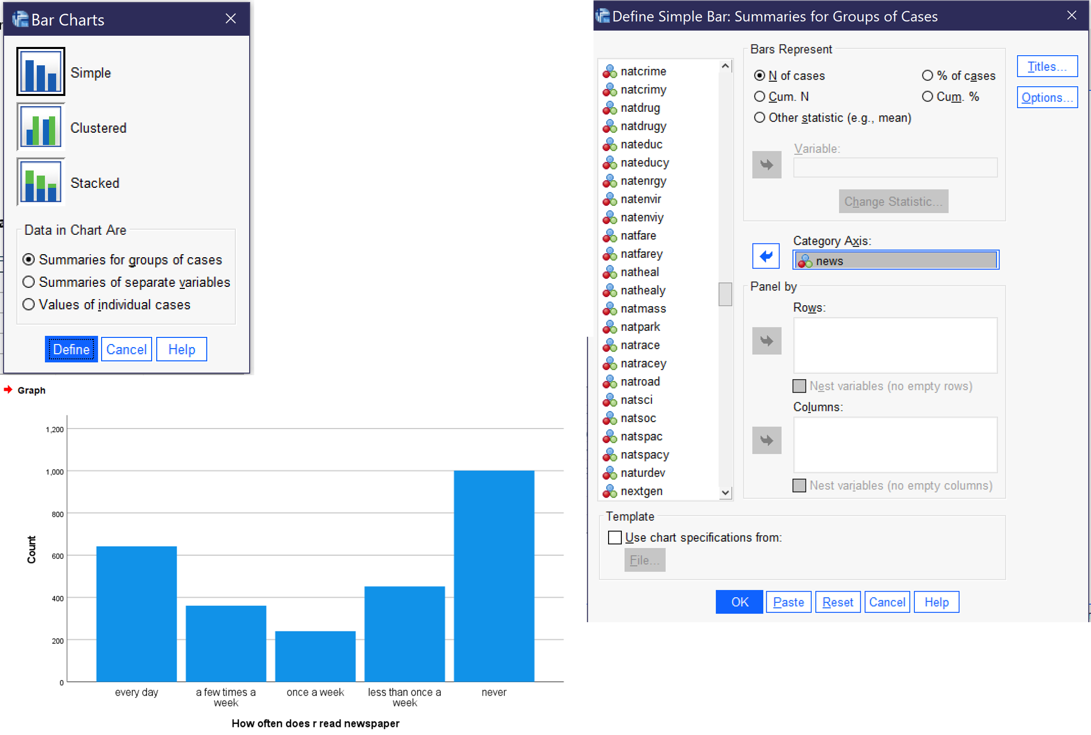
To produce a bar graph, go to Graphs → Legacy Dialogs → Bar. For a univariate graph, then select Simple, and click Define. Then, select the relevant binary, nominal, or ordinal variable and use the blue arrow (or drag and drop it) to place it in the “Category Axis” box. You can change the options under “Bars represent” to be the number of cases, the percent of cases, or other statistics, if you choose. Once you have set up your graph, click OK, and the graph will appear in the Output Viewer window. Figure 14 shows the dialog boxes for creating a bar graph, with the appropriate options selected, as well as a graph of the variable NEWS, which measures how often the respondent reads a newspaper.
Pie Charts
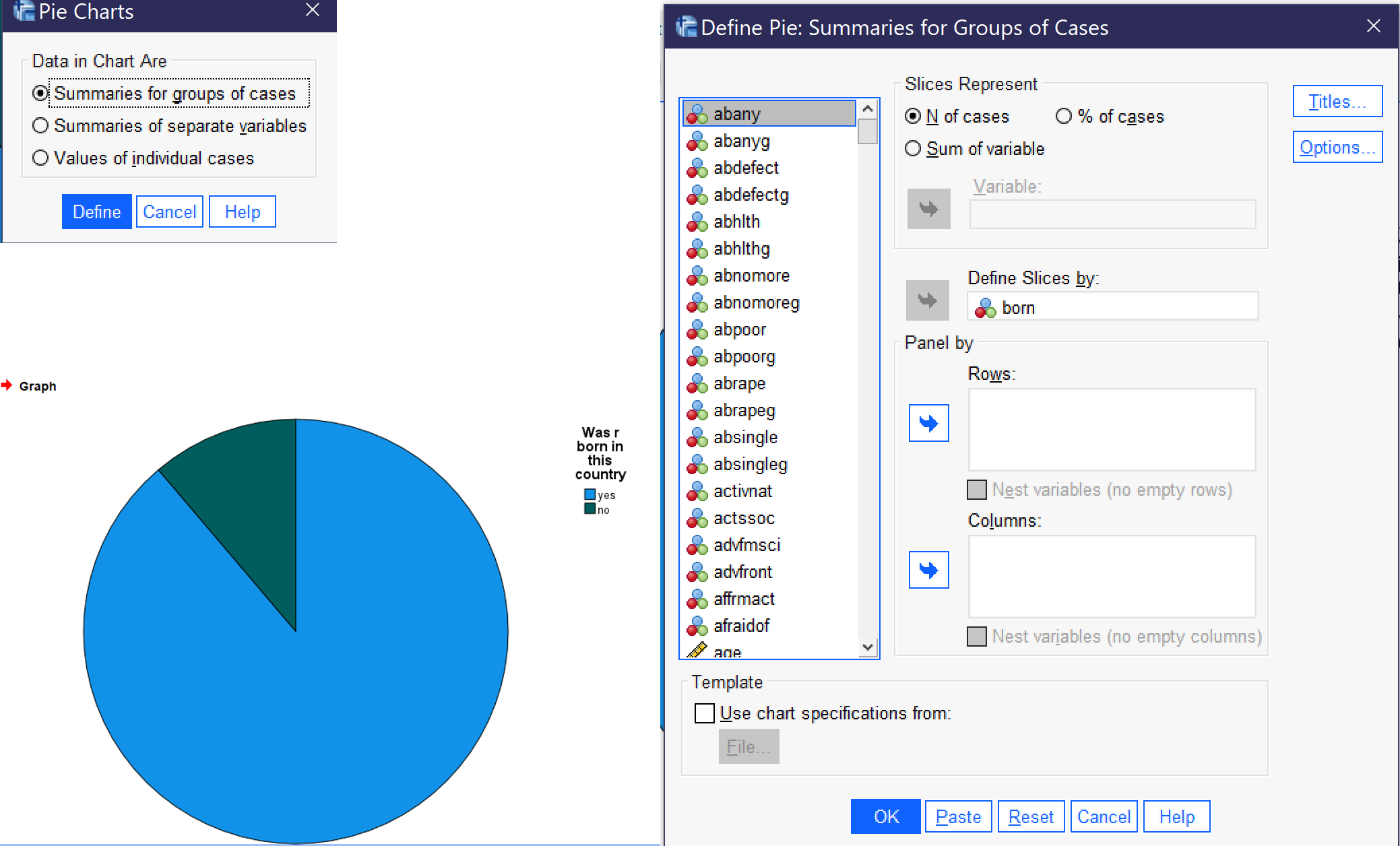
To produce a pie chart, go to Graphs → Legacy Dialogs → Pie. In most cases, users will want to select the default option, “Summaries for groups of cases,” and click define. Then, select the relevant binary, nominal, or ordinal variable (remember not to use pie charts for variables with too many categories) and use the blue arrow (or drag and drop it) to place it in the “Define Slices By” box. You can change the options under “Slices represent” to be the number of cases or the percent of cases. Once you have set up your graph, click OK, and the graph will appear in the Output Viewer window. Figure 15 shows the dialog boxes for creating a pie chart, with the appropriate options selected, as well as a graph of the variable BORN, which measures whether or not the respondent was born in the United States.
Histograms
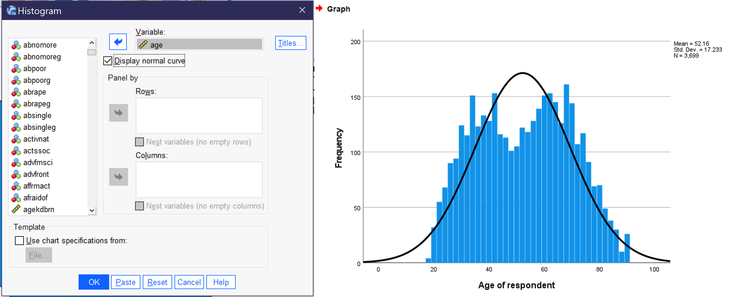
To produce a histogram, go to Graphs → Legacy Dialogs → Histogram. Then, select the relevant continuous variable and use the blue arrow (or drag and drop it) to place it in the “Variable” box. Most users will want to check the “Display normal curve” box. Once you have set up your graph, click OK, and the graph will appear in the Output Viewer window. Figure 16 shows the dialog boxes for creating a histogram, with the appropriate options selected, as well as a graph of the variable AGE, which measures the respondent’s age at the time of the survey. Note that when histograms are produced, SPSS also provides the mean, standard deviation, and total number of cases along with the graph.
Other Ways of Producing Graphs
Other options include the Chart Builder and the Graphboard Template Chooser. In the Graphboard Template Chooser, users select one or more variables and SPSS indicates a selection of graphs that may be suitable for that combination of variables (note that SPSS simply provides options, it cannot determine if those options would in fact be appropriate for the analysis in question, so analysts must take care to evaluate the options and choose which one(s) are actually useful for a given analysis). Then, users are able to select from among a set of detailed options and provide titles for their graph. In chart builder, users first select from among a multitude of univariate and bivariate graph formats and drag and drop variables into the graph, then setting options and properties and changing colors as desired. While both of these tools provide more flexibility than the graphs accessed via Legacy Dialogs, advanced users designing visuals often move outside of the SPSS ecosystem and create graphs in software more directly suited to this purpose, such as Excel or Tableau.
Exercises
To complete these exercises, load the 2021 GSS data prepared for this text into SPSS. For each of the following variables, answer the questions below.
- ZODIAC
- COMPUSE
- SATJOB
- NUMROOMS
- Any other variable of your choice
- What is the variable measuring? Use the GSS codebook to be sure you understand.
- At what level of measurement is the variable?
- What measures of central tendency, measures of dispersion, and graphs can you produce for this variable, given its level of measurement?
- Produce each of the measures and graphs you have listed and copy and paste the output into a document.
- Write a paragraph explaining the results of the descriptive statistics you’ve obtained. The goal is to put into words what you now know about the variable—interpreting what each statistic means, not just restating the statistic.
Media Attributions
- descriptives frequencies © IBM SPSS is licensed under a All Rights Reserved license
- frequencies window © IBM SPSS is licensed under a All Rights Reserved license
- frequencies-statistics © IBM SPSS is licensed under a All Rights Reserved license
- frequencies charts © IBM SPSS is licensed under a All Rights Reserved license
- binary descriptives © IBM SPSS is licensed under a All Rights Reserved license
- gunlaws output © IBM SPSS is licensed under a All Rights Reserved license
- nominal descriptives © IBM SPSS is licensed under a All Rights Reserved license
- mobile16 output © IBM SPSS is licensed under a All Rights Reserved license
- ordinal descriptives © IBM SPSS is licensed under a All Rights Reserved license
- carsgen output © IBM SPSS is licensed under a All Rights Reserved license
- continuous descriptives © IBM SPSS is licensed under a All Rights Reserved license
- eatmeat output © IBM SPSS is licensed under a All Rights Reserved license
- graphs legacy dialogs © IBM SPSS is licensed under a All Rights Reserved license
- bar graphs © IBM SPSS is licensed under a All Rights Reserved license
- pie charts © IBM SPSS is licensed under a All Rights Reserved license
- histogram © IBM SPSS is licensed under a All Rights Reserved license
Using one variable.
Statistics used to describe a sample.
An analysis that shows the number of cases that fall into each category of a variable.
A measure of the value most representative of an entire distribution of data.
Statistical tests that show the degree to which data is scattered or spread.
Classification of variables in terms of the precision or sensitivity in how they are recorded.
A characteristic that can vary from one subject or case to another or for one case over time within a particular research study.
Consisting of only two options. Also known as dichotomous.
A variable whose categories have names that do not imply any order.
A variable with categories that can be ordered in a sensible way.
A variable measured using numbers, not categories, including both interval and ratio variables. Also called a scale variable.
A way of standardizing data based on how many standard deviations away each value is from the mean.
The sum of all the values in a list divided by the number of such values.
The middle value when all values in a list are arranged in order.
The category in a list that occurs most frequently.
A measure of variation that takes into account every value’s distance from the sample mean.
A basic statistical measure of dispersion, the calculation of which is necessary for computing the standard deviation.
The highest category in a list minus the lowest category.
An asymmetry in a distribution in which a curve is distorted either to the left or the right, with positive values indicating right skewness and negative values indicating left skewness.
How sharp the peak of a frequency distribution is. If the peak is too pointed to be a normal curve, it is said to have positive kurtosis (or “leptokurtosis”). If the peak of a distribution is too flat to be normally distributed, it is said to have negative kurtosis (or platykurtosis).
Also called bar graphs, these graphs display data using bars of varying heights.
Circular graphs that show the proportion of the total that is in each category in the shape of a slice of pie.
A graph that looks like a bar chart but with no spaces between the bars, it is designed to display the distribution of continuous data by creating rectangles to represent equally-sized groups of values.
A distribution of values that is symmetrical and bell-shaped.
