Quantitative Data Analysis With SPSS
17 Quantitative Analysis with SPSS: Bivariate Regression
Mikaila Mariel Lemonik Arthur
This chapter will detail how to conduct basic bivariate linear regression analysis using one continuous independent variable and one continuous dependent variable. The concepts and mathematics underpinning regression are discussed more fully in the chapter on Correlation and Regression. Some more advanced regression techniques will be discussed in the chapter on Multivariate Regression.
Before beginning a regression analysis, analysts should first run appropriate descriptive statistics. In addition, they should create a scatterplot with regression line, as described in the chapter on Quantitative Analysis with SPSS: Correlation & descriptive statistics. One important reason why is that linear regression has as a basic assumption the idea that data are arranged in a linear—or line-like—shape. When relationships are weak, it will not be possible to see just by glancing at the scatterplot whether it is linear or not, or if there is no relationship at all.
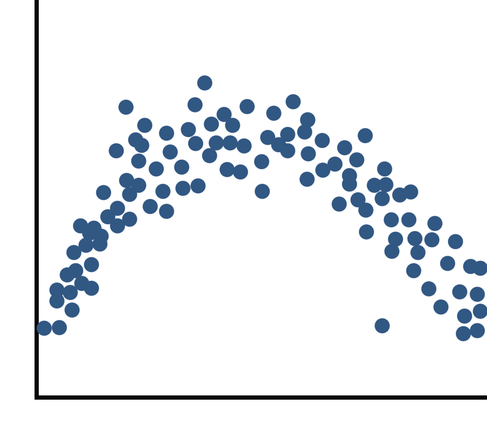
However, there are cases where it is quite obvious that there *is* a relationship, but that this relationship is not line-like in shape. For example, if the scatterplot shows a clear curve, as in Figure 1, one that could not be approximated by a line, then the relationship is not sufficiently linear to be detected by a linear regression.[1] Thus, any results you obtain from linear regression analysis would considerably underestimate the strength of such a relationship and would not be able to discern its nature. Therefore, looking at the scatterplot before running a regression allows the analyst to determine if the particular relationship of interest can appropriately be tested with a linear regression.
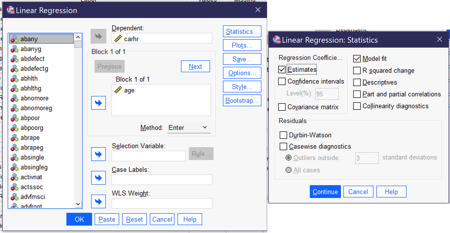
Assuming that the relationship of interest is appropriate for linear regression, the regression can be produced by going to Analyze → Regression → Linear[2] (Alt+A, Alt+R, Alt+L). The dependent variable is placed in the Dependent box; the independent in the “Block 1 of 1” box. Under Statistics, be sure both Estimates and Model fit are checked. Here, we are using the independent variable AGE and the dependent variable CARHR. Once the regression is set up, click OK to run it.
The results will appear in the output window. There will be four tables: Variables Entered/Removed; Model Summary; ANOVA; and Coefficients. The first of these simply documents the variables you have used.[3] The other three contain important elements of the analysis. Results are shown in Tables 1, 2, and 3.
| Model | R | R Square | Adjusted R Square | Std. Error of the Estimate |
|---|---|---|---|---|
| 1 | .100a | .010 | .009 | 8.656 |
| a. Predictors: (Constant), Age of respondent | ||||
| Model | Sum of Squares | df | Mean Square | F | Sig. | |
|---|---|---|---|---|---|---|
| 1 | Regression | 1290.505 | 1 | 1290.505 | 17.225 | <.001b |
| Residual | 127966.152 | 1708 | 74.922 | |||
| Total | 129256.657 | 1709 | ||||
| a. Dependent Variable: How many hours in a typical week does r spend in a car or other motor vehicle, not counting public transit | ||||||
| b. Predictors: (Constant), Age of respondent | ||||||
| Model | Unstandardized Coefficients | Standardized Coefficients | t | Sig. | ||
|---|---|---|---|---|---|---|
| B | Std. Error | Beta | ||||
| 1 | (Constant) | 9.037 | .680 | 13.297 | <.001 | |
| Age of respondent | -.051 | .012 | -.100 | -4.150 | <.001 | |
| a. Dependent Variable: How many hours in a typical week does r spend in a car or other motor vehicle, not counting public transit | ||||||
When interpreting the results of a bivariate linear regression, we need to answer the following questions:
- What is the significance of the regression?
- What is the strength of the observed relationship?
- What is the direction of the observed relationship?
- What is the actual numerical relationship?
Each of these questions is answered by numbers found in different places within the set of tables we have produced.
First, let’s look at the significance. The significance is found in two places among our results, under “Sig.” in the ANOVA table (here, table 2) and under “Sig.” in the Coefficients table (here, table 3). In the Coefficients table, look at the significance number in the row with the independent variable; you will also see a significance number for the constant, which will be discussed later. In a bivariate regression, these two significance numbers are the same (this is not true for multivariate regressions). So, in these results, the significance is p<0.001, which means we can conclude that the results are significant.
Next, we look at the strength. Again, we can look in two places for the strength, under R in the Model Summary table (here, table 1) and under Beta in the Coefficients table. Beta refers to the Greek letter [latex]\beta[/latex], and beta and [latex]\beta[/latex] are used interchangeably when referring to the standardized coefficient. R, here, refers to Pearson’s r, and both it and Beta are interpreted the same way as measures of association usually are. While the R and the Beta will be the same in a bivariate regression, the sign (whether the number is positive or negative) may not be; again, in multivariate regressions, the numbers will not be the same. This is because Beta is used to look at the strength of the relationship each individual independent variable has with the dependent variable. Here, the R/Beta is 0.100, so the relationship is moderate in strength.
The direction of the relationship is determined by whether the Beta is positive or negative. Here, it is negative, so that means it is an inverse relationship. In other words, as age goes up, time spent in cars each week goes down. And the B value, found in the Coefficients table, tells us by how much it goes down. Here we see that for every one year of additional age, time spent in cars goes down by about 0.051 hours (a little more than three minutes).
One final thing to look at is the R squared (R2) in the Model Summary table. The R2 tells us how much of the variance in our dependent variable is explained by our independent variable. Here, then, age explains 1% (0.010 converted to a percent by multiplying it times 100) of the variance in time spent in a car each week. That might not seem like very much, and it is not very much. But considering all the things that matter to how much time you spend in a car each week, it is clear that age is contributing somehow.
The numbers in the Coefficients table also allow us to construct the regression equation (the equation for the line of best fit). The number under B for the constant row is the y intercept (in other words, if X were 0, what would Y be?), and the number under B for the variable is the slope of the line. We apply asterisks to indicate significance, giving us the following equation: [latex]y=9.037-0.051x^{***}[/latex]. Note that whether or not the constant/intercept is statistically significant is just telling us whether the constant/intercept is statistically significantly different from zero, which is not actually very interesting, and thus most analysts do not pay much attention to the significance of the constant/intercept.
So, in summary, our results tell us that age has a significant, moderate, inverse relationship with time spent in a car each week; that age explains 1% of the variance in time spent in the car each week, and that for every one year of additional age, just over 3 more minutes per week are spent in the car.
Exercises
- Choose two continuous variables of interest. Write a hypothesis about the relationship between the variables.
- Create a scatterplot for these two variables with regression line (line of best fit). Explain what the scatterplot shows.
- Run a bivariate regression for these two variables. Interpret the results, being sure to discuss significance, strength, direction, and the actual magnitude of the effect.
- Create the regression equation for your regression results.
Media Attributions
- curvilinear © Mikaila Mariel Lemonik Arthur is licensed under a CC BY-NC-SA (Attribution NonCommercial ShareAlike) license
- linear regression dialog © IBM SPSS is licensed under a All Rights Reserved license
- There are other regression techniques that are appropriate for such relationships, but they are beyond the scope of this text. ↵
- You will notice that there are many, many options and tools within the Linear Regression dialog; some of these will be discussed in the chapter on Multivariate Regression, while others are beyond the scope of this text. ↵
- The Variables Entered/Removed table is important to those running a series of multivariate models while adding or removing individual variables, but is not useful when only one model is run at a time. ↵
