Quantitative Data Analysis With SPSS
13 Quantitative Analysis with SPSS: Bivariate Crosstabs
Mikaila Mariel Lemonik Arthur
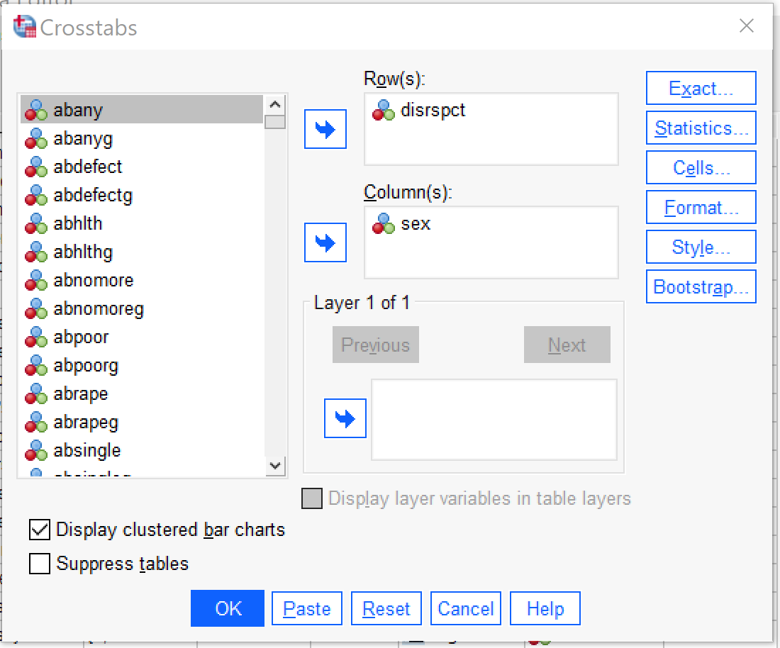
This chapter will focus on how to produce and interpret bivariate crosstabulations in SPSS. To access the crosstabs dialog, go to Analyze → Descriptive Statistics → Crosstabs (Alt+A, Alt+E, Alt+C). Once the Crosstabs dialog opens, the independent variable should be placed in the Columns box and the dependent variable in the Rows box. There is a checkbox that will make a clustered bar chart appear, as well as one that will suppress the tables so that only the bar chart appears (typically one would not want to suppress the tables; whether or not to produce the clustered bar chart is a matter of personal preference). In the analysis shown in Figure 1, SEX is the independent variable (here permitting only male and female as answers) and DISRSPCT is the dependent variable (how often the respondent feels they are treated with “less courtesy or respect” than other people are).
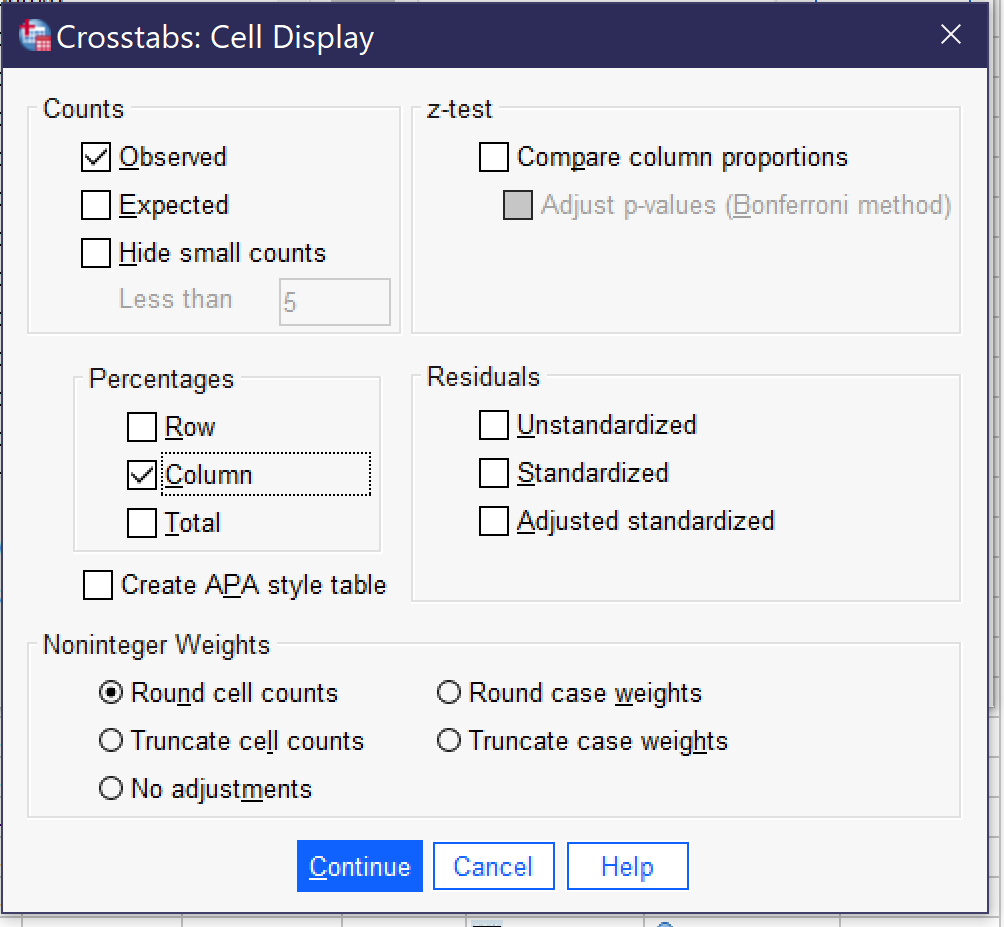
Next, click the Cells button (Alt+E) and select Column under Percentages. It is important to be sure to select column percentages when the independent variable is in the columns; this is necessary for proper interpretation of the table. Observed will already be checked under Counts; if it is not, you may want to select it as well. There are a variety of other options in this dialog, but they are beyond the scope of this chapter. To see what the Cell Display dialog should look like before proceeding, take a look at Figure 2. Once the appropriate options are selected from Cell Display, click Continue. If one is interested only in producing the crosstabulation table and/or clustered bar charts, OK can be pressed after returning to the main crosstabs dialog.
However, in most cases analysts will want to obtain statistical significance and association measures as well. These can be located by clicking the Statistics button. Chi-square should be checked in order to produce statistical significance; analysts should then select the appropriate measure of association for their analysis from among those displayed in the box. In the absence of information suggesting a different measure of association, Phi and Cramer’s V is a reasonable default, with Phi being used for 2×2 tables and Cramer’s V for larger tables, though this may not be appropriate for Ordinal x Ordinal tables. For more information on selecting an appropriate measure of association, see the chapter on measures of association. The default options are shown in Figure 3.
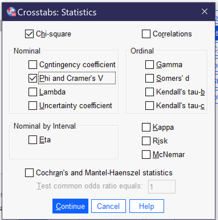
Some measures of association that SPSS can compute are not listed in the dialog but instead are produced by selecting a different option: Goodman and Kruskal tau can be found under Lambda, while both Pearson’s r and Spearman Correlation are found under correlations.
Note that not all of the statistics SPSS can produce are frequently used by beginning social science data analysts, and thus some are not addressed in the chapter on measures of association. And remember to select only one or two appropriate options—it is never the right answer to produce all, or many, of the statistics that are available, especially not if the analyst is simply searching for the strongest possible association.
Once the appropriate statistics are selected, click continue to go back to the main Crosstabs dialogue, and then OK to proceed with producing the results (which will then appear in the output).
The output for this analysis is shown in Figure 4. Below Figure 4, the text will review how to interpret this output.
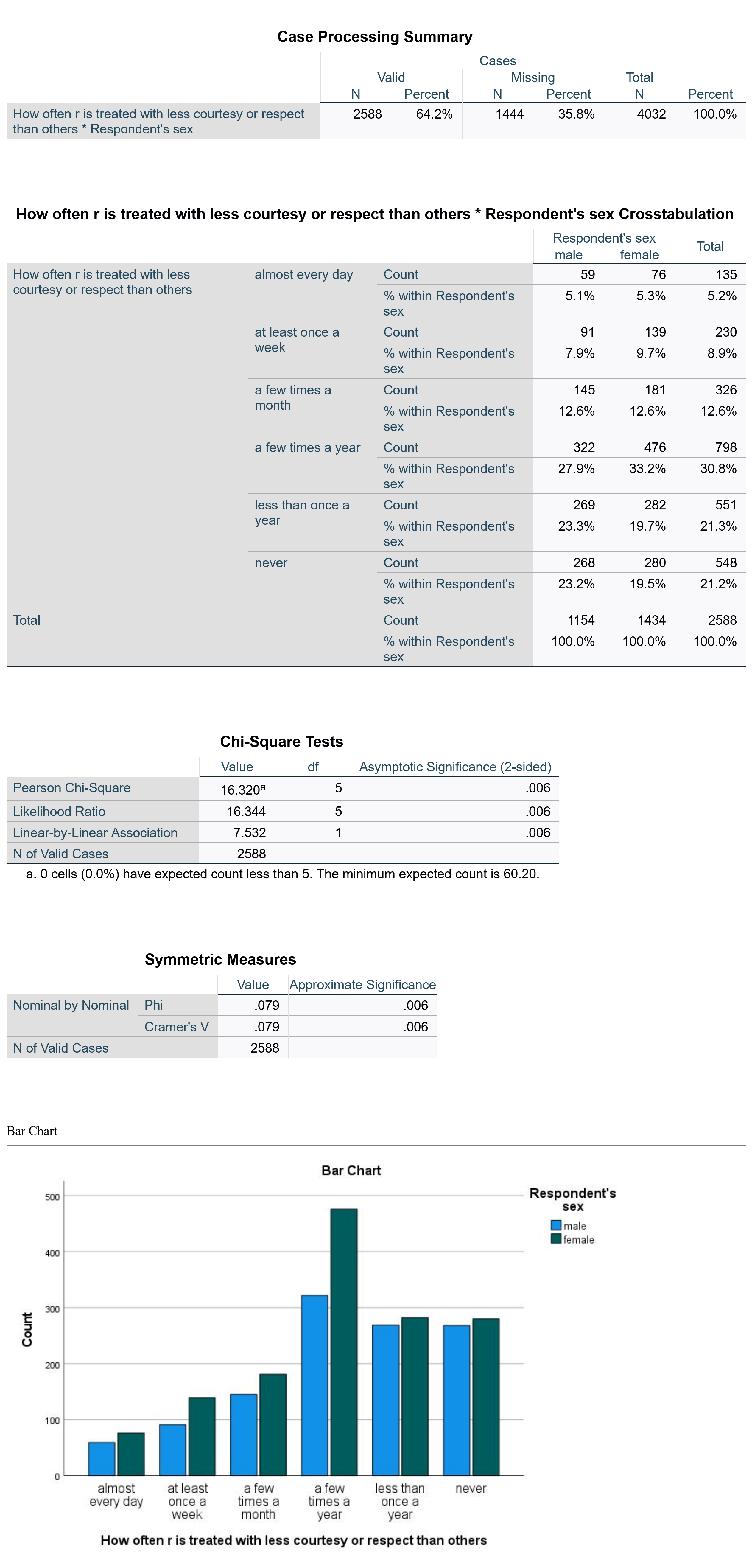
The first table shown is the Case Processing Summary, which simply shows the proportion of valid cases included in the analysis versus those missing from the analysis (which are those where there is no response to at least one of the variables).
The second table is the main crosstabulation table. To read this table, compare the percentages across the rows. So, for instance, we can see that very similar proportions of males and females feel disrespected almost every day or a few times a month, though females are somewhat more likely to feel disrespected at least once a week. Females are also more likely to feel disrespected a few times a year, while males are more likely to feel disrespected less than once a year or never. These conclusions are made simply by comparing percentage across the rows and noting which are bigger and which are smaller. Ignore the count (the raw number) as this is heavily impacted by the total number of people in each category of the independent variable and thus is not analytically useful. For example, in this analysis, there are 1434 women and 1154 men (see the total row in the crosstabulation table) and thus there are more women than men in every category of the dependent variable—even those where men are more likely to have selected that answer choice than women! Thus, it is necessary to focus on the percentages, not the raw numbers.
The third table presents the results of the Chi-square significance test. A variety of figures are provided in this table, including the value and degrees of freedom used to compute the Chi square. However, in most cases you need only pay attention to the figure under Asymptotic Significance (2-Sided). You will note there are several rows in that column, all of which provide the same figure. It will almost always be the case that the same figure appears in each row under the significance column; if it does not, attend to the first significance figure. In this case, the significance figure presented is 0.006, well under both the p<0.05 and p<0.01 confidence levels though above the p<0.001 level.
The fourth table presents the measures of association, in this case Phi and Cramer’s V. Sometimes as in this case, these figures are the same, while in other cases they are different. If they are different, be sure you know which one you should be looking at given the level of measurement of your variables. Here, they are 0.079, which the strength chart in the measures of association chapter would tell us means there is a weak association.
Finally, at the bottom, is a clustered bar chart. Bivariate bar graphs can also be produced using the Graphs menu. Under Graphs → Legacy Dialogs → Bar Charts, both clustered and stacked bar charts are available. Those interested in displaying their data in bivariate graphs may wish to play around with the different options to see which presents the data in the most useful form.
Exercises
Select two variables of interest. Answer the following questions:
- Which is the independent variable and which is the dependent variable?
- What is the research hypothesis for this analysis?
- What is the null hypothesis for this analysis?
- What confidence level (p value) have you chosen?
- Which measure of association is most appropriate for this relationship?
Next, use SPSS to produce a crosstabulation according to the instructions in this chapter. Interpret the crosstabulation, being sure to answer the following questions:
- Is the relationship statistically significant?
- Can the null hypothesis be rejected?
- How strong is the association between the two variables?
- Looking at that pattern of percentages across the rows, what can you determine about the nature of the relationship between the two variables?
- Is there support for your research hypothesis?
Repeat this exercise for two additional pairs of variables, choosing new variables each time.
Media Attributions
- crosstabs dialog bivariate © IBM SPSS is licensed under a All Rights Reserved license
- cell display crosstabs © IBM SPSS is licensed under a All Rights Reserved license
- statistics dialog crosstabs © IBM SPSS is licensed under a All Rights Reserved license
- crosstabs output © IBM SPSS is licensed under a All Rights Reserved license
