Quantitative Data Analysis With SPSS
16 Quantitative Analysis with SPSS: Correlation
Mikaila Mariel Lemonik Arthur
So far in this text, we have only looked at relationships involving at least one discrete variable. But what if we want to explore relationships between two continuous variables? Correlation is a tool that lets us do just that.[1] The way correlation works is detailed in the chapter on Correlation and Regression; this chapter, then, will focus on how to produce scatterplots (the graphical representations of the data upon which correlation procedures are based); bivariate correlations and correlation matrices (which can look at many variables, but only two at a time); and partial correlations (which enable the analyst to examine a bivariate correlation while controlling for a third variable).
Scatterplots
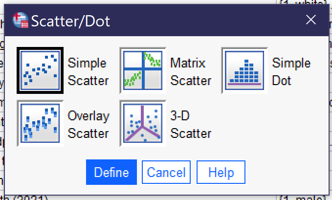
To produce a scatterplot, go to Graphs → Legacy Dialogs → Scatter/Dot (Alt+G, Alt+L, Alt+S), as shown in Figure 13 in the chapter on Quantitative Analysis with SPSS: Univariate Analysis. Choose “Simple Scatter” for a scatterplot with two variables, as shown in Figure 1.
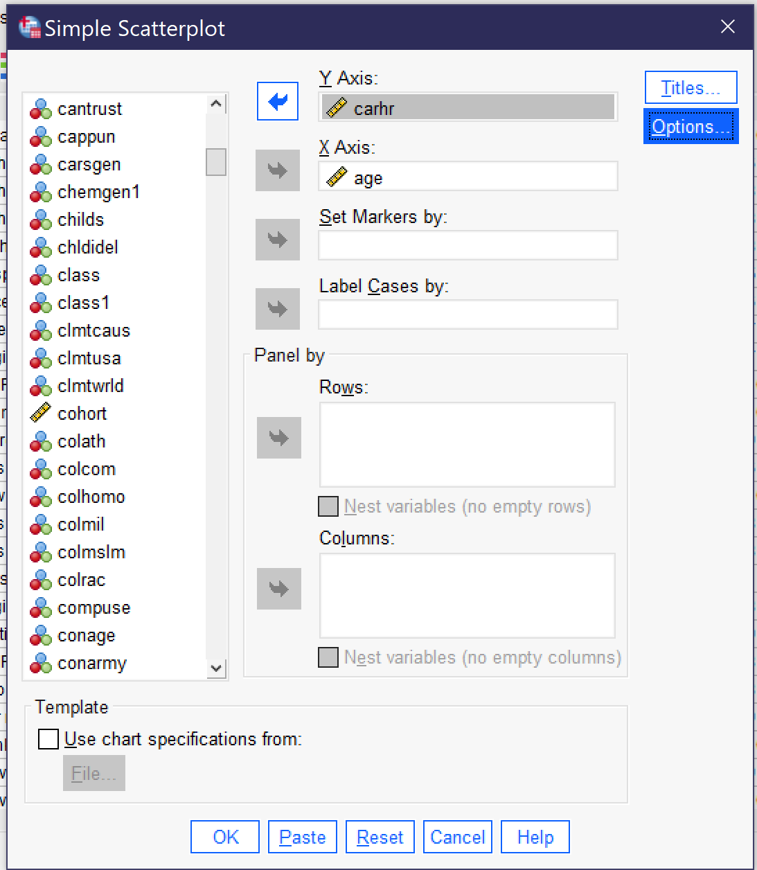
This brings up the dialog for creating a scatterplot, as shown in Figure 2. The independent variable is placed in the X Axis box, as it is a graphing convention to always put the independent variable on the X axis (you can remember this because X comes before Y, therefore X is the independent variable and Y is the dependent variable, and X goes on the X axis while Y goes on the Y axis). Then the dependent variable is placed in the Y Axis box.
There are a variety of other options in the simple scatter dialog, but most are rarely used. In a small dataset, Label Cases by allows you to specify a variable that will be used to label the dots in the scatterplot (for instance, in a database of states you could label the dots with the 2-letter state code).
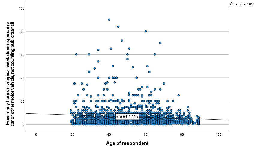
Once the scatterplot is set up with the independent and dependent variables, click OK to continue. The scatterplot will then appear in the output. In this case, we have used the independent variable AGE and the dependent variable CARHR to look at whether there is a relationship between the respondent’s age and how many hours they spend in a car per week. The resulting scatterplot is shown in Figure 3.
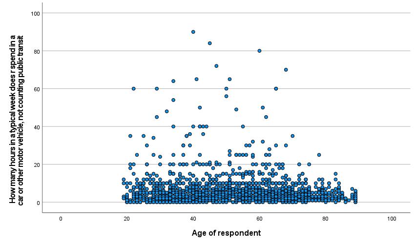
In some scatterplots, it is easy to observe the relationship between the variables. In others, like the one in Figure 3, the pattern of dots is too complex to make it possible to really see the relationship. A tool to help analysts visualize the relationship is the line of best fit, as discussed in the chapter on Correlation and Regression. This line is the line mathematically calculated to be the closest possible to the greatest number of dots. To add the line of best fit, sometimes called the regression line or the fit line, to your scatterplot, go to the scatterplot in the output window and double-click on it. This will open up the Chart Editor window. Then go to Elements → Fit Line at Total, as shown in Figure 4. This will bring up the Properties window. Under the Fit Line tab, be sure the Linear button is selected; click apply if needed and close out.
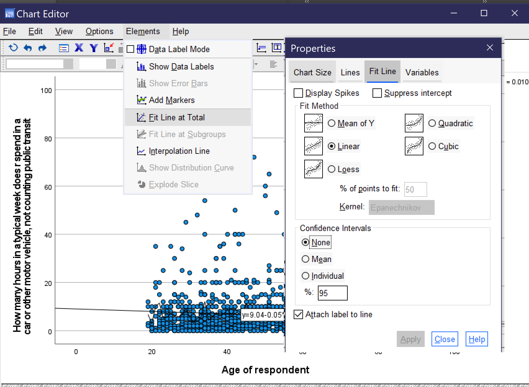
Doing so will add a line with an equation to the scatterplot, as shown in Figure 5.[2] From looking at the line, we can see that age age goes up, time spent in the car per week goes down, but only slightly. The equation confirms this. As shown in the graph, the equation for this line is [latex]y=9.04-0.05x[/latex]. This equation tells us that the line crosses the y axis at 9.04 and that the line goes down 0.05 hours per week in the car for every one year that age goes up (that’s about 3 minutes).
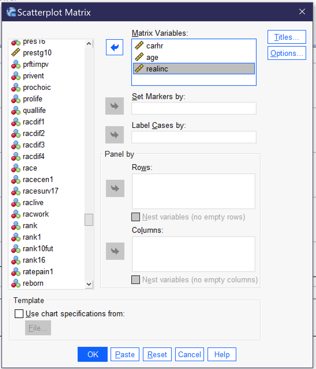
What if we are interested in a whole bunch of different variables? It would take a while to produce scatterplots for each pair of variables. But there is an option for producing them all at once, if smaller and a bit harder to read. This is a scatterplot matrix. To produce a scatterplot matrix, go to Graphs → Legacy Dialogs → Scatter/Dot (Alt+G, Alt+L, Alt+S), as in Figure 1. But this time, choose Matrix from the dialog that appears.
In the Scatterplot Matrix dialog, select all of the variables you are interested in and put them in the Matrix Variables box, and then click OK. The many other options here, as in the case of the simple scatterplot, are rarely used.
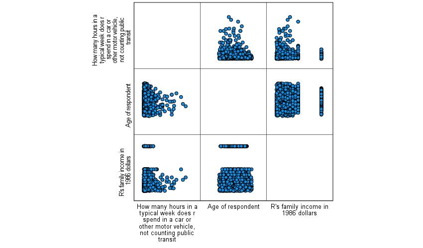
The scatterplot matrix will then be produced. As you can see in Figure 7, the scatterplot matrix involves a series of smaller scatterplots, one for each pair of variables specified. Here we specified CARHR and AGE, the two variables we were already using, and added REALINC, the respondent’s family’s income in real (inflation-adjusted) dollars. It is possible, using the same instructions detailed above, to add lines of best fit to the little scatterplots in the scatterplot matrix. Note that each little scatterplot appears twice, once with the variable on the x-axis and once with the variable on the y-axis. You only need to pay attention to one version of each pair of scatterplots.
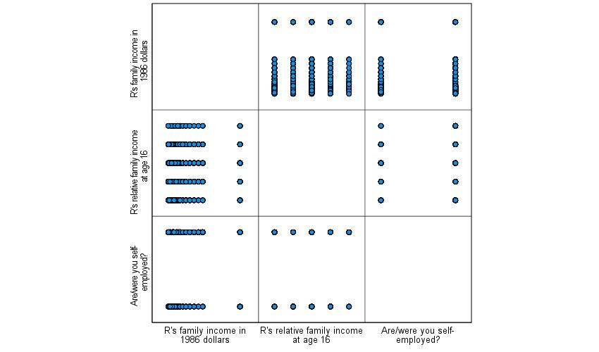
Keep in mind that while you can include discrete variables in a scatterplot, the resulting scatterplot will be very hard to read as most of the dots will just be stacked on top of each other. See Figure 8 for an example of a scatterplot matrix that uses some binary and ordinal variables so you are aware of what to expect in such circumstances. Here, we are looking at the relationships between pairs of the three variables real family income, whether the respondent works for themselves or someone else, and how they would rate their family income from the time that they were 16 in comparison to that of others. As you can see, including discrete variables in a scatterplot produces a series of stripes which are not very useful for analytical purposes.
Correlation
Scatterplots can help us visualize the relationships between our variables. But they cannot tell us whether the patterns we observe are statistically significant—or how strong the relationships are. For this, we turn to correlation, as discussed in the chapter on Correlation and Regression. Correlations are bivariate in nature—in other words, each correlation looks at the relationship between two variables. However, like in the case of the scatterplot matrix discussed above, we can produce a correlation matrix with results for a series of pairs of variables all shown in one table.
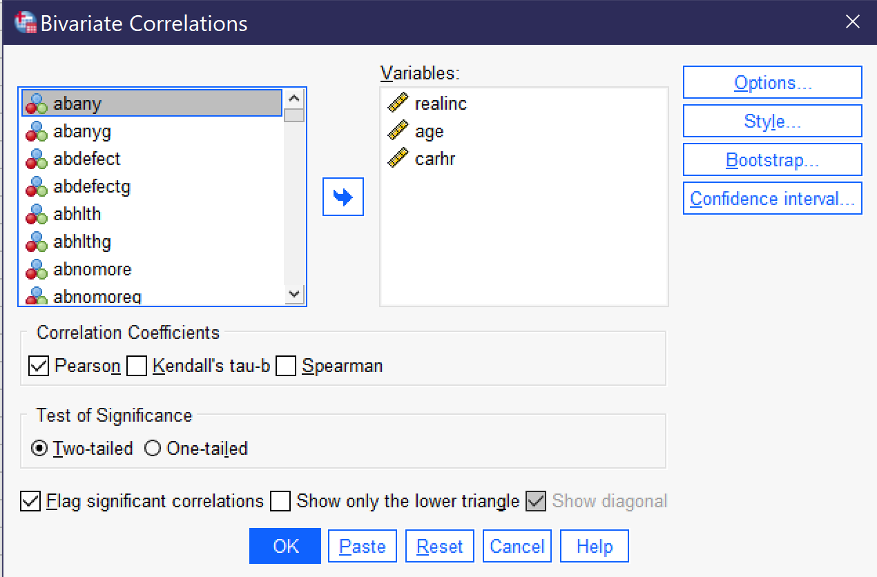
To produce a correlation matrix, go to Analyze → Correlate → Bivariate (Alt+A, Alt+C, Alt+B). Put all of the variables of interest in the Variables box. Be sure Flag significant correlations is checked and select your correlation coefficient. Note that the dialog provides the option of three different correlation coefficients, Pearson, Kendall’s tau-b, and Spearman. The first, Pearson, is used when looking at the relationship between two continuous variables; the other two are used when looking at the relationship between two ordinal variables.[3] In most cases, you will want the two-tailed test of significance. Under options, you can request that means and standard deviations are also produced. When your correlation is set up, as shown in Figure 8, click OK to produce it. The results will be as shown in Table 1 (the order of variables in the table is determined by the order in which they were entered into the bivariate correlation dialog).
| R’s family income in 1986 dollars | Age of respondent | How many hours in a typical week does r spend in a car or other motor vehicle, not counting public transit | ||
|---|---|---|---|---|
| R’s family income in 1986 dollars | Pearson Correlation | 1 | .017 | -.062* |
| Sig. (2-tailed) | .314 | .013 | ||
| N | 3509 | 3336 | 1613 | |
| Age of respondent | Pearson Correlation | .017 | 1 | -.100** |
| Sig. (2-tailed) | .314 | <.001 | ||
| N | 3336 | 3699 | 1710 | |
| How many hours in a typical week does r spend in a car or other motor vehicle, not counting public transit | Pearson Correlation | -.062* | -.100** | 1 |
| Sig. (2-tailed) | .013 | <.001 | ||
| N | 1613 | 1710 | 1800 | |
| *. Correlation is significant at the 0.05 level (2-tailed). | ||||
| **. Correlation is significant at the 0.01 level (2-tailed). | ||||
As in the scatterplot matrix above, each correlation appears twice, so you only need to look at half of the table—above or below the diagonal. Note that in the diagonal, you are seeing the correlation of each variable with itself, so a perfect 1 for complete agreement and the number of cases with valid responses on that variable. For each pair of variables, the correlation matrix includes the N, or number of respondents included in the analysis; the Sig. (2-tailed), or the p value of the correlation; and the Pearson Correlation, which is the measure of association in this analysis. It is starred to further indicate the significance level. The direction, indicated by a + or – sign, tells us whether the relationship is direct or inverse. Therefore, for each pair of variables, you can determine the significance, strength, and direction of the relationship. Taking the results in Table 1 one variable pair at a time, we can thus conclude that:
- The relationship between age and family income is not significant. (We could say there is a weak positive association, but since this association is not significant, we often do not comment on it.)
- The relationship between time spent in a car per week and family income is significant at the p<0.05 level. It is a weak negative relationship—in other words, as family income goes up, time spent in a car each week goes down, but only a little bit.
- The relationship between time spent in a car per week and age is significant at the p<0.001 level. It is a moderate negative relationship—in other words, as age goes up, time spent in a car each week goes down.
Partial Correlation
Partial correlation analysis is an analytical procedure designed to allow you to examine the association between two continuous variables while controlling for a third variable. Remember that when we control for a variable, what we are doing is holding that variable constant so we can see what the relationship between our independent and dependent variables would look like without the influence of the third variable on that relationship.
Once you’ve developed a hypothesis about the relationship between the independent, dependent, and control or intervening variable and run appropriate descriptive statistics, the first step in partial correlation analysis is to run a regular bivariate correlation with all of your variables, as shown above, and interpret your results.
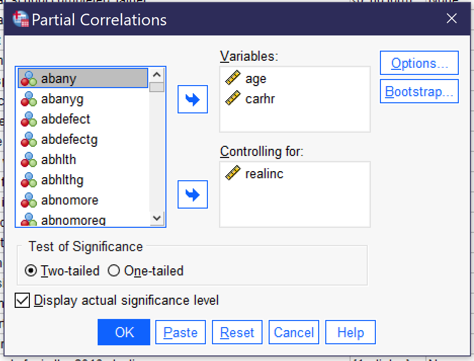
After running and interpreted the results of your bivariate correlation matrix, the next step is to produce the partial correlation by going to Analyze → Correlate → Partial (Alt+A, Alt+C, Alt+R). Place the independent and dependent variables in the Variables box, and the control variable in the Controlling for box, as shown in Figure 9. Note that the partial correlation assumes continuous variables and will only produce the Pearson correlation. The resulting partial correlation Table 2 will look much like the original bivariate correlation, but will show that the third variable has been controlled for, as shown in Table 2. To interpret the results of the partial correlation, begin by looking at the significance and association displayed and interpret them as usual.
| Control Variables | Age of respondent | How many hours in a typical week does r spend in a car or other motor vehicle, not counting public transit | ||
|---|---|---|---|---|
| R’s family income in 1986 dollars | Age of respondent | Correlation | 1.000 | -.106 |
| Significance (2-tailed) | . | <.001 | ||
| df | 0 | 1547 | ||
| How many hours in a typical week does r spend in a car or other motor vehicle, not counting public transit | Correlation | -.106 | 1.000 | |
| Significance (2-tailed) | <.001 | . | ||
| df | 1547 | 0 | ||
To interpret the results, we again look at significance, strength, and direction. Here, we find that the relationship is significant at the p<0.001 level and it is a weak negative relationship. As age goes up, time spent in a car each week goes down.
After interpreting the results of the bivariate correlation, compare the value of the measure of association in the correlation to that in the partial correlation to see how they differ. Keep in mind that we ignore the + or – sign when we do this, just considering the actual number (the absolute value). In this case, then, we would be comparing 0.100 from the bivariate correlation to 0.106 from the partial correlation. The number in the partial correlation is just a little bit higher. So what does this mean?
Interpreting Partial Correlation Coefficients
To determine how to interpret the results of your partial correlation, figure out which of the following criteria applies:
- If the correlation between x and y is smaller in the bivariate correlation than in the partial correlation: the third variable is a suppressor variable. This means that when we don’t control for the third variable, the relationship between x and y seems smaller than it really is. So, for example, if I give you an exam with a very strict time limit to see if how much time you spend in class predicts your exam score, the exam time limit might suppress the relationship between class time and exam scores. In other words, if we control for the time limit on the exam, your time in class might better predict your exam score.
- If the correlation between x and y is bigger in the bivariate correlation than in the partial correlation, this means that the third variable is a mediating variable. This is another way of saying that it is an intervening variable—in other words, the relationship between x and y seems larger than it really is because some other variable z intervenes in the relationship between x and y to change the nature of that relationship. So, for example, if we are interested in the relationship between how tall you are and how good you are at basketball, we might find a strong relationship. However, if we added the additional variable of how many hours a week you practice shooting hoops, we might find the relationship between height and basketball skill is much diminished.
- It is additionally possible for the direction of the relationship to change. So, for example, we might find that there is a direct relationship between miles run and marathon performance, but if we add frequency of injuries, then running more miles might reduce your marathon performance.
- If the value of Pearson’s r is the same or very similar in the bivariate and partial correlations, the third variable has little or no effect. In other words, the relationship between x and y is basically the same regardless of whether we consider the influence of the third variable, and thus we can conclude that the third variable does not really matter much and the relationship of interest remains the one between our independent and dependent variables.
Finally, remember that significance still matters! If neither the bivariate correlation nor the partial correlation is significant, we cannot reject our null hypothesis and thus we cannot conclude that there is anything happening amongst our variables. If both the bivariate correlation and the partial correlation are significant, we can reject the null hypothesis and proceed according to the instructions for interpretation as discussed above. If the original bivariate correlation was not significant but the partial correlation was significant, we cannot reject the null hypothesis in regards to the relationship between our independent and dependent variables alone. However, we can reject the null hypothesis that there is no relationship between the variables as long as we are controlling for the third variable! If the original bivariate correlation was significant but the partial correlation was not significant, we can reject the null hypothesis in regards to the relationship between our independent and dependent variables, but we cannot reject the null hypothesis when considering the role of our third variable. While we can’t be sure what is going on in such a circumstance, the analyst should conduct more analysis to try to see what the relationship between the control variable and the other variables of interest might be.
So, what about our example above? Well, the number in our partial correlation was higher, even if just a little bit, than the number in our bivariate correlation. This means that family income is a suppressor variable. In other words, when we do not control for family income, the relationship between age and time spent in the car seems smaller than it really is. But here is where we find the limits of what the computer can do to help us with our analysis—the computer cannot explain why controlling for income makes the relationship between age and time spent in the car larger. We have to figure that out ourselves. What do you think is going on here?
Exercises
- Choose two continuous variables of interest. Produce a scatterplot with regression line and describe what you see.
- Choose three continuous variables of interest. Produce a scatterplot matrix for the three variables and describe what you see.
- Using the same three continuous variables, produce a bivariate correlation matrix. Interpret your results, paying attention to statistical significance, direction, and strength.
- Choose one of your three variables to use as a control variable. Write a hypothesis about how controlling for this variable will impact the relationship between the other two variables.
- Produce a partial correlation. Interpret your results, paying attention to statistical significance, direction, and strength.
- Compare the results of your partial correlation to the results from the correlation of those same two variables in Question 3 (when the other variable is not controlled for). How have the results changed? What does that tell you about the impact of the control variable?
Media Attributions
- scatter dot dialog © IBM SPSS is licensed under a All Rights Reserved license
- simple scatter dialog © IBM SPSS is licensed under a All Rights Reserved license
- scatter of carhrs and age © Mikaila Mariel Lemonik Arthur is licensed under a CC BY-NC-ND (Attribution NonCommercial NoDerivatives) license
- scatter fit line © IBM SPSS is licensed under a All Rights Reserved license
- scatter with line © Mikaila Mariel Lemonik Arthur is licensed under a CC BY-NC-ND (Attribution NonCommercial NoDerivatives) license
- scatterplot matrix dialog © IBM SPSS is licensed under a All Rights Reserved license
- matrix scatter © Mikaila Mariel Lemonik Arthur is licensed under a CC BY-NC-ND (Attribution NonCommercial NoDerivatives) license
- scatter binary ordinal © Mikaila Mariel Lemonik Arthur is licensed under a All Rights Reserved license
- bivariate correlation dialog © IBM SPSS is licensed under a All Rights Reserved license
- partial correlation dialog © IBM SPSS is licensed under a All Rights Reserved license
- Note that the bivariate correlation procedures discussed in this chapter can also be used with ordinal variables when appropriate options are selected, as will be detailed below. ↵
- It will also add the R2; see the chapter on Correlation and Regression for more on how to interpret this. ↵
- A detailed explanation of each of these measures of association is found in the chapter An In-Depth Look At Measures of Association. ↵
The line that best minimizes the distance between itself and all of the points in a scatterplot.
A variable hypothesized to intervene in the relationship between an independent and a dependent variable; in other words, a variable that is affected by the independent variable and in turn affects the dependent variable.
