Qualitative and Mixed Methods Data Analysis with Dedoose
26 Qualitative Data Analysis with Dedoose: Developing Findings
Mikaila Mariel Lemonik Arthur
When working with very small datasets, analysts may find it sufficient to use Dedoose to code texts and then use the coding tools to just explore each code. But Dedoose offers a variety of tools for digging more deeply into the data, exploring relationships, and moving towards findings. In this chapter, we will review the each of the analysis tools, showing what each tool can provide and how to work with the analysis tools in developing findings.
Using the Analysis Tools
To access the analysis tools in Dedoose, click on the “Analyze” button in the toolbar at the top of the screen, as shown in Figure 1. This will bring up the Analyze window. In this window, the sidebar contains a list of all of the analysis tools that Dedoose provides, categorized by type. The main window displays the results after a particular analysis tool is selected.
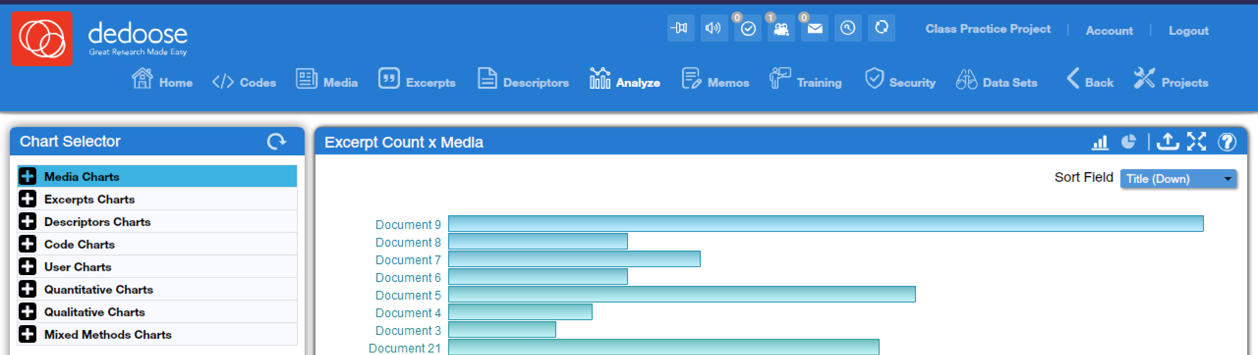
In the top corner of the screen, you will observe a variety of icons for interacting with the results of the selected analysis tool. Note that not all of these icons are available for all tools—for instance, the icons that let users switch between bar graph and pie chart views are only available for tools where the results are displayed in bar graphs and pie charts. Next to the pie chart you will see a tool with an up arrow; this tool is used to export results. Most results are exported in Microsoft Excel format (which can be easily viewed in Google Sheets and other spreadsheet programs and includes both data and visuals), though in one or two cases a PDF file is produced. Sometimes there are options users can select when determining how to export their results. After that, the icon with four arrows is used to enter full-screen view, and the icon with the question mark is used to access very brief information about the currently-selected tool. Many tools will also provide specific options for formatting or data processing, and these will be explained along with the explanation of each tool.
Before getting into the specific tools, it is also important to note that tools provide direct access to relevant excerpts. While tools are loaded, you can typically put your cursor over any data element to bring up a popup with more detailed information. Then, if you click on the data element, you will bring up a window that provides all excerpts that meet the given criteria specified by the data element you have clicked on. For instance, if an analyst clicked on one of the bars shown in the bar graph in Figure 1 (which represent texts), they would be taken to a window showing all of the excerpts in the text they clicked on. Clicking on an excerpt then brings up more detail about that specific excerpt in a new window, and the text of that excerpt can then be selected, copied, and pasted into a working document when quotes are desired.
The Dedoose Analysis Toolkit
Below, each of the analysis tools in Dedoose will be explored. There are a few more advanced tools that will only be touched upon briefly. Note that many tools can be found under multiple tool categories in the sidebar, but provide the same information regardless of which category the tool has been selected under.
Exploring Media and Users
Dedoose offers a few tools that are rather limited in terms of analytical power but that do offer some useful ways to explore the texts that are part of a project and to track the work of multiple coders on the project. The first two tools discussed in this section are for exploring texts, while the final three are for looking at the work of coders.
Excerpt Count x Media (found under Media Charts, Excerpt Charts, and Quantitative Charts) provides an overview of how many excerpts have been created in each text. This is the tool shown in Figure 1 above. Clicking on the bar representing any given text provides a window with all of the excerpts from that text. The dropdown menu in the corner provides the option of changing the sort order.
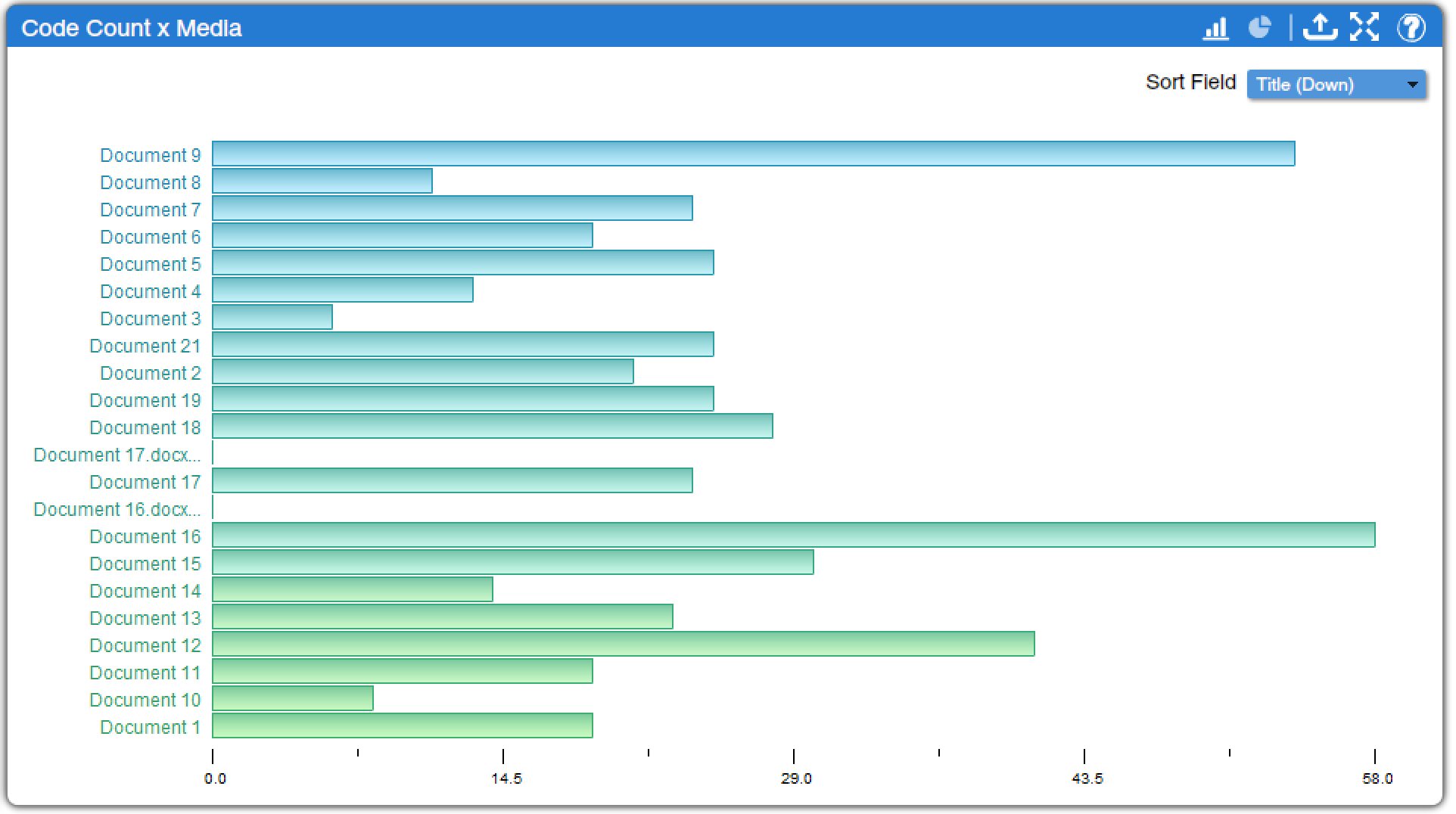
Code Count x Media (found under Media Charts, Code Charts, and Quantitative Charts) shows how many codes were applied to each text, displaying a bar graph (which can be changed to a pie chart) as shown in Figure 2. This bar graph is often quite similar to the one found under Excerpt Count x Media, except the numbers are typically higher as more than one code is typically applied per excerpt. Similarly, clicking on a bar brings up all relevant excerpts, and the dropdown menu in the corner provides the option of changing the sort order.
User Excerpts (found under Excerpt Charts, User Charts, and Quantitative Charts) and User Code Application (found under Code Charts, User Charts, and Quantitative Charts) provide bar graphs similar to those discussed above, except instead of displaying the number of excerpts and codes by text, they display the number of excerpts and codes by user. These tools, then, can be a useful way of tracking engagement with a project when multiple coders are working together. User Media (found under Media Charts, User Charts, and Quantitative Charts) provides a bar graph showing how many media were uploaded by each user. Except in large projects with many researchers, this tool is less likely to be useful.
Code Tools
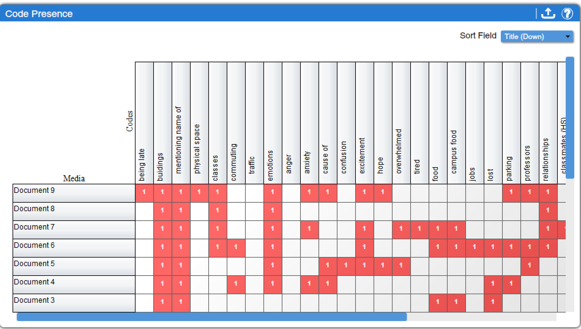
The tools that are most important for the standard forms of qualitative data analysis discussed in this text are among the code tools. These are a set of tools that allow analysts to explore what they can learn from the way they have coded within their project. The most basic of these is Code Presence (found under Media Charts, Code Charts, and Qualitative Charts), which simply displays whether or not a particular code has been applied at least once to a given text. As shown in Figure 3, this tool provides a grid or matrix in which the entire code tree developed in the project is arrayed across the top, while the document titles are listed down the side. When a code appears in a particular document or text, a red square with the numeral 1 marks the intersection; when the code does not appear, the intersecting cell is empty. If you click on the red square, a window will pop up with all of the excerpts from that text to which that code was applied.
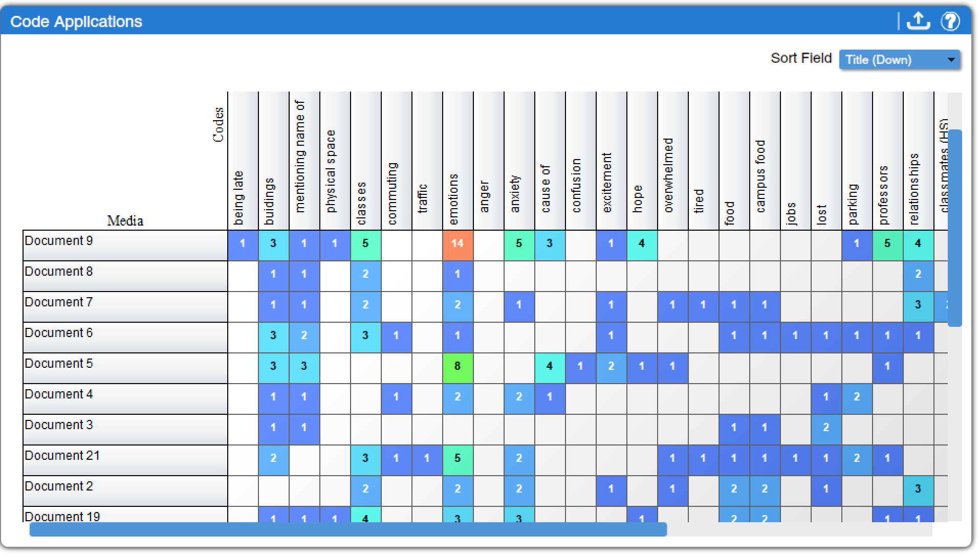
Code Application (found under Media Charts, Code Charts, and Qualitative Charts) is a somewhat more useful way to view the same data. In this tool, instead of just displaying the presence or absence of each code in each text, the number of times each code was applied to each text is displayed, as shown in Figure 4. Color coding helps users quickly spot the most frequently used codes, which are displayed in orange and red (while rarely used codes are displayed in blue) with the number of times they were applied indicated. As in the case of other tools, clicking on a table cell brings up all applicable excerpts.
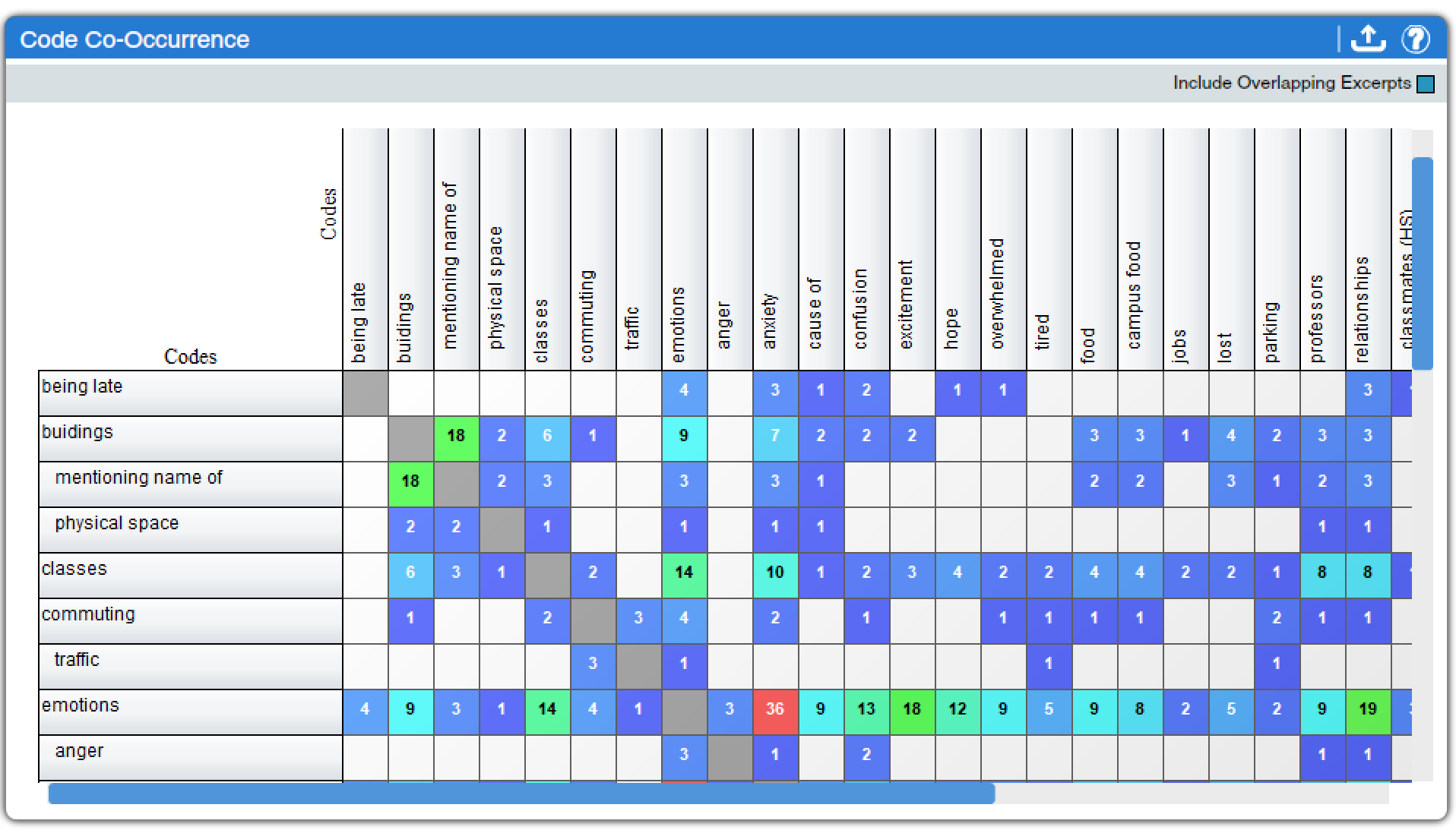
Code Co-Occurrence (found under Code Charts and Qualitative Charts) is arguably the most useful of the code tools. Rather than simply documenting the presence or extent of given codes in particular texts, the Code Co-Occurrence tool lets analysts explore the relationships between codes. It flags and tallies excerpts in which the same codes appear. For example, in investigating the sample data displayed in Figure 5, we can observe that “emotions” tends to co-occur with relationships and classes, and anxiety is a particular emotion frequently occurring in relation to discussions of classes. The same color scheme as noted above in relation to the Code Application tool helps viewers see, at a glance, which codes co-occur most frequently, and clicking on table cells brings up relevant excerpts. The checkbox in the corner toggles whether overlapping excerpts—or multiple excerpts that have some sections of text in common—are included. As is the case with other tools, the resulting chart can be exported to a spreadsheet format, though excerpts are not included in the export.
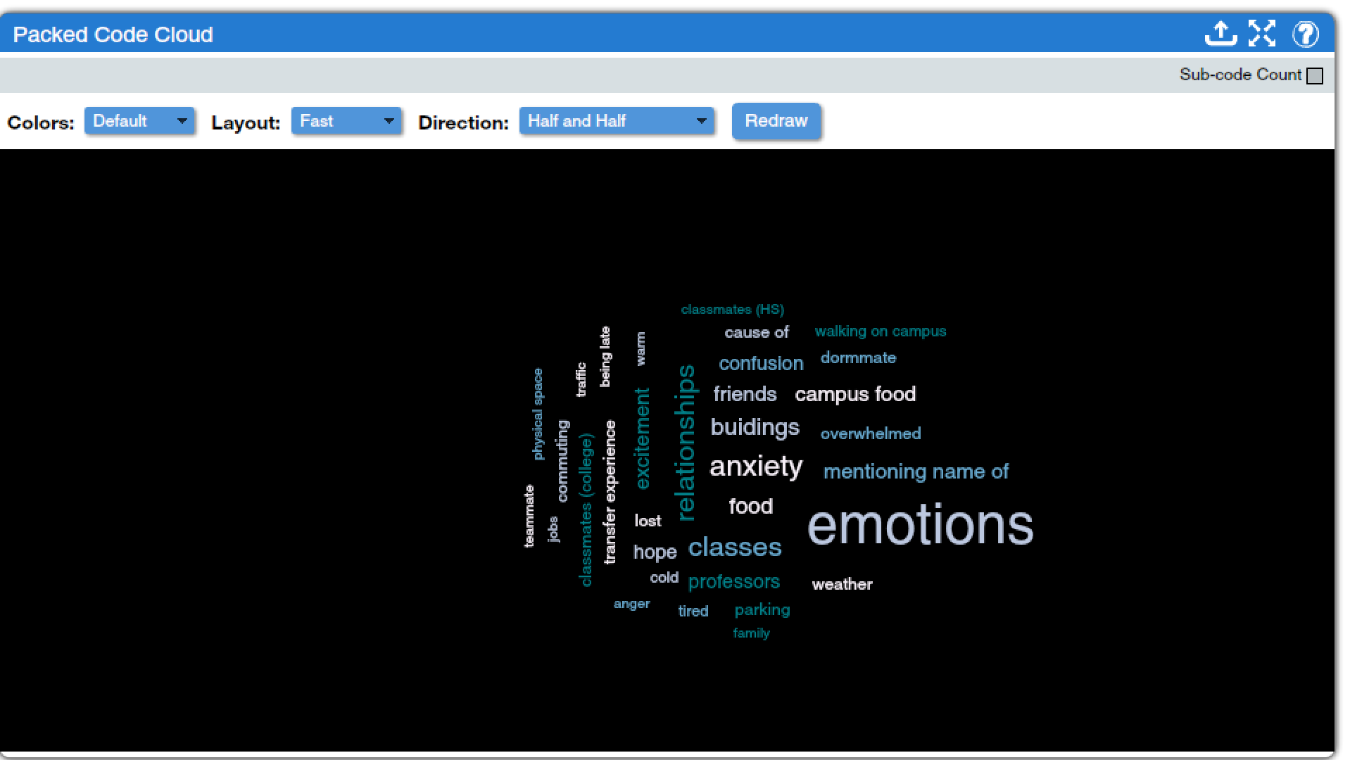
Less useful, but perhaps more fun, are two tools that produce code clouds. Code clouds are a type of word clouds used specifically to display the frequency at which a given code has been applied within the body of text in a project. In code clouds, codes that have been applied more frequently are displayed in larger and bolder text than codes that are used less frequently. These tools can be used to get an at-a-glance sense of which codes are most predominant in the text, and can also be useful in creating visuals to use in presentations when discussing coding. The Packed Code Cloud (found under Code Charts and Qualitative Charts), as shown in Figure 4, provides a static visual which can be modified in a variety of ways. The “Sub-code Count” checkbox toggles whether or not child codes are included in the counts driving the sizes of the codes. Under the “Colors” drop-down menu, analysts can choose from the default color scheme shown in Figure 4 or color schemes that are more blue, red/yellow/orange, or pastel in color. The “Layout” drop-down menu offers a fast scheme or one that places each code into the visual one at a time. The “Direction” drop-down menu offers options for how horizontal or vertical the display is, as well as an option called “Wiggly” for a more dynamic diagonal display of terms. Finally, the “Redraw” button refreshes the display once options have been changed; even if options aren’t changed, slightly different presentations will occur each time Redraw is hit, so that the analyst can chose the one that is most visually appealing. Hovering the mouse over a code provides the number of times that code was applied in the project, and clicking on it brings up a window with all instances of the code. The export tool creates a PDF of the code cloud, which is necessary if you need a print-quality version of the resulting image, though for including in a presentation or other digital document many users might prefer to take a screenshot. Note that the Packed Code Cloud is most useful as a visual representation of coding data—to actually carry out data analysis, other tools will be more helpful.
Similarly, the 3D Code Cloud (found under Code Charts and Qualitative Charts) presents word cloud data, but in a simulated three-dimensional format, as shown in the (silent) video clip below. A checkbox toggles the inclusion or exclusion of sub-codes, while sliders on the side of the window allow users to adjust the zoom and the minimum frequency of code applications for inclusion. Note that the 3D Code Cloud tool does not provide an export option, so users will need to have a screen recorder in order to use these visualizations elsewhere. Just as in the Packed Code Cloud tool, users can click on individual codes to bring up matching excerpts. However, as not all codes can be clearly seen at once, the 3D Code Cloud is even less useful as an analytical tool.[1]
Tools for both Descriptors and Codes
An additional set of tools is designed to help analysts investigate the relationships between codes and descriptors. These tools would permit, for example, an investigation of gender or racial differences in how respondents discuss a particular topic, or an analysis of whether different age groups use different emotion words when talking about their pets. All of the tools provide similar basic information, but display it differently or permit deeper dives.
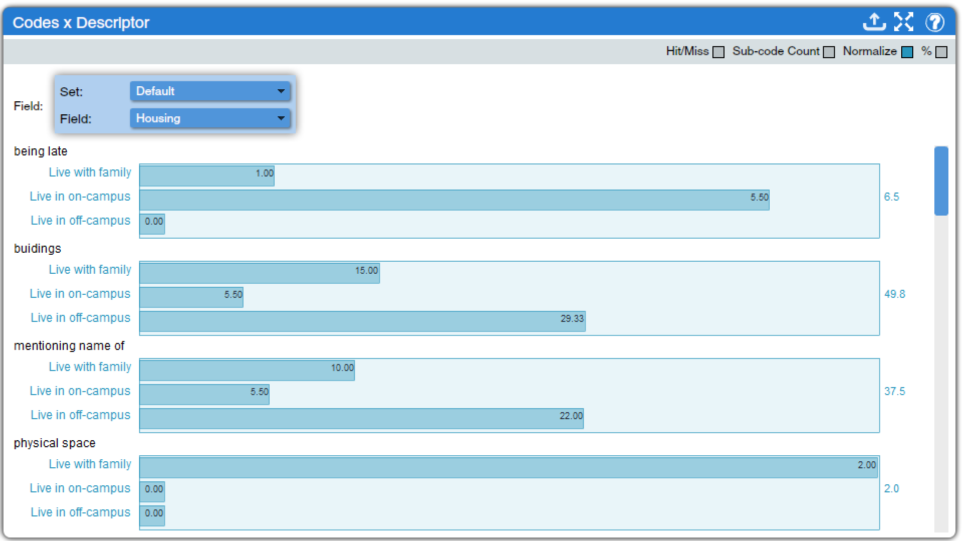
Codes x Descriptor (found under Descriptors Charts, Code Charts, and Mixed Methods Charts, as well as under the Codes tab in Dedoose) creates bar graphs that show how often a code is applied to texts with a given descriptor, as shown in Figure 7. All codes in the code tree are shown in the visualization, and a box at the top of the window with two drop-down menus lets the analyst select the descriptor they wish to investigate (and the descriptor set in which that descriptor appears, if more than one descriptor set is in use in a given project). Other options, shown in the grey bar at the top of the window, allow for configuration of the results:
- Hit/Miss: when selected, the display will show the number of texts with a given descriptor to which a particular code is applied. When unselected, the display will show the total number of times a particular code is applied to texts with a given descriptor. This option cannot be selected at the same time as the Normalize option.
- Sub-code Count: as in other tools, this toggles on or off the inclusion of child codes when parent codes are presented.
- Normalize: this option applies a mathematical calculation to the figures presented in the tool to adjust them in light of the overall number of texts with a given descriptor. For instance, if a dataset had 23 nurses and 5 doctors, it might not be reasonable to just examine how many times nurses versus doctors discussed status at work—there are so many more nurses that their figures would just seem inflated. Normalizing helps correct for this.
- %: toggles between displaying data as counts (raw numbers) and percentages.
As in other tools, clicking a bar in one of the graphs brings up a window with relevant excerpts.
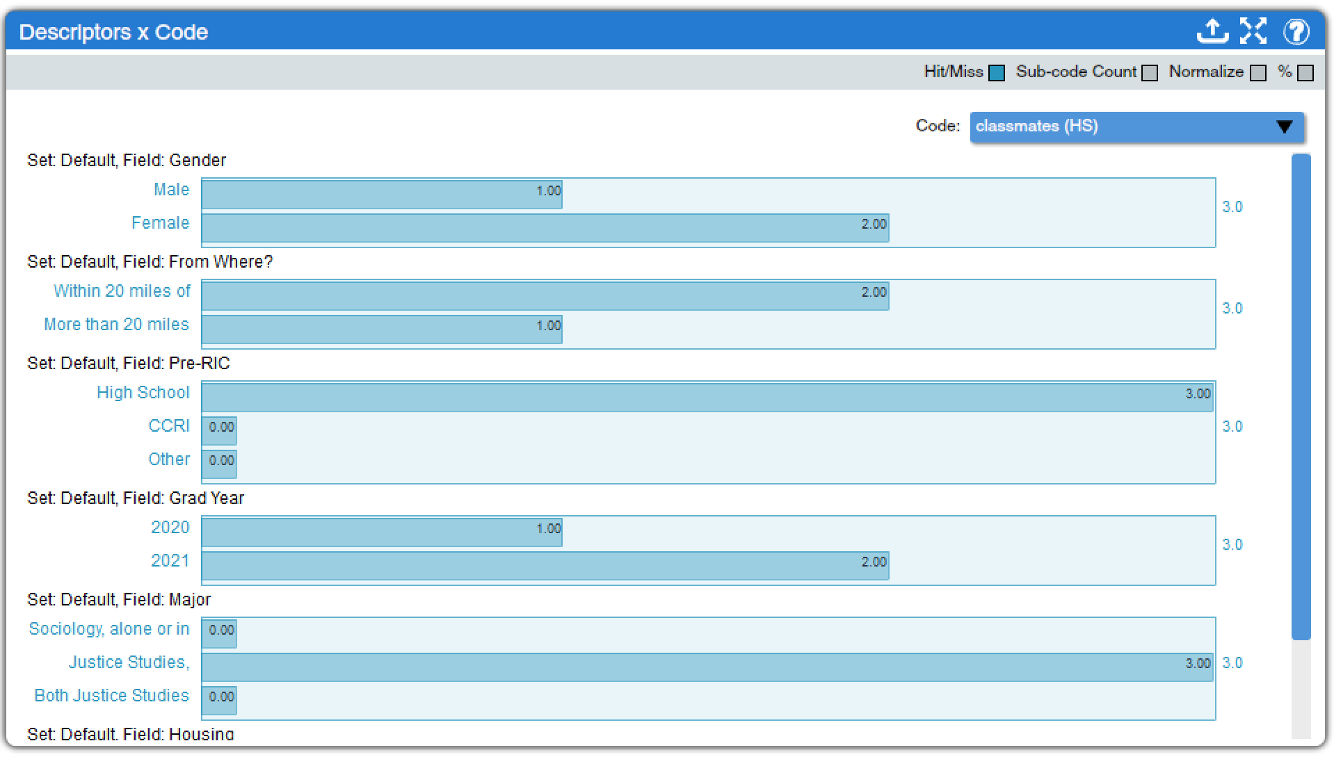
Descriptor x Code (found under Descriptors Charts, Code Charts, and Mixed Methods Charts) is, in a way, the inverse of Code x Descriptor. Here, all descriptors employed in the project are displayed in the window, and a drop-down menu permits the analyst to select which code they wish to investigate. The same options for adjusting the output are provided. In the example displayed in Figure 8, for instance, we can see that only those texts produced by individuals who were recently in high school are coded as involving high school classmates, though not too many texts discuss high school classmates at all.
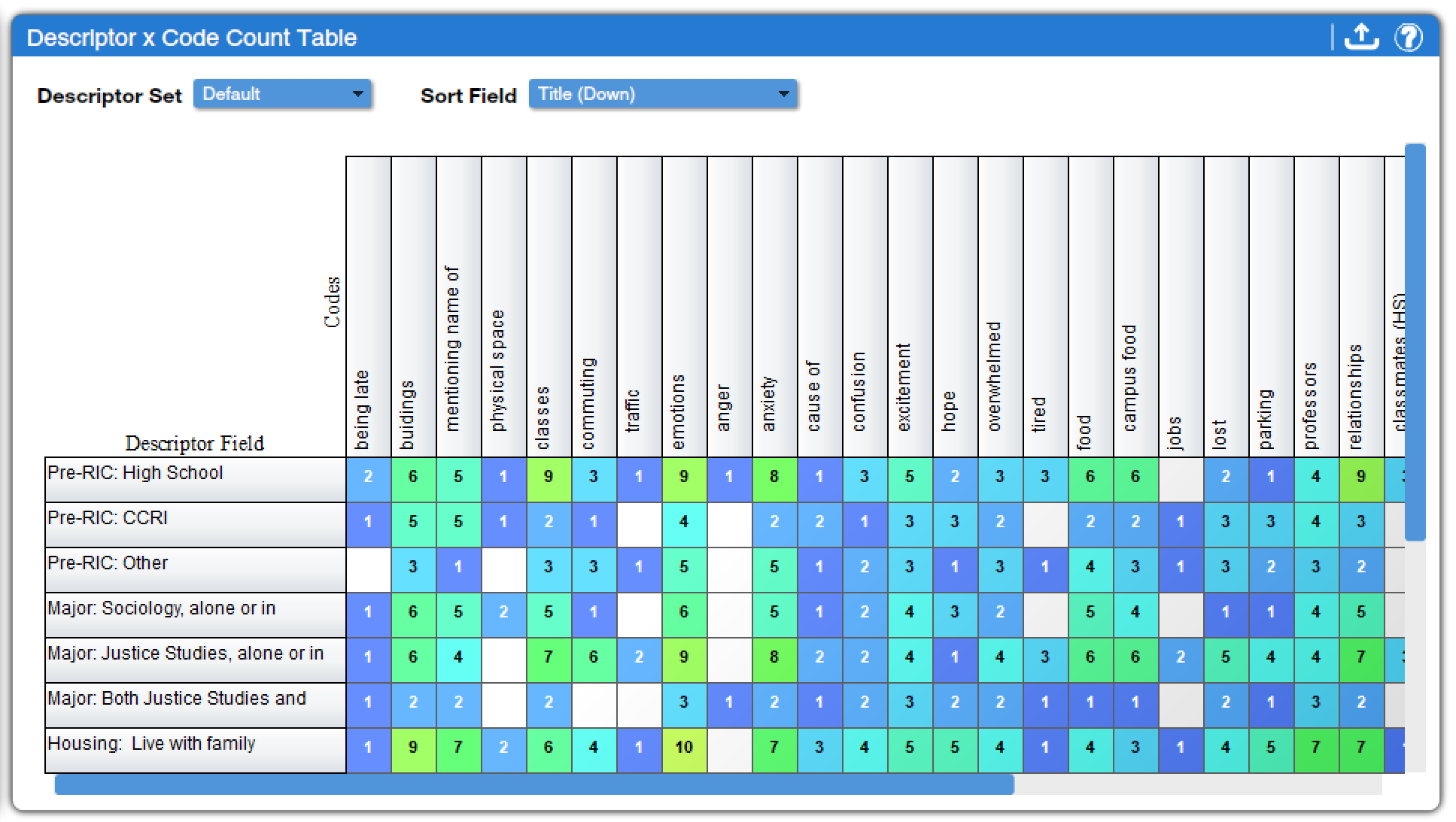
The next two tools provide an overview of code applications by descriptor. Both have the same options and the same basic format, but they provide slightly different data. The Descriptor x Code Case Count Table (found under Descriptors Charts, Code Charts, and Mixed Methods Charts) shows the number of excerpts across all texts with a given descriptor to which a particular code has been applied. In contrast, the Descriptor x Code Count Table (found under Descriptors Charts, Code Charts, and Mixed Methods Charts) shows the number of texts with a given descriptor to which a particular code has been applied. Thus, it is unsurprising that the numbers are generally higher in the former than in the latter. Which is more appropriate to use depends on the research question and goals of a given project. Figure 9 shows the Descriptor x Code Count Table; the Descriptor x Code Case Count Table would look similar but with higher numbers in many cells.
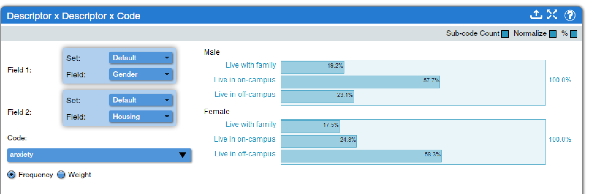
Descriptor x Descriptor x Code (found under Descriptors Charts, Code Charts, and Mixed Methods Charts) provides a way to look at the relationship between two descriptors and a code. Analysts choose two descriptors, and the tool produces a set of bar graphs, one graph for each category of the first descriptor with one bar in each graph for each category of the second descriptor. Then analysts choose a code, and the applications of that code determine the length of each bar. For instance, in Figure 10, we can see the relationship between gender, living arrangements, and the application of the anxiety code. The results show that anxiety is discussed most frequently among male respondents who live on campus, but among female respondents who live off campus but not with family. Note that switching which descriptor is in Field 1 and which is in Field 2 does change the results, especially when the normalize option is switched on as this makes the data quite susceptible to alteration based on small numbers of texts with a given descriptor. Thus, it is essential that analysts think carefully about their research question and how to set up any Descriptor x Descriptor X Code analysis to address that question. This tool can be used with code weights in projects that have applied them. Options for the inclusion of child codes, for normalizing figures, and for toggling between percentages and raw numbers are also available.
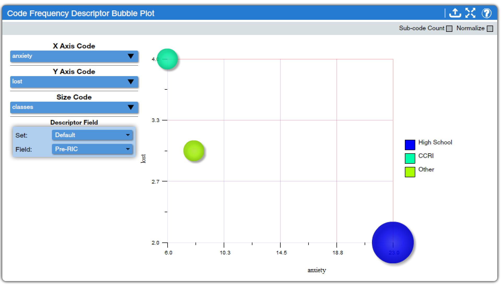
Code Frequency Descriptor Bubble Plot (found under Descriptors Charts, Code Charts, and Mixed Methods Charts) creates a visual display incorporating data from three codes and one descriptor. The frequency of applications of one code is displayed on the X axis, of a second code on the Y axis, and of a third code in the size of the bubble. Note that rearranging which code is in the X axis, Y axis, or size drop-down box will alter the display, so analysts should think carefully about how they wish to set up their display. Then, the descriptor selected from the Field drop-down box creates different bubbles, with a color key, for each category of the selected descriptor. For example, in Figure 11, we can see a plot looking at anxiety, being lost, and talking about classes, with the descriptor of where students were prior to their first day on my campus: high school, the local community college, or another college. The results show that anxiety is most prevalent in the discussions of students starting directly from high school, who are also more likely to talk about classes. In contrast, students coming from the local community college wrote little about anxiety, but a lot about getting lost. As in other tools, including sub-code counts and normalizing can be toggled on and off; clicking a bubble will bring up a list of included excerpts, and results can be exported, in this case as both spreadsheet and PDF files.
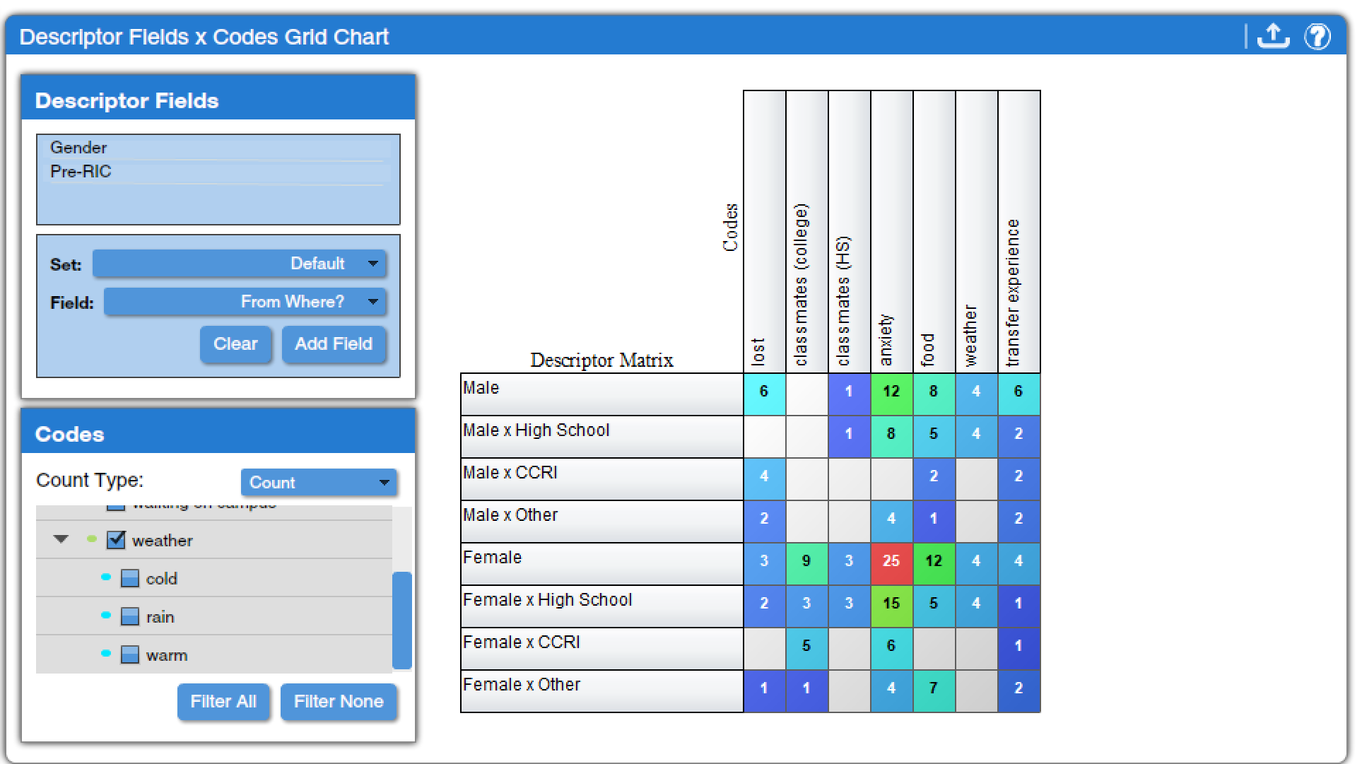
Descriptor Fields by Codes Grid Chart (found under Descriptors Charts, Code Charts, and Mixed Methods Charts) is a particularly flexible tool that lets analysts look at various combinations of descriptors and codes. First, analysts select as many descriptor fields as they wish to include from the Field drop-down menu, clicking “Add Field” after each one to add it to the list of Descriptor Fields in the top corner. Then, they select the checkboxes next to the codes they wish to include from the Codes list. Counts or weights can be displayed in projects that use weights. These selections generate a grid chart that shows all possible combinations of the selected descriptor categories and the number of code applications of each selected code in texts with those combinations of descriptors. For instance, in Figure 12, we can see that female students coming directly from high school made more statements that were coded with Anxiety than did other groups.
Descriptor Tools
The descriptor tools are tools designed to provide summary data, including descriptive statistics and some basic explanatory statistics, using descriptors as variables. Unlike other tools in Dedoose, the descriptor tools produce primarily quantitative data. As such, they are generally most useful either for presenting basic descriptive data about participants in a study or when the study is designed as a mixed-methods study. However, in most cases, if more than the most basic descriptive data is desired, it would make more sense to export the relevant descriptor data from Dedoose (which can be done under the Descriptors tab) and load it into appropriate statistical analysis software.
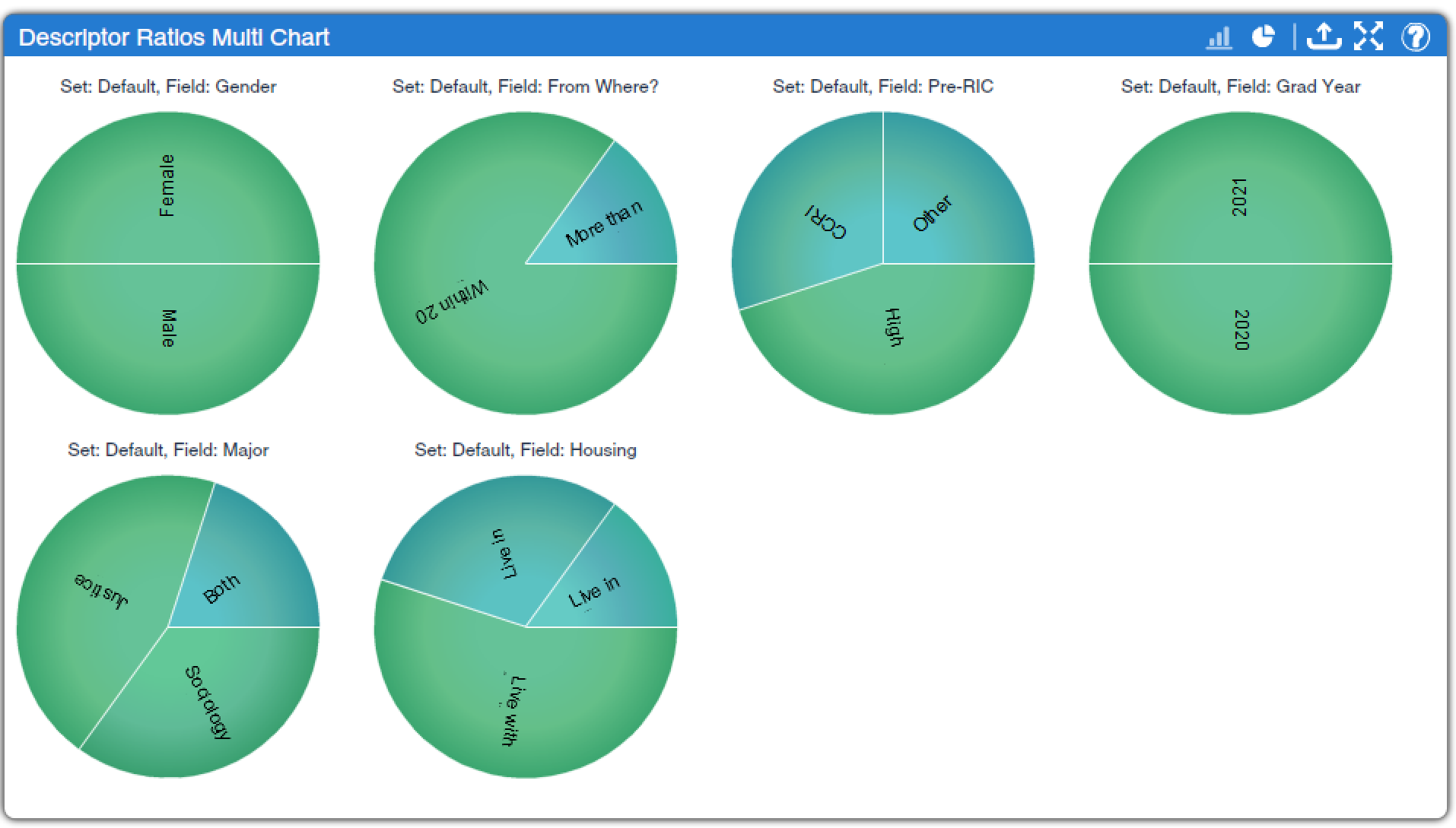
Descriptor Ratios Multi Chart (found under Descriptors Charts and Quantitative Charts) provides a choice of pie or bar graphs that display the number of texts associated with each category for each descriptor field. This tool, as shown in Figure 12, is a good way to quickly familiarize oneself with the distribution of descriptor data in a project.
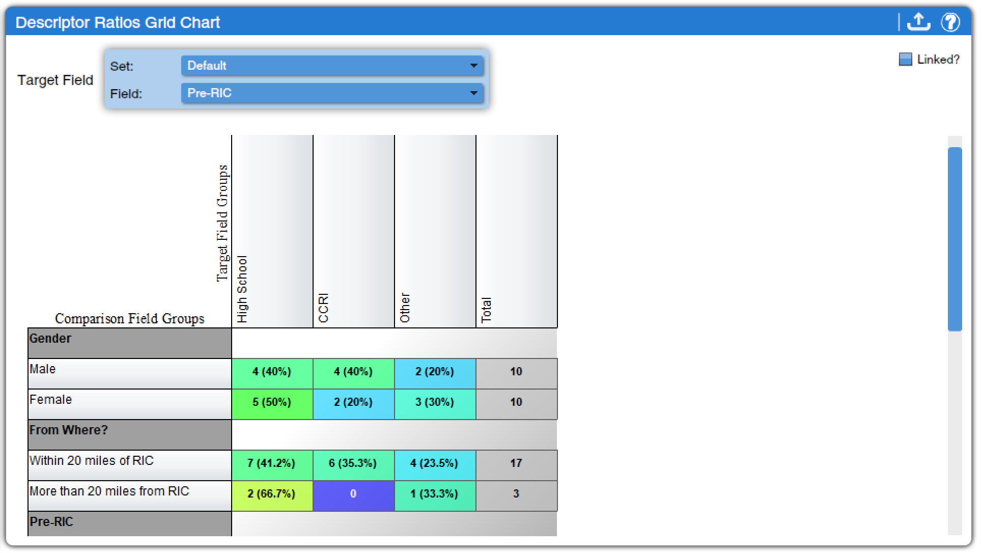
Descriptor Ratios Grid Chart (found under Descriptors Charts and Quantitative Charts) provides a way to view crosstabulations of descriptor field categories. Analysts choose one descriptor from the Target Field drop-down menu and that descriptor is used as the independent variable in a stack of crosstabulations, with the other descriptors as the dependent variables. A toggle is available to turn on or off the inclusion of descriptors that have not been linked to a text. For example, Figure 13 shows students’ status prior to coming to our campus as the target field; crosstabulations with gender and how far away students lived from campus prior to becoming students as the other included variables. More information on how to interpret crosstabulations can be found in the chapter on Bivariate Analyses: Crosstabulation, but in short, researchers compare the percentages across the rows. Doing so for the data displayed in Figure 13 shows that there is no notable gender difference in students’ educational status before coming to our campus, but that there is a difference in terms of how far away their homes are from campus—students who came to our campus from the local community college are more likely to live within 20 miles of campus.
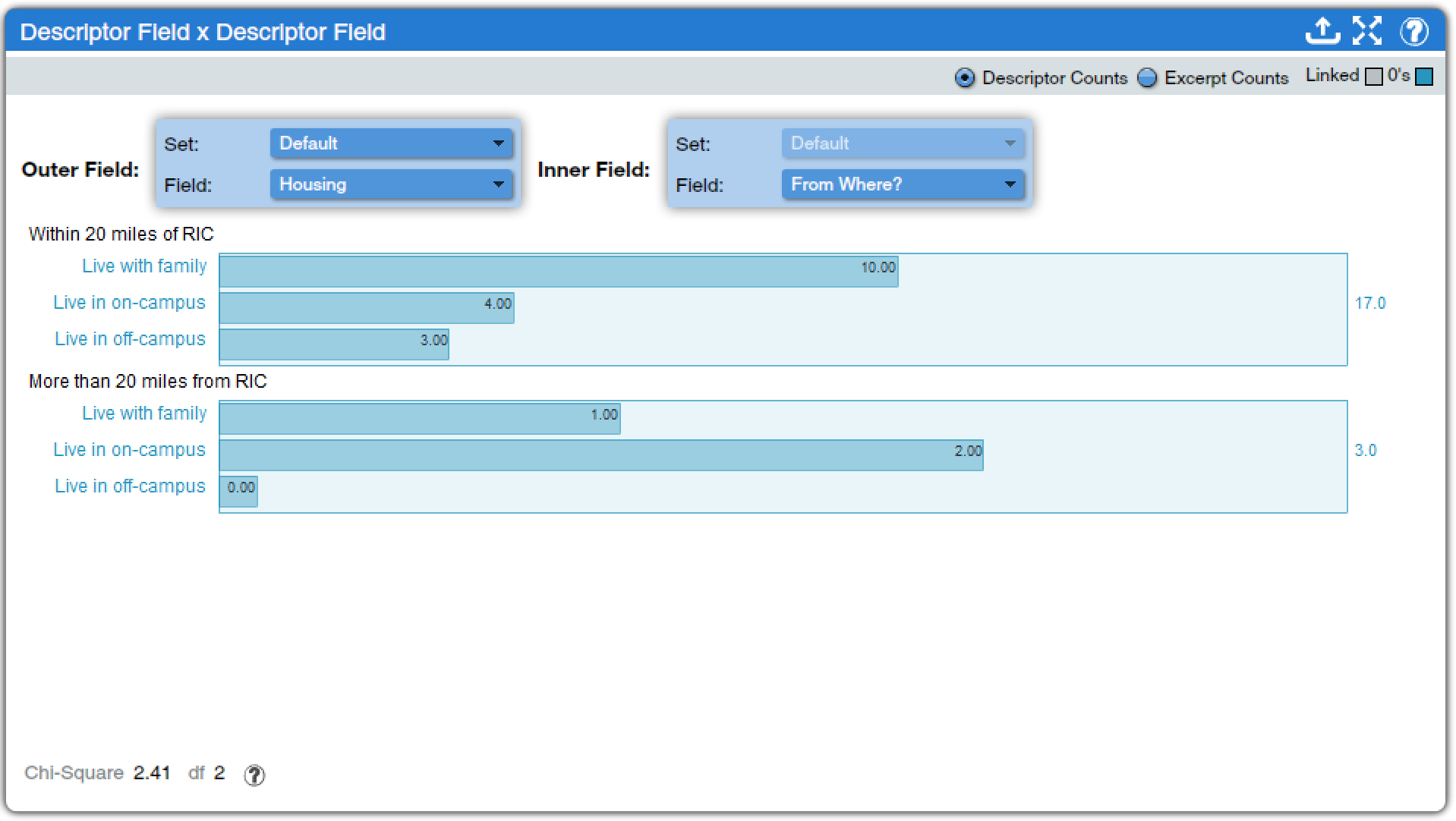
Descriptor Field x Descriptor Field (found under Descriptors Charts and Quantitative Charts) provides a different way to examine crosstabulation data. To use this tool, researchers select two descriptors, one for the outer field and one for the inner field. A separate bar graph is produced for each category of the inner field, with bars for each category of the outer field. Options toggle whether the count is of descriptors or of excerpts, whether only linked descriptors are included, and whether categories with no data are included. At the bottom of the screen, the critical value of the Chi square and the degrees of freedom (df) are presented; clicking on the question mark in a circle at the bottom of the screen brings up a webpage that provides the table of critical values of Chi square, as discussed in the chapter on Bivariate Analyses: Crosstabulation. For example, in Figure 14, an analysis of the relationship between housing one’s first year on campus and how far away one lived prior to enrolling is presented. The data shows that the vast majority of students lived within 20 miles of our campus prior to enrolling, and that those students were more likely to continue to live with family, while students from further away were more likely to live in on-campus housing. However, the Chi square calculation is such that this observed relationship is not statistically significant. To determine this, note the Chi square and df values and click on the question mark in a circle at the bottom of the screen, and follow the directions to use the table that is presented.
Because this text recommends that statistical analysis be performed using statistical analysis software, discussion of the remaining more-quantitative tools will be limited–especially as these tools rely heavily on the inclusion of continuous, numerical variables among the descriptors, which is generally less common in qualitative and perhaps even mixed-methods projects. The Descriptor Number Distribution Plot (found under Descriptors Charts and Quantitative Charts) provides a way to obtain basic descriptive data for large descriptors in larger datasets. However, its use is not possible with smaller datasets such as are commonly used for qualitative analysis. The Descriptor Field T-Test (found under Descriptors Charts, Code Charts, Quantitative Charts, and Mixed Methods Charts) produces an independent-samples T-test. To use this tool, you can select under the drop-down for “primary field” any descriptor with categories, and this will be the independent variable. The dependent variable must be continuous rather than discrete. The tool then produces a plot, mean and median differences, and the T-value and degrees of freedom to look up in the chart that loads when the “Critical Values Table” button is pressed. Similarly, the Descriptor ANOVA (found under Descriptors Charts, Code Charts, Quantitative Charts, and Mixed Methods Charts) produces an ANOVA output for a discreet independent variable and a continuous dependent variable. The Descriptor Field Correlation (found under Descriptors Charts and Quantitative Charts) produces a kind of scatterplot with descriptors that are continuous variables in nature presented in both the X-axis and the Y-axis. As in the other tool, the correlation and degrees of freedom (here called DoF) are provided, along with a button to bring up the relevant critical value table.
Code Weight Tools
Code weighting is generally beyond the scope of this text, but it is worth briefly noting that there are four analysis tools designed specifically for projects that use code weight. In addition, some of the tools discussed above have options that allow the incorporation of data on code weights into the analysis process, as you have seen.
Code Weight Statistics (found under Code Charts and Qualitative Charts) displays the minimum, maximum, mean, median, and count of code weights applied for each code, while Code Weight Distribution Plot (found under Code Charts and Quantitative Charts) provides more ways to examine descriptive statistics about code weights for a particular code.
Code Weight Descriptor Bubble Plot (found under Descriptors Charts, Code Charts, and Mixed Methods Charts) lets users create four-dimensional visualizations of the relationship between three different codes with code weights and one descriptor. Codes can be assigned to the X axis, Y axis, and bubble size, while the categories of the descriptor become different bubbles on the graph. Code Weight Frequency x Field (found under Code Charts and Mixed Methods Charts) permits the analyst to see how the weight of codes varies across different categories of a descriptor.
Conducting and Concluding Analysis
While Dedoose provides powerful analytical tools, it is important to remember that it remains up to the analyst to make the right choices and use the tools appropriately in service of the project. Analysts need to make sure to choose the tools that fit with the research question and approach, not just those that are appealing or easy to use. For instance, many students of Dedoose are drawn to the code cloud tools because they are attractive and simple—but they provide far less analytical power than does the code co-occurence tool or even the code application tool.
In addition, in qualitative research, it is not sufficient to simply report what a tool tells you. And it is very unlikely that many of the graphs, tables, and other visuals Dedoose produces will find their way into publications or presentations. Instead, the tools should be used as a guide to determine what findings are worth investigating further or focusing on. Analysts will then need to return to the texts to choose appropriate quotes for illustrating these findings and making sure the findings are sensible in the context of the data. Dedoose provides tools to help researchers make sense of their data, but it does not itself provide answers.
Exercises
- Return to the Dedoose project involving oral history transcripts. Click though all of the analysis tools. Select two tools you find useful (not just easy or pretty) and write a paragraph summarizing the findings from each tool.
- Use the tools you have selected to locate and copy two quotes that illustrate each of the findings you have summarized.
Media Attributions
- analyze tools © Dedoose is licensed under a All Rights Reserved license
- codecountmedia © Dedoose is licensed under a All Rights Reserved license
- code presence © Dedoose is licensed under a All Rights Reserved license
- code application © Dedoose adapted by Mikaila Mariel Lemonik Arthur is licensed under a All Rights Reserved license
- code coocurrance © Dedoose adapted by Mikaila Mariel Lemonik Arthur is licensed under a All Rights Reserved license
- packed code cloud © Dedoose adapted by Mikaila Mariel Lemonik Arthur is licensed under a All Rights Reserved license
- code x descriptor © Dedoose is licensed under a All Rights Reserved license
- descriptor x code © Dedoose is licensed under a All Rights Reserved license
- descriptor x code count table © Dedoose is licensed under a All Rights Reserved license
- descriptor x descriptor x code © Dedoose adapted by Mikaila Mariel Lemonik Arthur is licensed under a All Rights Reserved license
- code descriptor bubble © Dedoose adapted by Mikaila Mariel Lemonik Arthur is licensed under a All Rights Reserved license
- descriptor codes grid © Dedoose adapted by Mikaila Mariel Lemonik Arthur is licensed under a All Rights Reserved license
- descriptor ratios multi © Dedoose is licensed under a All Rights Reserved license
- descriptor ratios grid © Dedoose is licensed under a All Rights Reserved license
- descriptor field x descriptor field © Dedoose
- For screenreader users: there is a screencapture video of this tool below; it is silent. Tab to move through toggle buttons and options; the screenreader is unable to read the moving graphic shown. ↵
Visual display of words in which the size and boldness of each word indicates the frequency with which it appears in a body of text.
An analytical method in which a bivariate table is created using discrete variables to show their relationship.
A measure of statistical significance used in crosstabulation to determine the generalizability of results.
A variable measured using numbers, not categories, including both interval and ratio variables. Also called a scale variable.
A variable measured using categories rather than numbers, including binary/dichotomous, nominal, and ordinal variables.
