Quantitative Data Analysis
8 Correlation and Regression
Roger Clark
The chapter on bivariate analyses focused on ways to use data to demonstrate relationships between nominal and ordinal variables and the chapter on multivariate analysis on controling these relationships for other variables. This chapter will introduce you to the ways scholars show relationships between interval variables and control those relationships with other interval variables.
It turns out that the techniques presented in this chapter are by far the most likely ones you’ll see used in research articles in the social sciences. There are a couple of reasons for this popularity. One is that the techniques we’ll show you here are much less clumsy than the ones we showed you in prior chapters. The other is that, despite what we led you to believe in the chapter on univariate analysis (in our discussion of levels of measurement), all variables, whatever their level of measurement, can, via an ingenious method, be converted into interval-level variables. This method may strike you at first as having a very modest name for an ingenious method: dummy variable creation. Until you realize that dummy does not always refer to a dumb person—a dated and offensive expression in any case. Sometimes dummy refers to a “substitute for,” as it does in this case.
Dummy Variables
In fact, a dummy variable is a two-category variable that is used as an ordinal or interval level variable. To understand how any variable, even a nominal-level variable can be treated as an ordinal or interval level variable, let’s recall the definitions of ordinal and interval level variables.
An ordinal level variable is a variable whose categories can be ordered in some sensible way. The General Social Survey (GSS) measure of “general happiness” has three categories: very happy, happy, and not too happy. It’s easy to see how these three categories can be ordered sensibly: “very happy” suggests more happiness than “happy,” which in turn implies more happiness than “not too happy.” But we’d normally say that the variable “gender,” when limited to just two categories (female and male), is merely nominal. Neither category seems to have more of something than the other.
Not until you do a little conceptual blockbusting and think of the variable gender as a measure of either how much “maleness” or “femaleness” a person has. If we coded, as the GSS does, males as 1 and females as 2 we could say that a person’s “gender,” really “femaleness,” is greater any time a respondent gets coded 2 (or female) than when s/he gets coded 1 (or male).[1] Then one could, as we’ve done in Table 1, ask for a crosstabulation of sex (really “gender”) and happy (really level of unhappiness) and see that females, generally, were a little happier than males in the U.S. in 2010, either by looking at the percentages or the gamma—a measure of relationship generally reserved for two ordinal level variables. The gamma for this relationship is -0.08, indicating that, in 2010, as femaleness went up, unhappiness went down. Pretty cool, huh?
Table 1. Crosstabulation of Gender (Sex) and Happiness (Happy), GSS data from SDA, 2010
| Frequency Distribution | ||||
|---|---|---|---|---|
| Cells contain: –Column percent -Weighted N |
sex | |||
| 1 male |
2 female |
ROW TOTAL |
||
| happy | 1: very happy | 26.7 247.0 |
29.8 330.8 |
28.4 577.8 |
| 2: pretty happy | 57.5 532.3 |
57.5 639.3 |
57.5 1,171.5 |
|
| 3: not too happy | 15.9 146.9 |
12.7 141.0 |
14.1 287.8 |
|
| COL TOTAL | 100.0 926.1 |
100.0 1,111.0 |
100.0 2,037.1 |
|
| Means | 1.89 | 1.83 | 1.86 | |
| Std Devs | .64 | .63 | .64 | |
| Unweighted N | 890 | 1,149 | 2,039 | |
| Color coding: | <-2.0 | <-1.0 | <0.0 | >0.0 | >1.0 | >2.0 | Z |
|---|---|---|---|---|---|---|---|
| N in each cell: | Smaller than expected | Larger than expected | |||||
| Summary Statistics | ||||||||
|---|---|---|---|---|---|---|---|---|
| Eta* = | .05 | Gamma = | -.09 | Rao-Scott-P: F(2,156) = | 1.95 | (p= 0.15) | ||
| R = | -.05 | Tau-b = | -.05 | Rao-Scott-LR: F(2,156) = | 1.94 | (p= 0.15) | ||
| Somers’ d* = | -.05 | Tau-c = | -.05 | Chisq-P(2) = | 5.31 | |||
| Chisq-LR(2) = | 5.30 | |||||||
| *Row variable treated as the dependent variable. | ||||||||
We hope it’s now clear why and how a two-category (dummy) variable can be used as an ordinal variable. But why and how can it be used as an interval variable? The answer to this question also lies in a definition: this time, of an interval level variable. An interval level variable, you may recall, is one whose adjacent categories are a standard or fixed distance from each other. For example, on the Fahrenheit temperature scale, we think of 32 degrees being the same distance from 33 degrees as 82 degrees is from 83 degrees. Returning to what we previously might have said was only a nominal-level variable, gender (using here just two categories: female and male), statisticians now ask us to ask: what is the distance between categories here. They answer: who really cares? Whatever it is, it’s a standard distance because there’s only one length of it to be covered. Every male, once coded, say, as a “1,” is as far from the female category, once coded as a “2,” as every other male. And every two-category (dummy) variable similarly consists of categories that are a “fixed” distance from each other. We hope this kind of conceptual blockbusting isn’t as disorienting for you as it was for us when we first had to wrap our heads around it.
But this leaves the question of how “every” nominal-level variable can become an ordinal or interval level variable. After all, some nominal level variables have more than two categories. The GSS variable “labor force status” (wrkstat) has eight usable categories: working full time, working part time, temporarily not working, unemployed, retired, school, keeping house, and other.
But even this variable can become a two-category variable through recoding. Roger, for instance, was interested is seeing whether people who work fulltime were happier than other people, so he recoded so that there were only two categories: working full time and not working full time (wrkstat1). Then, using the Social Data Archive facility, he asked for the following crosstab (Table 2):
Table 2. Crossbulation of Whether a Respondent Works Fulltime (Wrkstat1) and Happiness (Happy), GSS data vis SDA
| Frequency Distribution | ||||
|---|---|---|---|---|
| Cells contain: –Column percent -Weighted N |
wrkstat1 | |||
| 1 Working Full Time |
2 Not Working Full Time |
ROW TOTAL |
||
| happy | 1: very happy | 33.2 9,963.5 |
32.8 9,860.2 |
33.0 19,823.8 |
| 2: pretty happy | 57.7 17,300.1 |
53.2 15,986.4 |
55.4 33,286.5 |
|
| 3: not too happy | 9.1 2,738.6 |
14.0 4,223.8 |
11.6 6,962.4 |
|
| COL TOTAL | 100.0 30,002.2 |
100.0 30,070.5 |
100.0 60,072.7 |
|
| Means | 1.76 | 1.81 | 1.79 | |
| Std Devs | .60 | .66 | .63 | |
| Unweighted N | 29,435 | 30,604 | 60,039 | |
| Color coding: | <-2.0 | <-1.0 | <0.0 | >0.0 | >1.0 | >2.0 | Z |
|---|---|---|---|---|---|---|---|
| N in each cell: | Smaller than expected | Larger than expected | |||||
| Summary Statistics | ||||||||
|---|---|---|---|---|---|---|---|---|
| Eta* = | .04 | Gamma = | .06 | Rao-Scott-P: F(2,1132) = | 120.24 | (p= 0.00) | ||
| R = | .04 | Tau-b = | .03 | Rao-Scott-LR: F(2,1132) = | 121.04 | (p= 0.00) | ||
| Somers’ d* = | .04 | Tau-c = | .04 | Chisq-P(2) = | 368.93 | |||
| Chisq-LR(2) = | 371.39 | |||||||
| *Row variable treated as the dependent variable. | ||||||||
The gamma here (0.06) indicates that those working full time do tend to be happier than others, but that the relationship is a weak one.
We’ve suggested that dummy variables, because they are interval-level variables, can be used in analyses designed for interval-level variables. But we haven’t yet said anything about analyses aimed at looking at the relationship between interval level variables. Now we will.
Correlation Analysis
The examination of relationships between interval-level variables is almost necessarily different from that of nominal or ordinal level variables. Doing crosstabulations of many interval level variables, for one thing, would involve very large numbers of cells, since almost every case would have its own distinct category on the independent and on the dependent variables.[2] Roger hypothesizes, for instance, that as the percentage of residents who own guns in a state rises, the number of gun deaths in a year per 100,000 residents would also increase. He just went to a couple of websites and downloaded information about both variables for all 50 states in 2017. Here’s how the data look for the first six cases:
Table 3. Gun Ownership and Shooting Deaths by State, 2016[3]
| State | Percent of Residents Who Own Guns | Gun Shooting Deaths Per 100,000 Population |
| Alabama | 52.8 | 21.5 |
| Alaska | 57.2 | 23.3 |
| Arizona | 36 | 15.2 |
| Arkansas | 51.8 | 17.8 |
| California | 16.3 | 7.9 |
| Colorado | 37.9 | 14.3 |
| … | … | … |
One could of course recode all this information, so that each variable was reduced to two or three categories. For example, we could say any state whose number of gun shooting per 100,000 was less than 13 fell into a “low gun shooting category,” and any state whose number was 13 or more fell into a “high gun shooting category.” And do something like this for the percentage of residents who own guns as well. Then you could do a crosstabulation. But think of all the information that’s lost in the process. Statisticians were dissatisfied with this solution and early on noticed that there was a better way than crosstabulation to depict the relationship between interval level variables.
They discovered a better way was to use what is called a scatterplot. A scatterplot is a visual depiction of the relationship between two interval level variables, the relationship between which is represented as points on a graph with an x-axis and a y-axis. Thus, Figure 1 shows the “scatter” of the states when plotted with the percent of residents who are gun owners along the x-axis and the gun shooting death per 100,000 along the y-axis.
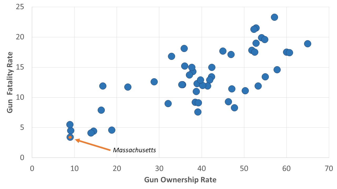
Each state is a distinct point in this plot. We’ve pointed in the figure to Massachusetts, the state with the lowest value on each of the variables (9% percent of residents own guns and there are 3.4 gun deaths per 100,000 population), but each of the 50 states is represented by a point or dot on the graph. You’ll note that, in general, as the gun ownership rate rises, the gun death rate does as well.
Karl Pearson (inventor of chi-square, you may recall) created a statistic, Pearson’s r, which measures both the strength and direction of a relationship between two interval level variables, like the ones depicted in Figure 1. Like gamma, Pearson’s r can vary between 1 and -1. The farther away Pearson’s r is from zero, or the closer it is to 1 or -1, the stronger the relationship. And, like gamma, a positive Pearson’s r indicates that as one variable increases, the other tends to as well. And this is the kind of relationship depicted in Figure 1: as gun ownership rises, the gun death rates tend to rise as well.
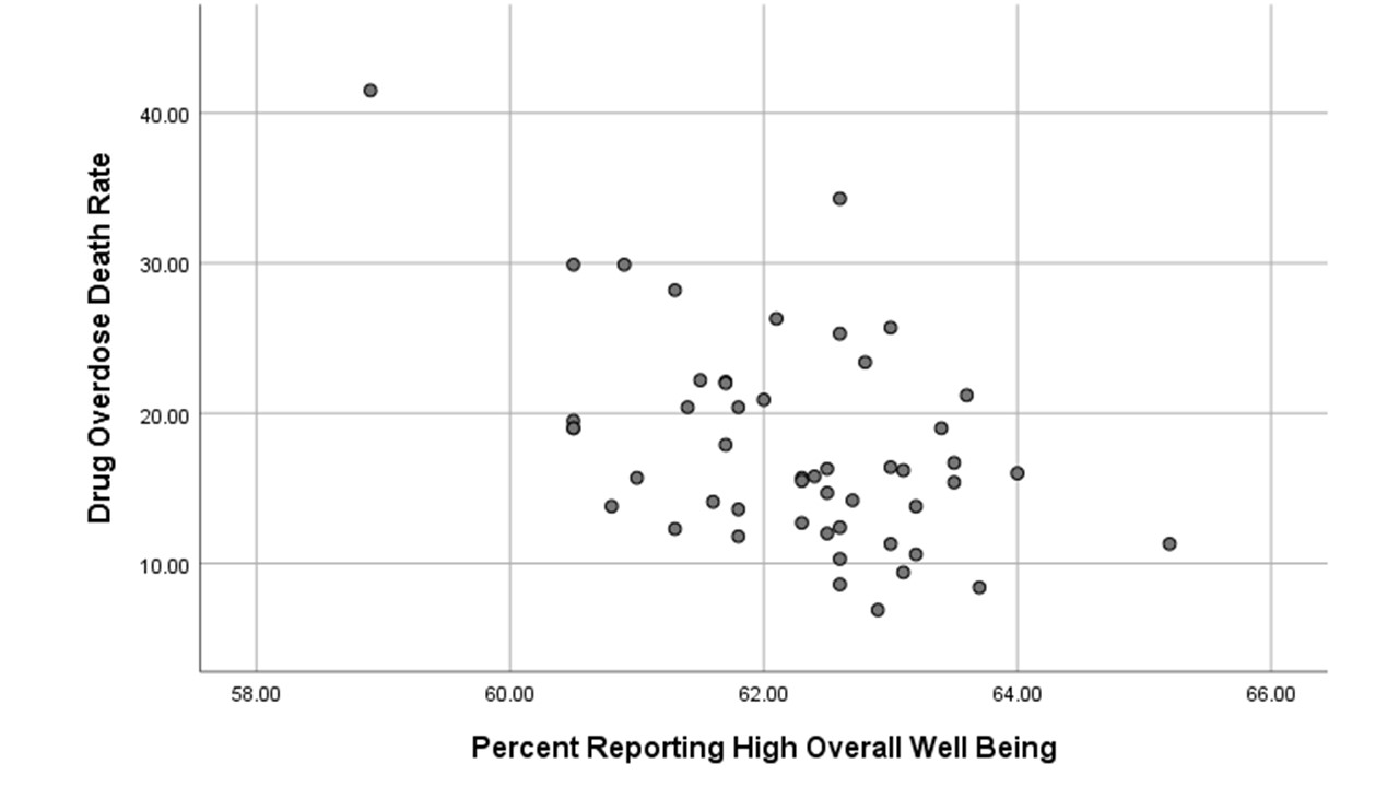
When the sign of Pearson’s r (or simply “r”) is negative, however, this means that as one variable rises in values, the other tends to fall in values. Such a relationship is depicted in Figure 2. Roger had expected that drug overdose death rates in states (measured as the number of deaths due to drug overdoses per 100,000 people) would be negatively associated with the percentage of states’ residents reporting a positive sense of overall well being in 2016. Figure 2 provides visual support for this hypothesis. Note that while in Figure 1 the plot of points tends to move from bottom left to upper right on the graph (typical of positive relationships), the plot in Figure 2 tends to move from top left to bottom right (typical of negative relationships).
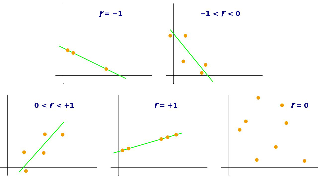
A Pearson’s r of 1.00 would not only mean that the relationship was as strong as it could be, that as one variable goes up, the other goes up, but also that all points fall on a line from bottom left to top right. A Pearson’s r of -1.00 would mean that the relationship was as strong as it can be, that as one variable goes up, the other goes down, and that all points fall on a line from top left to bottom right. Figure 3 illustrates what various graphs producing various Pearson’s r values would look like.
The formula for calculating Pearson’s r is not much fun to use, but all contemporary computers have no trouble adapting to systems that calculate it rapidly. The computer calculated the Pearson’s r for the relationship between gun ownership and gun death rates for 50 states and it is indeed positive. Pearson’s r is equal to 0.76. So it’s a strong positive relationship. In contrast, the r for the relationship between the overall wellbeing of state residents and their overdose deaths rates is negative. The r turns out to be -0.50. So it’s a strong negative relationship…though not quite as strong as the one for gun ownership and gun shootings. 0.76 is farther from zero than -0.50.
Most statistics packages will quickly calculate the several correlations very quickly as well. Roger asked SPSS to calculate the correlations among three variable characteristics of states: drug overdose death rates, percent of residents saying they have high levels of overall well being, and whether a state is in the southeast or southwest of the country. (Roger thought states in the southeast and southwest—the South, for short—might have higher rates of drug overdose deaths than other states.) The results of this request are shown in Table 3. This table shows what is called a correlation matrix and it’s worth a moment of your time.
One reads the correlation between two variables by finding the intersection of the column headed by one of the variables and seeing where it crosses the row headed by the other variable. The top number in the resulting box is the Pearson correlation for the two variables. Thus, if one goes down the column in Table 3 headed by “Drug Overdose Death Rate” and sees where it crosses the row headed by “Percent Reporting High Overall Well Being” one see that their correlation is “-0.495,” which rounds to -0.50. (Research reports always round correlation coefficients to two digits after the decimal point.) This is what we reported above.
Table 3. Correlations Among Drug Overdose Death Rates, Levels of Overall Well Being and Whether a State is in the American Southeast or Southwest
|
Correlations |
||||
|
|
Drug Overdose Death Rate |
Percent Reporting High Overall Well Being |
South or Other |
|
|
Drug Overdose Death Rate |
Pearson Correlation |
1 |
-.495** |
.094 |
|
Sig. (2-tailed) |
|
.000 |
.517 |
|
|
N |
50 |
50 |
50 |
|
|
Percent Reporting High Overall Well Being |
Pearson Correlation |
-.495** |
1 |
-.351* |
|
Sig. (2-tailed) |
.000 |
|
.012 |
|
|
N |
50 |
50 |
50 |
|
|
South or Other |
Pearson Correlation |
.094 |
-.351* |
1 |
|
Sig. (2-tailed) |
.517 |
.012 |
|
|
|
N |
50 |
50 |
50 |
|
|
**. Correlation is significant at the 0.01 level (2-tailed). |
||||
|
*. Correlation is significant at the 0.05 level (2-tailed). |
||||
If you answered, “I’m not sure,” you’re right! Whether a state is the South is a dummy variable: the state can be either in the South, on the one hand, or in the rest of the country, on the other. But since we haven’t told you how this variable is coded, you couldn’t possibly know what the Pearson’s r of 0.09 means. But once we tell you that Southern states were coded 1 and all others were coded 0, you should be able to see that Southern states tended to have higher drug overdose rates than others, but that the relationship isn’t very strong. Then you’ll also realize that the Pearson’s r relating region and overall well being (-0.35) suggests that overall well being tends to be lower in Southern states than in others.
One other thing is worth mentioning about a correlation matrix yielded by SPSS…and about Pearson’s r’s. If you look at the box (there are actually two such boxes; can you find the other?) telling you correlation between overdose rates and overall well being, you’ll see two other numbers in it. The bottom number (50) is of course the number of cases in the sample (there are, after all, 50 states). But the one in the middle (0.000) gives you some idea of the generalizability of the relationship (if there were, in fact, more states). A significance level or p-value of 0.000 does NOT mean there is no chance of making a Type 1 error (i.e., the error we make when we infer that a relationship exists in the larger population from which a sample is drawn when it does not), just that it’s lower than can be shown in an SPSS printout. It does mean it is lower than 0.001 and therefore than 0.05, so inferring that such a relationship would exist in a larger population is reasonably safe. Karl Pearson was, after all, the inventor of chi-square and was always looking for inferential statistics. He found one in Pearson’s r itself (imagine his surprise!) and figured out a way to use it to calculate the probability of making a Type 1 error (or p value) for values of r with various sample sizes. We don’t need to show you how this is done but we do want you to marvel at this: Pearson’s r is a measure of direction, strength, and generalizability of the relationship all wrapped into one.
There are several assumptions one makes when doing a correlation analysis of two variables. One, of course, is that both variables are interval-level. Another is that both are normally distributed. One can, with most statistical packages, do a quick check of the skewness of both variables. If the skewness of one or both is greater than 1.00 or less than -1.00, it is advisable to make a correction. Such corrections are pretty easy, but showing you how to do them is beyond our scope here. Roger did check on the variables in Table 5.3, found that the drug overdose rate was slightly skewed, corrected for the skewness, and found the correlations among the variables was very little changed.
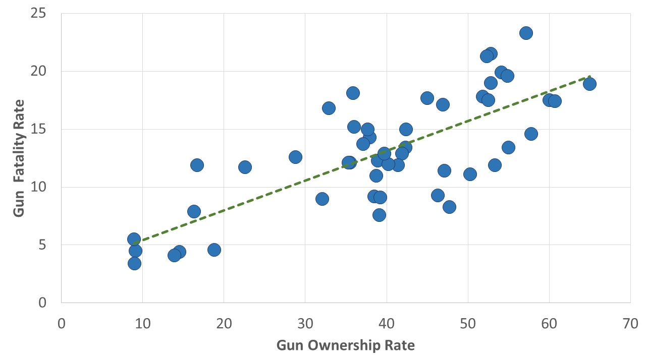
A third assumption of correlation is that the relationship between the two variables is linear. A linear relationship is one in which a good description of its scatterplot is that it tends to conform to a straight line, rather than some other figure, like a U-shape or an upside-down U-shape. This seems to be true of the relationships shown in Figures 1 and 2. One can almost imagine that a line from bottom left to top right, for instance, is a pretty good way of describing the relationship in Figure 1, and we’ve done so in Figure 4. It’s certainly not easy to see that any curved line would “fit” the points in that figure any better than a straight line does.
Regression Analysis
But the assumption of a linear relationship raises the question of “Which line best describes the relationship?” It may not surprise you to learn that statisticians have a way of figuring out what that line is. It’s called regression. Regression is a technique that is used to see how an interval-level dependent variable is affected by one or more interval-level independent variables. For the moment, we’re going to leave aside the very tantalizing “or more” part of that definition and focus on the how regression analysis can provide even more insight into the relationship between two variables than correlation analysis does.
We call regression simple linear regression when we’re simply examining the relationship between two variables. It’s called multiple regression or multivariate regression when we’re looking at the relationship between a dependent variable and more than one independent variable. Correlation, as we’ve said, can tell us about the strength, direction, and generalizability of the relationship between two interval level variables. Simple linear regression can tell us the same things, while adding information that can help us use an independent variable to predict values of a dependent variable. It does this by telling us the formula for the line of best fit for the points in a scatterplot. The line of best fit is a line that minimizes the distance between itself and all of the points in a scatterplot.
To get the flavor of this extra benefit of regression, we need to recall the formula for a line:
[latex]y= a + bx \\ \text{where, in the case of regression, $y$ refers to values of the dependent variable }\\ \text{$x$ refers to values of the independent variable}\\ \text{$a$ refers to the $y$-intercept, or where the line crosses the $y$-axis}\\ \text{$b$ refers to the slope, or how much $y$ increases every time $x$ increases $1$ unit }\\[/latex]
What simple linear regression does, in the first instance, is find the line that comes closest to all of the points in the scatterplot. Roger, for instance, used SPSS to do a regression of the gun shooting death rate by state on the percentage of residents who own guns (this is the vernacular used by statisticians: they regress the dependent variable on the independent variable[s]). Part of the resulting printout is shown in Table 4.
Table 4. Partial Printout from Request for Regression of Gun Shooting Death Rate Per 100,000 on Percentage of Residents Owning Guns
|
Coefficientsa |
||||||
|
Model |
Unstandardized Coefficients |
Standardized Coefficients |
t |
Sig. |
||
|
B |
Std. Error |
Beta |
||||
|
1 |
(Constant) |
2.855 |
1.338 |
|
2.134 |
.038 |
|
Gun Ownership |
.257 |
.032 |
.760 |
8.111 |
<.001 |
|
|
a. Dependent Variable: Gun Shooting Death Rate |
||||||
Note that under the column labeled “B” under “Unstandardized Coefficients,” one gets two numbers: 2.855 in the row labeled (Constant) and 0.257 in the row labeled “Gun Ownership.” The (Constant) 2.855,[4] rounded to 2.86, is the y-intercept (the “a” in the equation above) for the line of best fit. The 0.257, rounded to 0.26, is the slope for that line. So what this regression tells us is that the line of best fit for the relationship between gun shooting deaths and gun ownership is:
Gun shooting death rate = 2.86 + 0.26 * (% of residents owning guns)
Correlation, we’ve noted, provides information about the strength, direction and generalizability of a relationship. By generating equations like this, regression gives you all those things (as you’ll see in a minute), but also a way of predicting what (as-yet-incompletely-known) subjects will score on the dependent variable when one has knowledge of the their values on the independent variable. It permitted us, for instance, to draw the line of best fit into Figure 4, one that has a y-intercept of about 2.86 and a slope of about 0.26. And suppose you knew that about 50 percent of a state’s residents owned guns. You could predict the gun death rate of the state by substituting “50” for the “% of residents owning guns” and get a prediction that:
Gun shooting death rate = 2.86 + 0.26 (50)= 2.86 + 13 = 15.86
Or that 15.86 per 100,000 residents will have experienced gun shooting deaths. Another output of regression is something called R squared. R squared x 100 (because we are converting from a decimal to a percentage) tells you the approximate percentage of variation in the dependent variables that is “explained” by the independent variable. “Explained” here is a slightly fuzzy term that can be thought of as referring to how closely points on a scatterplot comes to a line of best fit. In the case of the gun shooting death rate and gun ownership, the R squared is 0.578, meaning that about 58 percent of the variation in the gun shooting death rate can be explained by gun ownership rate. This is actually a fairly high percentage of variance explained, by sociology and justice studies standards, but would mean one’s predictions using the regression formula are likely to be off by a bit, sometimes quite a bit.
The prediction bonus of regression is very profitable in some disciplines, like finance and investing. And predictions can even get pretty good in the social sciences if more variables are brought into play. We’ll show you how this gets done in a moment, but first a word about how regression, like correlation, also provides information about the direction, strength and generalizability of a two-variable relationship. If you return to Table 5.4, you’ll find in a column labeled “standardized coefficient” or beta (sometimes represented as β), the number 0.760. You may recall that the Pearson’s r of the relationship between the gun shooting death rate and the percentage of residents who own guns was also 0.76, and that’s no coincidence. The beta in simple regression is always the same as the Pearson’s r for the bivariate relationship. Moreover, you’ll find at the end of the row headed by “Gun Ownership” a significance level (<0.001)—which was exactly the same as the one for the original Pearson’s r. In other words, through beta and the significance level associated with an independent variable we can, just as we could with Pearson’s r, ascertain the direction, strength and generalizability of a relationship.
But beta’s meaning is just a little different from Pearson’s r’s. Beta actually tells you the correlation between the relevant independent variable and the dependent variable when all other independent variables in the equation or model are controlled. That’s a mouthful, we know, but it’s a magical mouthful, as we’re about to show you. In fact, the reason that the beta in the regression above is the same as the relevant Pearson’s r is that there are no other independent variables involved. But let’s now see what happens when there are….
Multiple Regression
Multiple regression (also called multivariate regression), as we’ve said before, is a technique that permits the examination of the relationship between a dependent variable and several independent variables. But to put it this way is somehow to diminish its magic. This magic is one reason that, of all the quantitative data analytic technique we’ve talked about in this book, multiple regression is probably the most popular among social researchers. Let’s see why with a simple example.
Roger’s taught classes in the sociology of gender and has long been interested in the question of why women are better represented in some countries’ governments than in others. For example, why are women better represented in the national legislatures in many Scandinavian countries than they are, say, in the United States? In 2020, the United States achieved what was then a new high in female representation in the House of Representatives—23.4 percent of the House’s seats were held by women after the election of the year before—while in Sweden 47 percent of the seats (almost twice as many) were held by women (Inter-Parliamentary Union 2022)[5]. He also knew that women were better represented in the legislatures of certain countries where some kind of quota for women’s representation in politics had been established. Thus, in Rwanda, where a bitter civil war tore the country apart in 1994, a new leader, Paul Kagame, felt it wise to bring women into government and established a law that women should constitute at least 30 percent of all government decision-making bodies. In 2019, 61 percent of the members of Rwanda’s lower house were women—by far the greatest percentage in the world and more than two and a half times as many as in the United States. Most Scandinavian countries also have quotas for women’s representation.
In any case, Roger and three students (Rebecca Teczar, Katherine Rocha, and Joseph Palazzo), being good social scientists, wondered whether the effect of quotas might be at least partly attributable to cultural beliefs—say, to beliefs that men are better suited for politics than women. And, lo and behold, they found an international survey that measured such an attitude in more than 50 countries: the 2014 World Values Survey. They (Teczar et al. found that for those countries, the correlation between the presence of some kind of quota and the percentage of women in the national legislature was pretty strong (r =0.31), but that the correlation between the percentage of the population that thought men were better suited for politics and the presence of women in the legislature was even stronger (r= -0.46). Still, they couldn’t be sure that the correlation of one of these independent variables with the dependent variable wasn’t at least partly due to the effects of the other variable. (Look out: we’re about to use the language of the elaboration model outlined in the chapter on multivariate analysis.)
One possibility, for instance, was that the relationship between the presence of quotas and women’s participation in legislatures was the spurious result of attitudes about women’s (or men’s) suitability for office on both the creation of quotas promoting their access to them and on the access itself. If this position had been proven correct, they would have discovered that there was an “explanation” for the relationship between quotas and women’s representation. But they would have had to see the correlation between the presence of quotas and women’s participation in legislatures drop considerably when attitudes were controlled for this position to be borne out.
On the other hand, it might have been that attitudes about women’s suitability made it more (or less) likely that countries would adopt quotas, which in turn made it more likely that women would be elected to parliaments. Had the data supported this view, if, that is, the controlled association between attitudes and women’s presence in parliaments dropped when the presence of quotas was controlled, we would have discovered an “interpretation” and might have interpreted the presence of quotas as the main way in which positive attitudes towards women in politics affected their presence in parliaments.
As it turns out, there was support, though nowhere near complete support, for both positions. Thus, the beta for the attitudinal question (-0.41) is slightly weaker than the original correlation (-0.46), suggesting that some of effect of cultural attitudes on women’s parliamentary participation may be accounted for by their effects on the presence of quotas and the quotas’ effects on participation. But the beta for the presence of quotas (0.23) is also weaker than its original correlation with women in parliaments (0.31), suggesting that some of its association with women in parliament may be due to the direct effects of attitudes on both the presence of quotas and on women in parliament. The R squared for this model (0.26) involving the two independent variables is considerably greater than it was for models involving each independent variable alone (0.20 for the attitudinal variable; 0.09 for the quota variable), so the two together explain more of the variance in women’s presence in parliaments than either does alone.
But an R squared of 0.26 suggests that even if we used the formula that multiple regression gives us for predicting women’s percentage of a national legislature from knowledge of whether a country had quotas for women and the percentage agreeing that men are better at politics, our prediction might not be all that good. That formula, though, is again provided by the numbers in the column headed by “B” under “Unstandardized Coefficients.” That column yields the formula for a line in three-dimensional space, if you can imagine:
Fraction of Legislature that is Female = 0.286 + 0.067 (Presence of Quota) – 0.002 (Percentage Thinking Men More Suitable)
If a country had a quota and 10% of the population thought men were better suited for politics, we would predict that the fraction of the legislature that was female would be 0.286 + 0.067 (1) – 0.002 (10) = 0.333 or that 33.3 percent of the legislature would be female. Because such a prediction would be so imperfect, though, social scientists usually wouldn’t make too much of it. It’s frequently the case that sociologists and students of justice are more interested in multiple regression for its theory testing, rather than its predictive function.
Table 5. Regression of Women in the Legislature by Country on the Presence of a Quota for Women in Politics and The Percent of the Population Agreeing that Men Are More Suitable for Politics than Women
|
Coefficientsa |
||||||
|
Model |
Unstandardized Coefficients |
Standardized Coefficients |
t |
Sig. |
||
|
B |
Std. Error |
Beta |
||||
|
1 |
(Constant) |
.286 |
.049 |
|
5.828 |
.000 |
|
Presence of a quota for women in politics |
.067 |
.037 |
.228 |
1.819 |
.075 |
|
|
Percent agreeing that men are more suitable for politics than women |
-.002 |
.001 |
-.412 |
-3.289 |
.002 |
|
|
a. Dependent Variable: women in legislature 2017 |
||||||
These are the kinds of lessons one can learn from multiple regression. Two things here are worthy of note. First, the variable “presence of a quota for women in parliament” is a dummy variable treated in this analysis just as seriously as one would any other interval level variable. Second, we could have added any number of other independent variables into the model, as you’ll see when you read the article referred to in Exercise 4 below. And any of them could have been a dummy variable. (We might, for instance, have included a dummy variable for whether a country was Scandinavian or not.) Multiple regression, in short, is a truly powerful, almost magical technique.
Exercises
- Write definitions, in your own words, for each of the following key concepts from this chapter:
- dummy variable
- scatterplot
- Pearson’s r
- linear relationship
- regression
- line of best fit
- simple linear regression
- multiple regression
- R squared
- beta
-
Return to the Social Data Archive we’ve explored before. The data, again, are available at https://sda.berkeley.edu/ . (You may have to copy this address and paste it to request the website.) Again, go down to the second full paragraph and click on the “SDA Archive” link you’ll find there. Then scroll down to the section labeled “General Social Surveys” and click on the first link there: General Social Survey (GSS) Cumulative Datafile 1972-2021 release.
For this exercise, you’ll need to come up with three hypotheses:
1) Who do you think will have more offspring: older or younger adults?
2) People with more education or less?
3) Protestants or other Americans?Now you need to test these hypotheses from the GSS, using correlation analysis. To do this, you’ll first need to make a dummy variable of religion. First, put “relig” in the “Variable Selection” box on the left and hit “View.” How many categories does “relig” have? This is how to reduce those categories to just two. First, hit the “create variables” button at the upper left. Then, on the right, name the new variable something like “Protestant.” (Some other student may have done this first. If so, you may want to use “their” variable.) The label for the new variable could be something like “Protestant or other.” Then put “relig” in the “Name(s) of existing variables” box and click on the red lettering below. There should be a bunch of boxes down below. Put a “1” in the first box on the left, give the category a name like “Protestant,” and put “1” for the Protestant category of “relig” on the right. Then go down one row and put “0” in the first box on the left in the row, label the category “other,” and put “2-13” in the right-hand box of the row. This will put all other religions listed in “relig” in the “other” category of “Protestant.” Then go to the bottom and hit “Start recoding.” If no one else has done this yet, you should see a frequency distribution for your new variable. If someone else has done it, you may use their variable for the rest of this exercise.
Now hit the “analysis” button at the upper left. Choose “Correl. Matrix” (for “correlation matrix”) for the kind of analysis. Now put the four variables of interest for this exercise (“childs,” “age,” “educ,” and “Protestant”) in the first four “Variables to Correlate” boxes. Now go to the bottom and hit “Run correlations.”
Report the correlations between the three independent variables (age, educ and Protestant) and your dependent variable (childs). Do the correlations support your hypotheses? Which hypothesis receives the strongest support? Which the weakest? Were any of your hypotheses completely falsified by the analysis?
- Now let’s use the same data that we used in Exercise 1 to do a multiple regression analysis. You’ll first need to leave the Social Data Archive and get back in again, returning to the GSS link. This time, instead of hitting “Correl. Matrix,” hit “Regression.” Then put “Childs” in the “Dependent” variable box and “Age,” “Educ,” and “Protestant” in three of the “Independent variables” boxes. Hit “Run regression.” Which of the independent variables retains the strongest association with the number of children a respondent has when all other variables in the model are controlled? What is that association? Which has the weakest when other variables are controlled?
-
Please read the following article:
Teczar, Rebecca, Katherine Rocha, Joseph Palazzo, and Roger Clark. 2018. “Cultural Attitudes towards Women in Politics and Women’s Political Representation in Legislatures and Cabinet Ministries.” Sociology Between the Gaps: Forgotten and Neglected Topics 4(1):1-7.
In the article, Teczar et al. use a multiple regression technique, called stepwise regression, which in this case only permits those variables that have a statistically significant (at the 0.05 level) controlled association into the model.
a. What variables do Teczar et al. find have the most significant controlled associations with women in national parliaments? Where do you find the relevant statistics in the article?
b. What variables do Teczar et al. find have the most significant controlled association with women in ministries? Where do you find the relevant statistics in the article?
c. Which model—the one for parliaments or the one for ministries (or cabinets)—presented in the article has the greater explanatory power? (i.e., which one explains more of the variation in the dependent variable?) How can you tell?
d. Do you agree with the authors’ point (at the end) that political attitudes, while tough to change, are not unchangeable? Can you think of any contemporary examples not mentioned in the conclusion that might support this point?
Media Attributions
- Scatterplot of Gun Ownership Rates and Per Capita Gun Deaths by State © Mikaila Mariel Lemonik Arthur
- Scatterplot of the Relationship Between Drug Overdoes Death Rates and Population Wellbeing, By State © Roger Clark
- correlation-coefficients-1 © Kiatdd adapted by Mikaila Mariel Lemonik Arthur is licensed under a CC BY-SA (Attribution ShareAlike) license
- Scatterplot of Gun Ownership Rates and Per Capita Gun Deaths by State, with Trendline © Mikaila Mariel Lemonik Arthur
- Professional statistical analysts usually use 0 and 1 rather than 1 and 2 when making dummy variables. This is due to the fact that the numbers used can impact the interpretation of the regression constant, which is not something beginning quantitative analysts need to worry about. Therefore, in this text, both approaches are used interchangeably. ↵
- Note that this would impact statistical significance, too, since there would be many cells in the table but few cases in each cell. ↵
- Gun ownership data from Schell et al. 2020; death data from National Center for Health Statistics 2022. ↵
- This constant is the number that is impacted by whether we choose to code our dummy variable as 0 and 1 or as 1 and 2. As you can see, this choice impacts the equation of the line, but otherwise does not impact our interpretation of these results. ↵
- When the U.S. Congress goes into session in 2023, the House of Representatives will be 28.5% women (Center for American Women in Politics 2022). Sweden has stayed about the same, while in Rwanda, women now make up 80% of members of the lower house (Inter-Parliamentary Union 2022). ↵
A two-category (binary/dichotomous) variable that can be used in regression or correlation, typically with the values 0 and 1.
A visual depiction of the relationship between two interval level variables, the relationship between which is represented as points on a graph with an x-axis and a y-axis.
A measure of association that calculates the strength and direction of association between two continuous (interval and/or ratio) level variables.
An asymmetry in a distribution in which a curve is distorted either to the left or the right, with positive values indicating right skewness and negative values indicating left skewness.
A relationship in which a scatterplot will produce a reasonable approximation of a straight line (rather than something like a U or some other shape).
A statistical technique used to explore how one variable is affected by one or more other variables.
A regression analysis looking at a linear relationship between one independent and one dependent variable.
Regression analysis looking at the relationship between a dependent variable and more than one independent variable.
Regression analysis looking at the relationship between a dependent variable and more than one independent variable.
The line that best minimizes the distance between itself and all of the points in a scatterplot.
The square of the regression coefficient, which tells analysts how much of the variation in the dependent variable has been explained by the independent variable(s) in the regression.
The standardized regression coefficient. In a bivariate regression, the same as Pearson's r; in a multivariate regression, the correlation between the given independent variable and the dependent variable when all other variables included in the regression are controlled for.
